How to Set Up a Sticky Header in Kadence Free
A sticky header keeps your navigation pinned to the top of the screen as visitors scroll down. It means your menu, logo, and call-to-action buttons are always one click away – no matter how far someone scrolls. And in Kadence, this feature is 100% free. No paid upgrade, no third-party plugin, no code.
But there’s a catch that trips up beginners who use a transparent header. When the header sticks, Kadence gives it a solid background, and if your menu text is white, it disappears into that background. I’ll walk through the full setup plus that fix in about 2 minutes. I re-tested every step on Kadence 1.4.5 for this update.
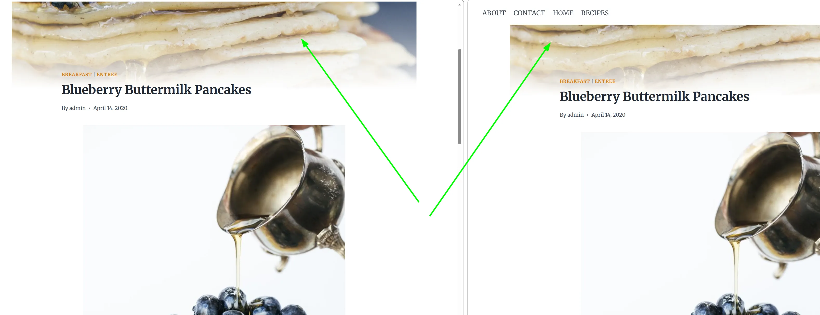
Here’s the difference it makes – same page, same scroll position. On the left, no sticky header (the navigation is long gone). On the right, sticky enabled – the menu stays pinned and is still one click away:
How Do I Enable the Sticky Header in Kadence?
The setting lives inside the Customizer, right next to your other header options. Kadence ships with it switched off, so you’ll need to turn it on yourself.
- Go to Appearance > Customize > Header
- Stay on the General tab and scroll down past the Available Items box
- Click the Sticky Header button (it sits right under Transparent Header)
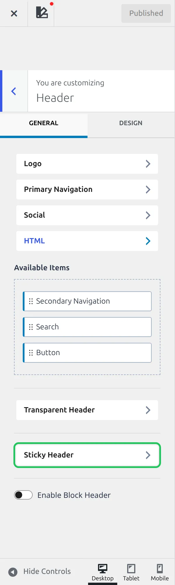
That opens the Sticky Header settings. Now:
- Find the dropdown labeled “Enable Sticky Header?”
- Select “Yes – Only Main Row”
- Click Publish to save
That’s the option most sites should pick. It sticks just your logo and main navigation to the top of the screen. Your top bar (if you have one with a phone number or social icons) scrolls away normally.
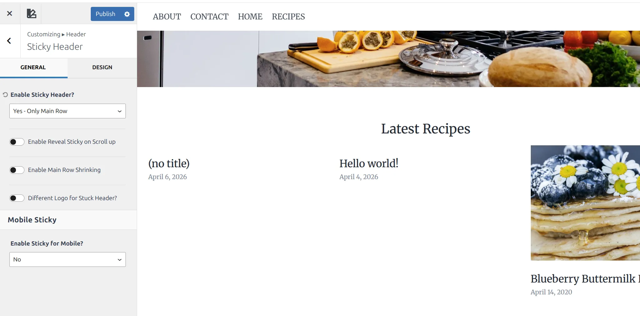
The dropdown has 6 choices in total: No, Yes – Only Main Row, Yes – Top Row & Main Row, Yes – Whole Header, Yes – Only Top Row, and Yes – Only Bottom Row. I’d avoid “Whole Header” unless your top bar is very short. Sticking the entire header eats up more screen space, and on smaller laptops that becomes noticeable fast.
One more thing about that Header panel. If you’ve switched on Enable Block Header at the bottom of it, the Sticky Header button disappears, because a block-built header has its own sticky settings.
Should I Enable the Shrink Effect?
Right below the sticky dropdown, you’ll find an option called “Enable Main Row Shrinking”. When you turn this on, the main row gets shorter once it becomes sticky – the logo shrinks and the row tightens up.
I’d recommend enabling it. Here’s why:
- It saves vertical screen space. A full-height header hovering over your content feels heavy. The shrunk version is more subtle.
- The transition is smooth. It doesn’t jump or flash – it just quietly reduces in size as you start scrolling.
- It gives visitors a visual signal that the header has switched to its “sticky” state, which feels more intentional than a header that just stays exactly the same.
As soon as you flip the switch, a new slider appears underneath it: Main Row Shrink Height. This is the height the row shrinks to, and it starts at 60px. So yes, you can control the shrink amount in the free version – drag it lower for a slimmer bar, or higher if your logo gets too small.
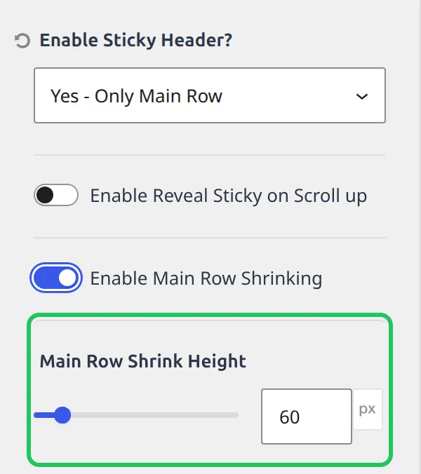
A quick sanity check before you pick a number: Kadence’s main row is 80px tall by default. Shrinking to 60px is a gentle change. Anything under 50px starts to squeeze most logos.
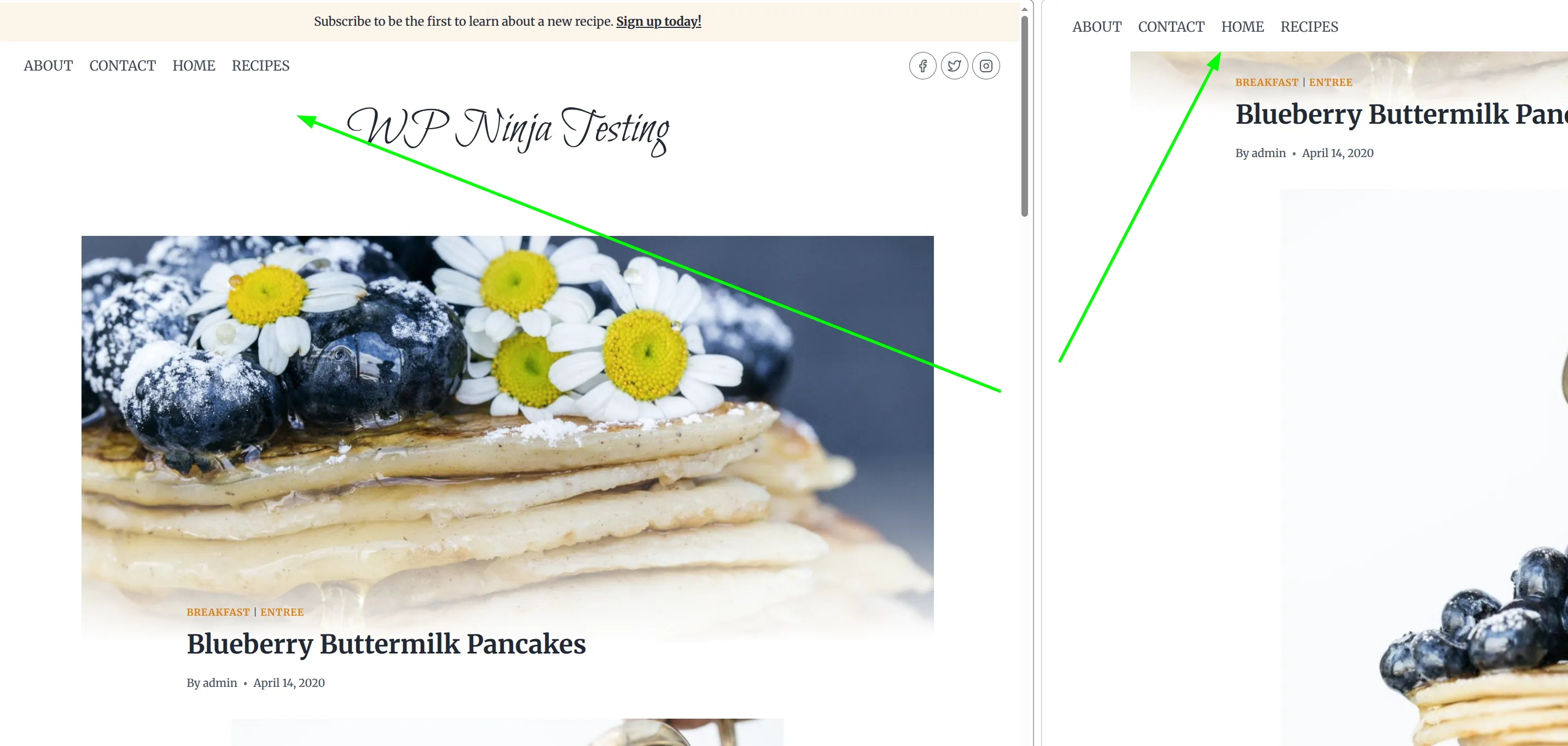
You can see the difference here. Left is the full-height header at the top of the page (with top bar, logo, and menu). Right is the shrunk sticky state after scrolling – just the main row, tightened up:
What About “Enable Reveal Sticky on Scroll Up”?
This is one of those settings that sounds like jargon until you see it in action. Turn it on and the sticky header only appears when the visitor scrolls back up. As they scroll down (reading your content), the header slides away. Scroll up even slightly, and it slides back in.
I tested it on my demo site to be sure. Scrolling down pushed the whole bar off the top of the screen, and a single small flick back up brought all 60px of it back.
I like this option on long-form article pages where you want readers focused on the content, but still want navigation a single scroll-up away. It feels like the header “knows” when they need it.
On ecommerce or landing pages, I’d skip it – you usually want the CTA in the header always visible, not hidden while scrolling down.
Set a Background Color (The Step Most Tutorials Skip)
This is the fix that separates a polished sticky header from a broken-looking one. And almost no tutorial explains what’s actually going on.
Here’s what Kadence does. When your header sticks, it gets the same background as your normal header – the Header Background setting, which is white out of the box. That’s fine for most sites. The problem shows up when you use a transparent header over a dark hero image and set your menu text to white so it’s readable on that image.
Scroll down, the header sticks, and your white menu is now sitting on a white bar. I recreated this on my test site and measured it: menu text rgb(255, 255, 255) on a background of rgb(255, 255, 255). The menu is still there. You just can’t see it.

The fix takes about 10 seconds:
- In the same Sticky Header panel, click the Design tab at the top
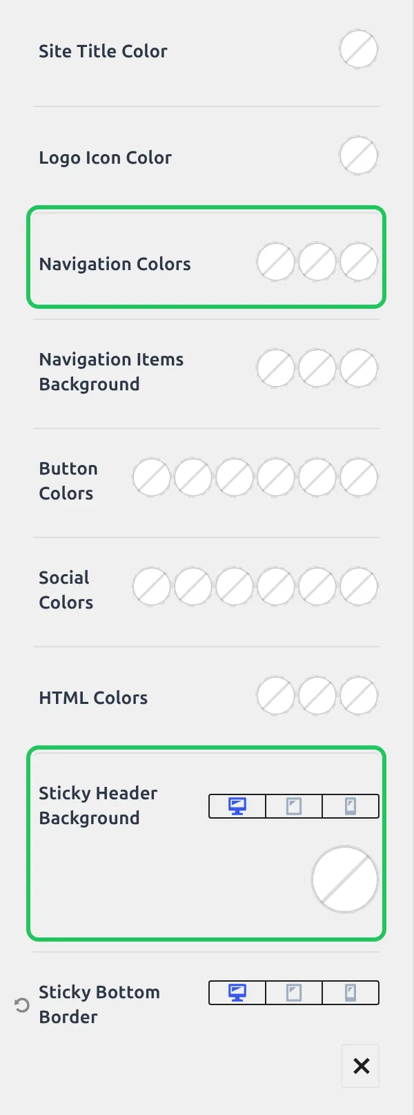
- Find Sticky Header Background and click the color swatch
- Pick a solid color that contrasts with your menu text – a dark gray or navy if your menu is white, or white if your menu is dark
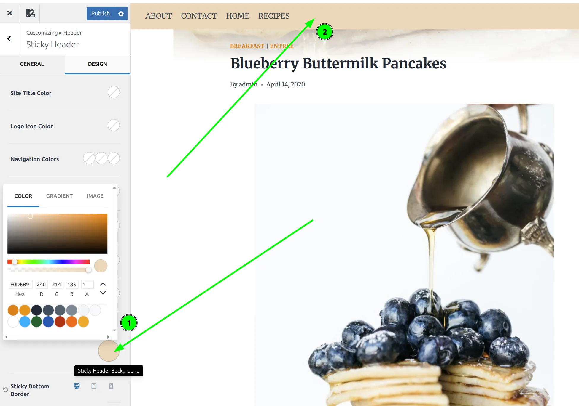
Here’s the same stuck header with the Sticky Header Background set to a dark navy (#1f2937). Same white menu, and now it’s perfectly readable:

If you’d rather keep a white sticky bar, use the Navigation Colors setting higher up the same Design tab instead. It sets the menu color for the stuck state only, so your menu can stay white over the hero and turn dark once it sticks. There are 10 settings on this tab in total, and every one of them starts empty.
While you’re in the Customizer, it’s worth checking my other quick wins like adding a back to top button and disabling breadcrumbs on specific pages – both are similar 2-minute tweaks.
Should I Use a Sticky Header on Mobile?
Kadence has a separate Mobile Sticky section below the main settings, with its own dropdown called “Enable Sticky for Mobile?”. It’s off by default, and it’s completely independent of the desktop setting. Turning on the desktop sticky header does nothing on phones.
And here you get more than a simple on/off toggle – there are 6 choices:
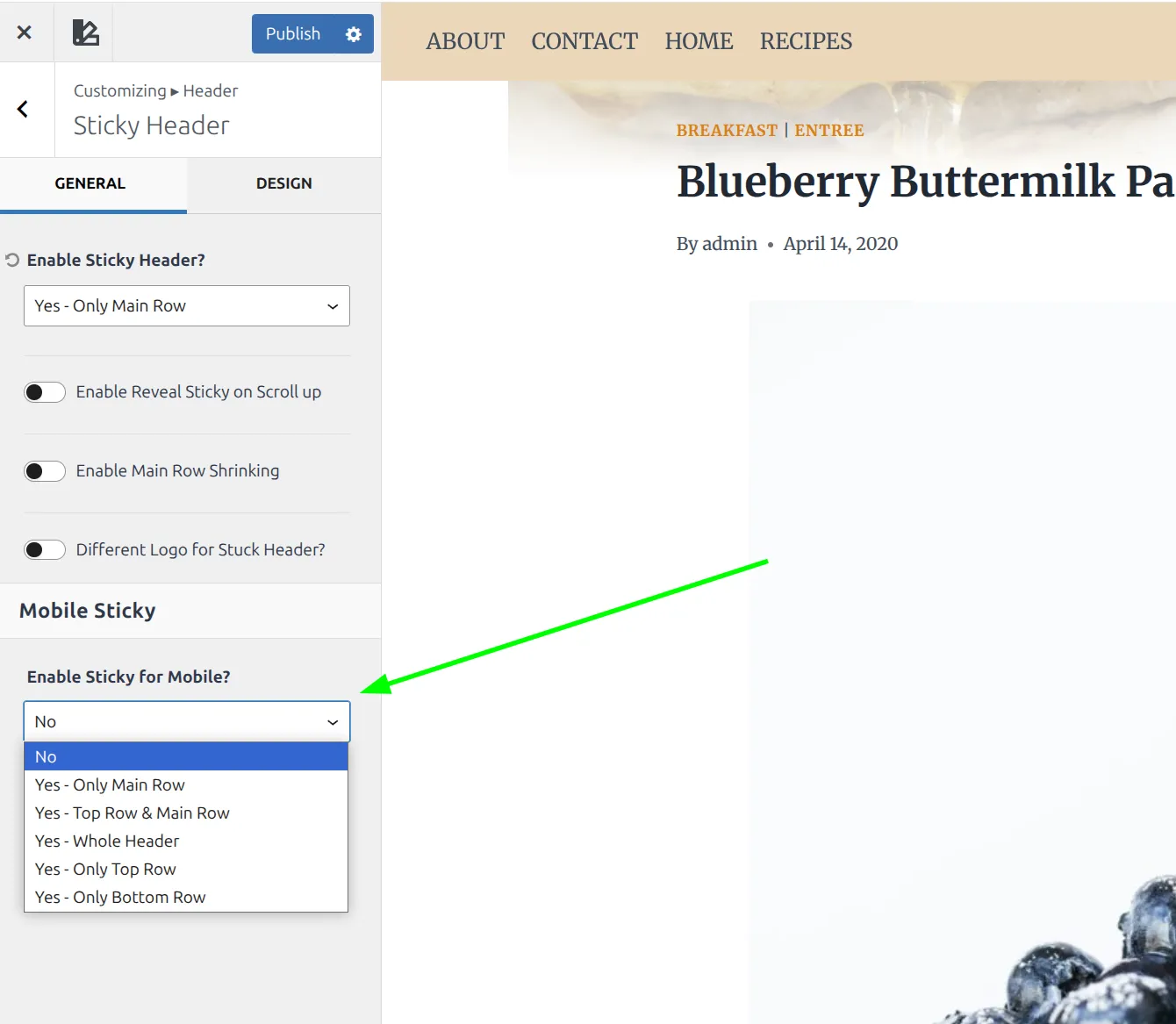
- No – sticky header disabled on phones
- Yes – Only Main Row – sticks just the main navigation row
- Yes – Top Row & Main Row – sticks both top and main
- Yes – Whole Header – pins every row
- Yes – Only Top Row – sticks just the top bar
- Yes – Only Bottom Row – sticks just the bottom row
The mobile section also has its own copies of Reveal on Scroll Up, Main Row Shrinking, and Main Row Shrink Height (60px again). So you can have a shrinking header on desktop and a plain one on phones, or the other way round.
How much room does it take? I measured it on a 390 x 844 phone screen. My test site’s stuck main row was 60px tall, which is about 7% of the screen. With Kadence’s default 80px row, it would be closer to 10%.
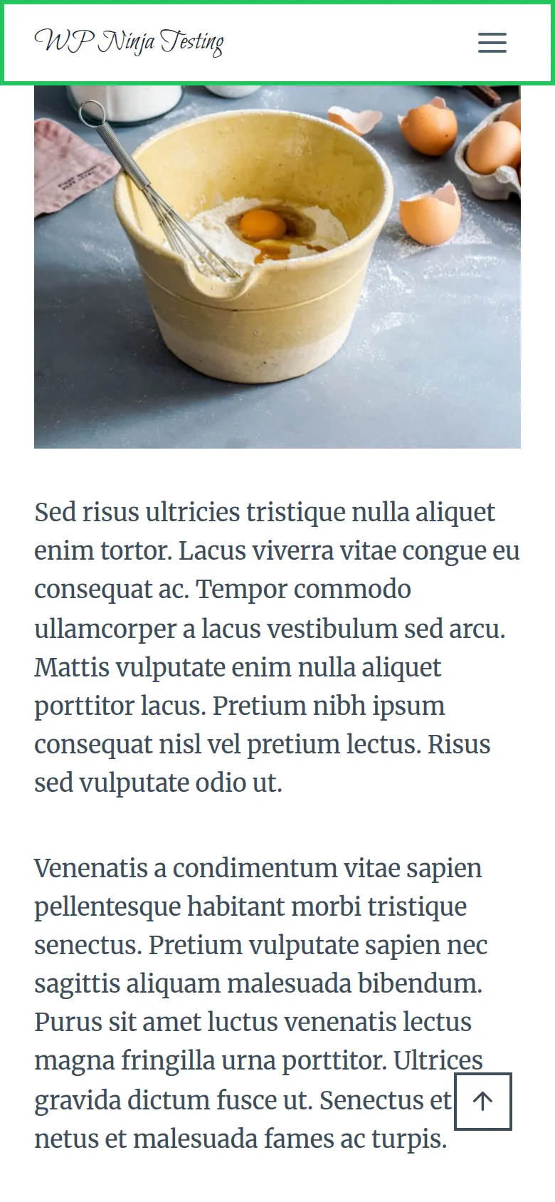
That’s less than I expected, so I don’t mind a single sticky row on mobile. My recommendation: use “Yes – Only Main Row” or “No”, and nothing bigger. If your main nav holds a critical CTA – like a “Book Now” button on a service business site – the main row is worth keeping. Never use “Whole Header” on mobile unless you enjoy watching a big chunk of the screen disappear.
Why Isn’t My Sticky Header Working?
If you’ve turned on the sticky header but it doesn’t seem to do anything, check these 4 things before you start troubleshooting CSS or reinstalling Kadence.
1. Your caching plugin is serving a stale page.
This is the most common cause, and it catches people every time. Plugins like LiteSpeed Cache, WP Rocket, and W3 Total Cache store a saved copy of your pages. When you enable the sticky header, the Customizer saves the setting – but your visitors (and you, if you’re logged out) still see the old cached copy, which was built before sticky was switched on.
Fix: Clear your cache. In LiteSpeed Cache, go to LiteSpeed Cache > Toolbox > Purge All. In WP Rocket, use the clear cache option in the WP Rocket menu on your admin bar. Then test your site in an incognito window. (If you’re still picking a caching plugin, I compared WP Rocket and LiteSpeed Cache for beginners.)
2. You selected the wrong header row.
Kadence’s header has 3 rows: Top, Main, and Bottom. If your logo and menu live in the Main Row but you set the sticky option to “Only Top Row,” nothing useful sticks. Double-check that your sticky setting matches where your navigation actually lives.
3. You’re testing on a phone, but only turned on desktop sticky.
The desktop dropdown and the mobile dropdown are two separate settings. If “Enable Sticky for Mobile?” is still on No, your header won’t stick on a phone no matter what the desktop setting says.
4. Another plugin is overriding your header.
Some page builder plugins – especially Elementor with its Theme Builder feature – can replace Kadence’s header entirely with a custom-built one. If you’ve set up an Elementor header template, Kadence’s sticky setting won’t apply because Kadence’s header isn’t even on the page anymore. Check if you have any header/footer override templates active in your page builder.
Free vs Pro: What’s Actually Different?
Here’s the honest breakdown. The free version of Kadence covers sticky headers really well, and I checked every setting in this article against the free theme’s own code.
Everything I’ve covered – enabling the sticky header, picking which rows stick, the shrink effect and its height, Reveal on Scroll Up, a different logo for the stuck state, the sticky colors and background, and the separate mobile controls – all works in Kadence Free. No upgrade needed.
Kadence Pro (the Theme Kit Pro plugin) doesn’t add a separate sticky mode. What it adds is Header Addons: according to Kadence’s own documentation, 20 extra elements for the header builder, like more buttons, HTML areas and widget areas. Those elements stick along with whatever row you put them in.
So for a standard blog, portfolio, or small business site, the free sticky header does everything you need. You’d buy Pro for the extra header elements, not for the sticky behavior.
Quick Troubleshooting Reference
| Problem | Likely Cause | Fix |
|---|---|---|
| Header doesn’t stick at all | Caching plugin serving old page | Clear all caches, test in incognito |
| Doesn’t stick on phones only | Mobile sticky still set to No | Set “Enable Sticky for Mobile?” in Mobile Sticky |
| Menu text disappears when scrolling | White menu text on the white sticky bar | Set Sticky Header Background or Navigation Colors in the Design tab |
| Header sticks but nothing useful visible | Wrong row selected (Top vs Main) | Match sticky setting to your menu’s row |
| Sticky Header button is missing | Enable Block Header is on | Use the block header’s own sticky settings |
| Stuck header too tall | Shrinking off | Turn on Main Row Shrinking and lower Main Row Shrink Height |
Frequently Asked Questions
Does a Kadence sticky header affect page speed or Core Web Vitals?
Not in any way I could measure. Kadence doesn’t use a CSS position: sticky rule – a small script switches the row to position: fixed as you scroll, and it holds the row’s original space with a fixed-height wrapper (108px on my test site). That’s why the content below doesn’t jump up when the header sticks, which is exactly what CLS (Cumulative Layout Shift) measures.
Can I make only part of my header sticky in Kadence?
Yes. Kadence gives you 5 “Yes” options in the Enable Sticky Header dropdown – Only Main Row, Top Row & Main Row, Whole Header, Only Top Row, and Only Bottom Row. Most sites should stick only the Main Row – that’s where your logo and navigation live.
What does the “Reveal Sticky on Scroll Up” option do?
With this option on, the sticky header only appears when the visitor scrolls back up. It stays hidden while scrolling down, which keeps the reading experience clean, and reappears the moment they scroll up to look for navigation. Great for long-form articles, less useful for conversion-focused pages.
Does the Kadence sticky header work with Elementor?
Only if you’re using Kadence’s native header. If you’ve built a custom header with Elementor’s Theme Builder, Kadence’s sticky header setting won’t apply because Elementor replaces Kadence’s header entirely. You’d need to use Elementor’s own sticky option instead.
Can I set a different logo for the sticky state?
Yes. In the Sticky Header panel there’s a “Different Logo for Stuck Header?” switch. Turn it on and you can upload a separate logo that only appears once the header is sticky, plus a Logo Max Width setting for it. The switch only shows up when your header actually includes a logo, so if you’re using a text-only site title you won’t see it.
Wrapping Up
Setting up a Kadence sticky header takes about 2 minutes. Open Customize > Header, click Sticky Header, pick “Yes – Only Main Row”, and turn on Main Row Shrinking. Then check the Design tab: if your menu text is white, give the sticky state a background it can be read on.
And the best part? Every feature I covered here is available in the free version of Kadence. If you want the full list of header settings and their defaults, I documented them in my Kadence header settings reference.
If you’re in the Customizer tweaking your header, it’s a good time to clean up other visual details too. Changing the footer copyright text is another 2-minute job that makes your site look more polished. Small touches add up.