How to Add a Back to Top Button in Kadence Theme
Kadence has a scroll to top button built right into the free theme. You don’t need a plugin. It’s a single toggle in the Customizer, and the button appears in the bottom corner of your page as soon as visitors scroll down. Lightweight, clean, and it just works.
I’ve seen people install dedicated “back to top” plugins for this. So for this update I installed one and measured it: 5 extra files and about 72 KB (compressed) added to every page. Meanwhile, Kadence already has the feature sitting there, turned off by default, and it costs nothing extra. Here’s how to set it up, plus the design options that make it match your site – every step re-tested on Kadence 1.4.5.
How Do I Enable the Scroll to Top Button?
The setting sits one level down in the Customizer’s General panel, so here’s the exact path:
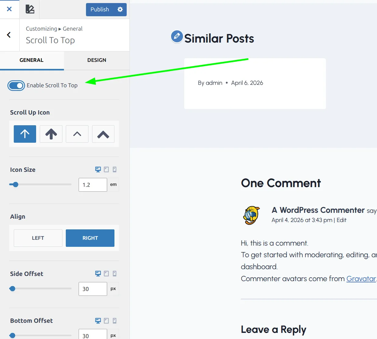
- Go to Appearance > Customize > General.
- Click Scroll To Top (it’s the 4th item in the list, under Images).
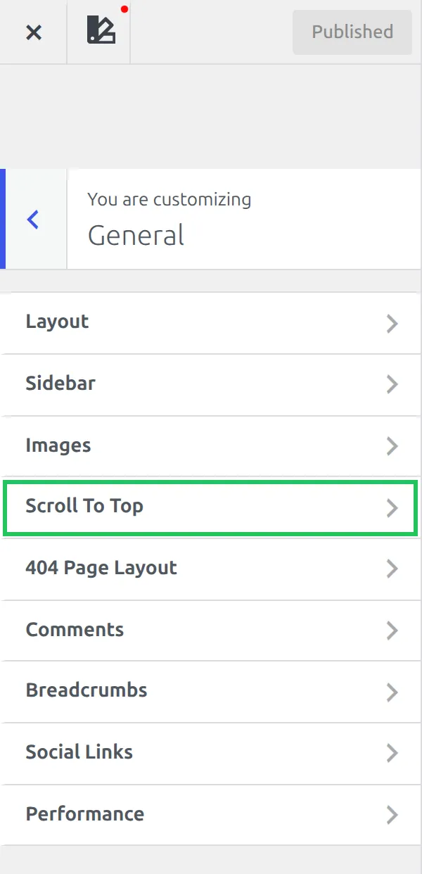
- Toggle “Enable Scroll To Top” to on.
- Click Publish.
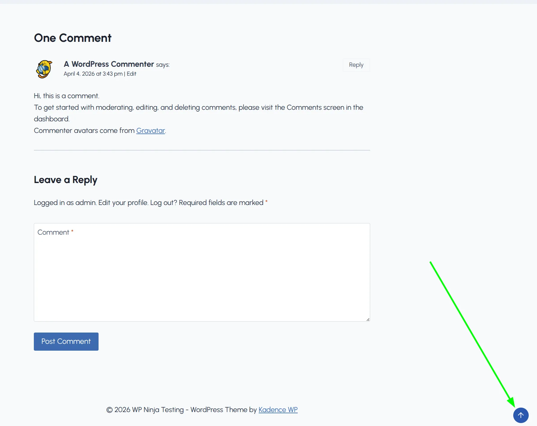
That’s it. A small arrow icon now appears in the bottom-right corner of your site whenever someone scrolls down the page. Click it, and the page scrolls smoothly back to the top.
The button only shows up after the visitor scrolls down past 100px. If they’re above that point, it stays hidden. I checked the theme’s script to get that number, then tested it on my demo site: at 90px of scroll the button was hidden, at 110px it faded in.
Kadence does this with a short block of plain JavaScript – no jQuery, no animation library. The button fades in and slides up 40px over 0.2 seconds, which is subtle enough that nobody finds it distracting.
What Are the General Settings?
Before you jump to colors and styling, there are 6 general options worth knowing about. They’re all in the same Scroll To Top panel, and they only appear once the toggle is on.
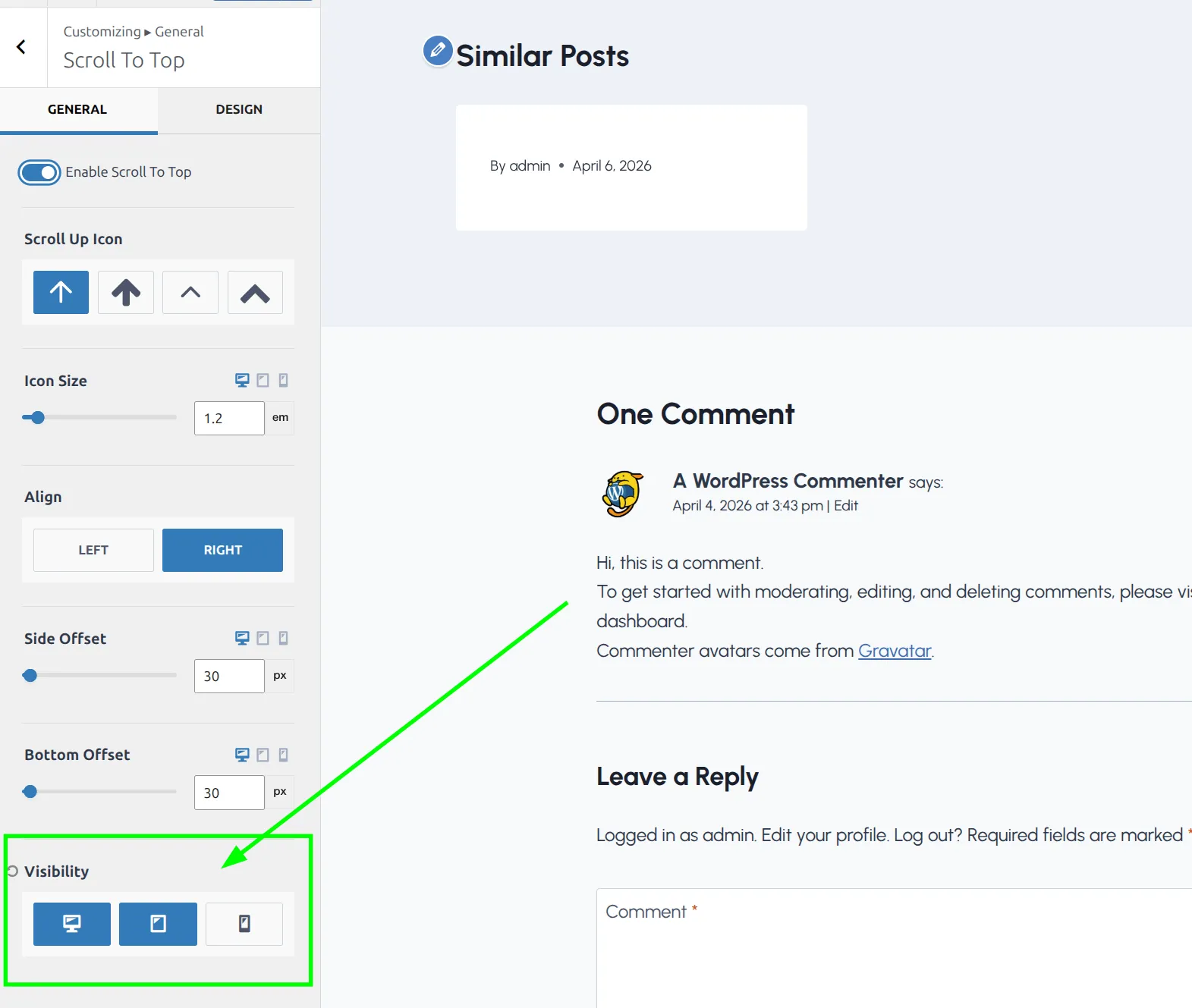
Icon choice. You get 4 icon options – 2 arrow styles and 2 chevron styles. The default arrow is the most universally recognized. I’d stick with it unless your site has a specific design reason to change it.
Icon size. Adjustable in px, em, or rem, and you can set a different size for desktop, tablet and mobile. The default is 1.2em. If your audience skews older, bumping it up to 1.5em makes it easier to see and tap on a phone.
Alignment. Left or right. The default is right, and I’d keep it there unless something else lives in that corner. Most live chat widgets (Crisp, Tidio, LiveChat) sit in the bottom-right by default, so if you run one, either switch the button to the left or raise it with the bottom offset. While you’re customizing the bottom of your site, you might also want to check out adding social icons to your Kadence footer.
Side offset and bottom offset. These control how far from the edge the button sits. Both default to 30px. Useful if the default position overlaps with a cookie consent banner or a floating chat bubble – you can nudge it up or sideways without changing the overall alignment.
Visibility. This is the one that catches people. By default, Kadence shows the button on desktop and tablet but hides it on mobile. If you want it on phones too – and you probably do for long blog posts – you need to click the mobile icon here so it turns blue.
How Do I Customize the Button Design?
Switch to the Design tab at the top of the Scroll To Top panel. This is where you control how the button actually looks.
Button style. 3 options, and the names don’t tell you much, so here’s how each one looked on my test site with the default colors:
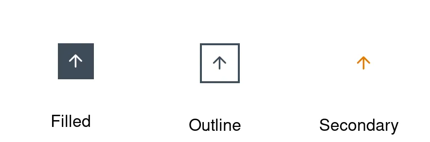
- Filled – a solid dark square with a white arrow (most visible)
- Outline – a 2px border around the arrow and a transparent background. This is the default
- Secondary – just the arrow in your site’s accent color. No border, no background
I usually go with Filled. It’s the most noticeable, and the whole point of a back-to-top button is that people should be able to find it without hunting. Secondary is easy to miss on a busy page, because it’s only an arrow floating over your content.
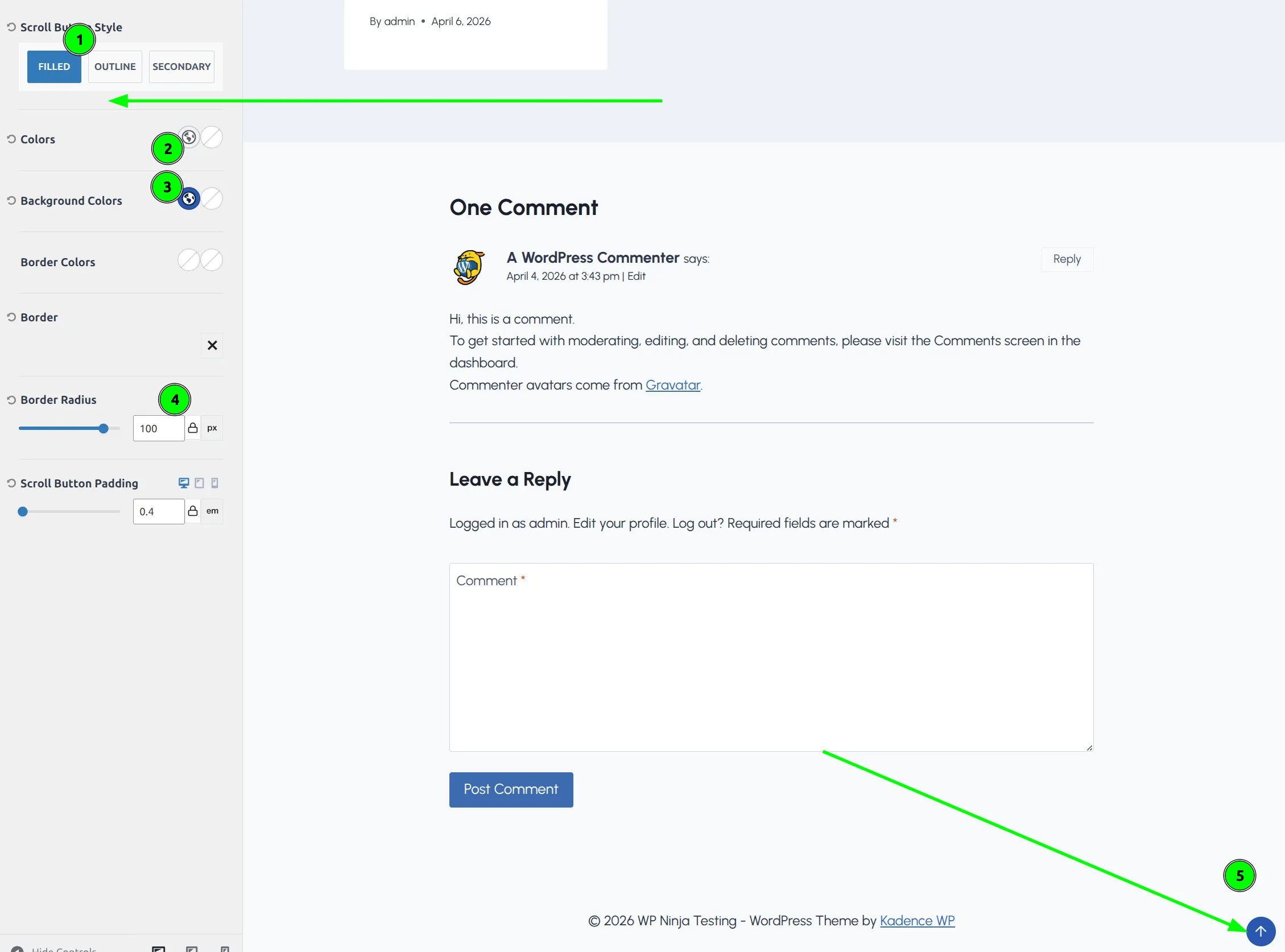
Colors. Set the initial color and hover color for the arrow icon itself. If you’re using Kadence’s global color palette, you can pick from your palette swatches here.
Background colors. Only available when the style is set to Filled – switch to Outline or Secondary and this control disappears. I like using the site’s accent color for the background and a slightly darker shade for hover. It gives users visual feedback that the button is clickable.
Border colors and border. Control the border appearance. Most relevant with the Outline style, where the border is the main visual element.
Border radius. This is how you turn the default square button into a circle. Set it to something like 100px and the button becomes a perfect circle. The default radius is 0 (a square), so you’ll probably want to change this.
Padding. Controls the space between the icon and the button’s edge. The default is 0.4em on all sides, which gives a nice balanced look. Increase it if you bumped up the icon size and need more breathing room.
What About Mobile – Should I Enable It?
I mentioned earlier that Kadence hides the scroll-to-top button on mobile by default. I confirmed it on a 390px phone screen: with the default visibility, the button doesn’t show up at all, no matter how far you scroll. Here’s why that might be a deliberate choice – and why I still turn it on.
The argument against: Mobile screens are small. A floating button in the corner competes for space with sticky footer menus, cookie consent banners, and chat widgets. On a phone, every pixel matters.
The argument for: Mobile users scroll through long posts on their phones. Scrolling back up through a 2,000-word article with your thumb is annoying. A tap-to-top button is genuinely useful.
Once I clicked the mobile icon under Visibility, the button appeared in the bottom-right corner of the phone screen, a little over 40px square:
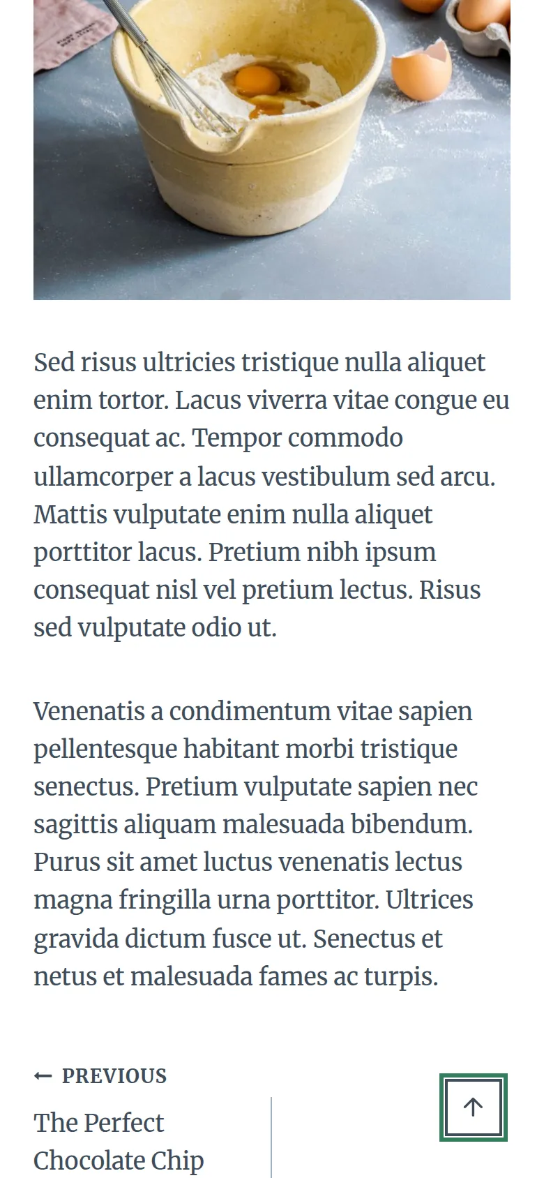
My recommendation: enable it on mobile, but check for conflicts. After enabling it, pull up your site on your phone (or use Chrome DevTools’ responsive mode) and scroll through a long post. Make sure the button doesn’t cover anything important. If it does, use the side offset and bottom offset controls to nudge it out of the way.
If you use a sticky footer menu or a cookie consent plugin, test those specifically. The scroll-to-top button is pinned to the corner of the screen, and so are those elements, so they can stack on top of each other until the offsets are adjusted. And if the problem is extra space at the bottom of your page rather than an overlap, that’s a different fix – I covered it in fixing extra white space in your Kadence footer.
Do I Need a Plugin Instead?
No. And I’d actively recommend against installing one.
To put a number on it, I compared Kadence’s button with To Top (version 3.2), a free back-to-top plugin from the WordPress plugin directory, on the same demo post. Kadence’s button added 1.6 KB of HTML and no extra files. The theme script that powers it is already loaded on a default Kadence install, because it also runs the “Enable Scroll To ID” smooth scrolling (Customize > General > Performance), which is on by default.
The plugin added 5 files to every page:
| File | Size (compressed) |
|---|---|
| jQuery | 30.2 KB |
| Dashicons (icon font CSS) | 35.7 KB |
| jQuery Migrate | 4.9 KB |
| The plugin’s own JavaScript | 0.7 KB |
| The plugin’s own CSS | 0.5 KB |
| Total | 72 KB |
To be fair to the plugin: if another plugin on your site already loads jQuery, you won’t pay for it twice. But that’s still 5 requests and up to 72 KB for a button Kadence gives you for free.
The only scenario where a plugin makes sense is if you need something Kadence’s button doesn’t offer:
- A scroll progress bar (the kind that fills up as you read)
- Multiple scroll targets (jump to specific sections, not just the top)
- Custom animations beyond the built-in fade and slide
For a typical blog or business site, the built-in option is all you need. Fewer plugins means fewer updates, fewer potential conflicts, and a faster site.
Quick Troubleshooting
| Problem | Cause | Fix |
|---|---|---|
| Button doesn’t appear | Feature disabled by default | Enable in Customize > General > Scroll To Top |
| Not showing on mobile | Mobile visibility off by default | Click the mobile icon under Visibility |
| Can’t see it on the page | You haven’t scrolled far enough | Scroll past 100px – the button only appears after that |
| Background color option missing | Style set to Outline or Secondary | Switch to Filled style to see background color controls |
| Button is hard to spot | Secondary style is a bare arrow | Switch to Filled, or add a background with Outline |
| Button overlaps chat widget | Both pinned to the bottom-right corner | Increase the bottom offset or switch alignment to the left |
My Recommended Settings
Here’s what I use on most of my Kadence sites:
| Setting | Value | Why |
|---|---|---|
| Enable | On | – |
| Icon | Arrow up (default) | Most recognizable |
| Style | Filled | Most visible for users |
| Alignment | Right (unless a chat widget is there) | Where people look for it |
| Border radius | 100px (circle) | Modern, clean look |
| Background color | Your accent color | Brand consistency |
| Visibility | Desktop + Tablet + Mobile | Long posts need it everywhere |
| Bottom offset | 30px (default) | Raise it above any cookie banner |
These aren’t the “correct” settings – they’re a starting point. Your site’s design, color scheme, and footer elements might need different values. But this combination works well as a baseline that you can adjust from there.
If you’re also pinning your menu to the top of the screen, the two features pair nicely – here’s how to set up a sticky header in Kadence.
Frequently Asked Questions
Is the Kadence scroll to top button available in the free version?
Yes. The scroll-to-top button is a free feature in Kadence theme. All the settings I covered – icon style, colors, border radius, visibility per device – are available without Kadence Pro. You don’t need any paid upgrade or third-party plugin.
Can I change the scroll distance before the back to top button appears?
Not through the Customizer. Kadence’s script shows the button once the page has scrolled past 100px, and that number is hard-coded. If you need a different trigger distance, you’d need a small JavaScript snippet. But for most sites, 100px works well – the button shows up right when readers start moving down the page.
Does the Kadence back to top button work with WooCommerce product pages?
Yes. The scroll-to-top button is a theme-level feature that Kadence adds to the footer of every page type, including WooCommerce products, shop archives, and cart pages. The visibility settings (desktop, tablet, mobile) apply globally across all pages. There’s no way to show it only on certain page types without custom code.
Will the scroll to top button conflict with my cookie consent banner?
It can. Both the scroll-to-top button and most cookie consent plugins are pinned to the bottom of the screen. If they overlap, check how tall your banner is (right-click it and choose Inspect), then set Kadence’s bottom offset a little higher than that. The button will sit above the banner while it’s showing.
Is the Kadence back to top button accessible?
Kadence adds a second, hidden copy of the button for keyboard and screen reader users. It stays invisible until someone tabs to it, then appears in the same corner with a “Scroll to top” label. You don’t need to set anything up for it.
Wrapping Up
Adding a scroll-to-top button in Kadence takes about 2 minutes. One toggle to enable it, a quick trip to the Design tab to make it look right, and a click to turn it on for mobile users.
The key things to remember: it’s off by default, mobile is hidden by default, and the default style is Outline with a square shape. Most people will want to switch to Filled, add a border radius for a circular look, and enable mobile visibility.
And skip the plugin. Kadence’s built-in version adds no extra files, and it’s one less thing to maintain. If you’re new to how Kadence organizes all these panels, my guide to how the Kadence Customizer works is a good next read.