Kadence Theme Settings: How the Customizer Actually Works
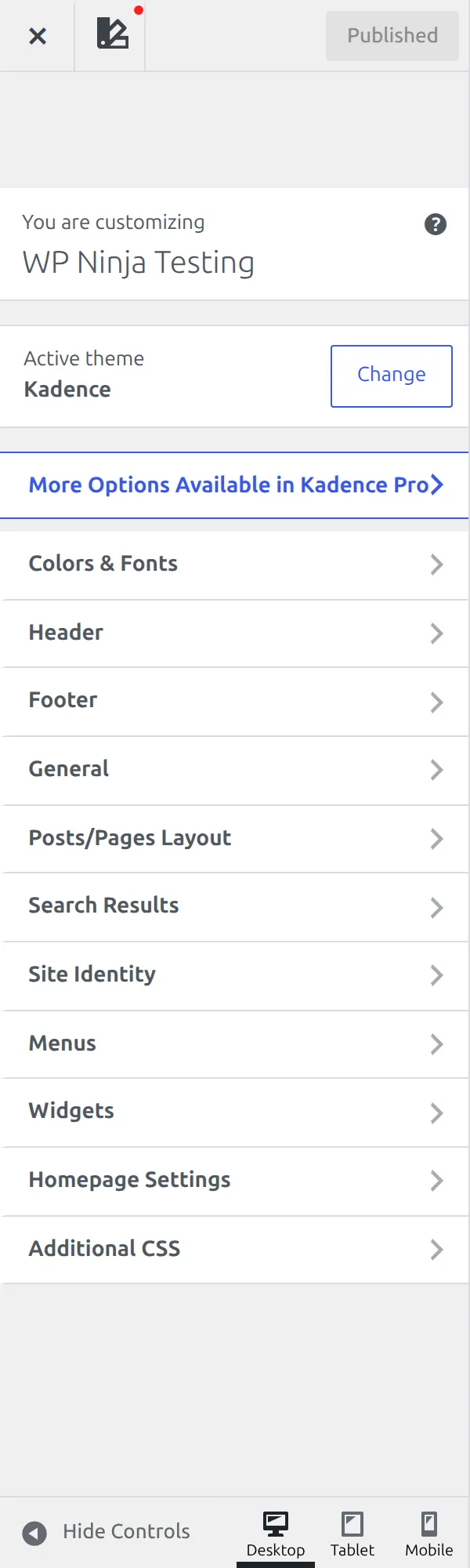
The first time I went looking for the Kadence theme settings I closed the Customizer again. There were panels inside panels, tabs I didn’t notice for a week, and a Header section that looked empty.
(If you can’t find the Customizer at all on a newer install, here’s where it went.)
So I counted. Kadence 1.4.5 registers 969 default values and puts 617 of its own settings in front of you, spread across 83 sections. That’s 83 places to look for one checkbox.
This is part 1 of a reference to all of them. It’s the map, not the tour – what the Customizer’s structure is, why settings go missing, and the handful of controls you’ll meet on every screen. The later parts go setting by setting.
How many Kadence theme settings are there really?
Fewer than the raw number suggests, and I want to be straight about that.
Kadence registers 748 controls. But 32 of those are just headings, 31 are blank spacers, and 36 are the little tab switchers I’ll get to below. Strip those out and you have 649 real settings, of which 617 are Kadence’s own and 32 belong to WordPress itself.
One more honest subtraction. The Social Links section reports 61 controls, and 59 of them are the same thing: a box to paste a URL, once per network. It’s one setting repeated, not 59 decisions.
I didn’t count these by clicking around. I asked the theme itself, by loading Kadence’s settings registry and reading back what it registers. That’s why the numbers here are odd and specific rather than round.
It matters because most articles quote a bigger number. Counting every heading and spacer as an option makes a theme sound generous and makes the reader feel worse about not understanding it.
Why does Kadence look so plain if it has 617 settings?
Because most of them don’t do anything yet.
I checked every single default value. 386 of the 617 settings – just over 62% – start out empty. They’re not set to a value Kadence picked. They’re set to nothing, which means “don’t override anything”, and the theme’s stylesheet carries on as normal.
So you’re not facing 617 decisions. You’re facing about 231 the theme already made for you, plus 386 switches sitting inert until you touch one. That reframed the whole thing for me. Kadence isn’t a theme with strong opinions you have to undo – it’s a big box of override switches, most of them off.
Why can’t I find the setting a tutorial mentioned?
This is the question I see most, and there are two separate answers.
The setting belongs to a component you haven’t placed yet. Header and footer parts live in a builder. Until you drag a component into a row, it sits in a tray called Available Items and it has no settings at all. On my test site, Secondary Navigation, Search and Button were all sitting in that tray – so three sets of options a tutorial might name simply weren’t there to find.
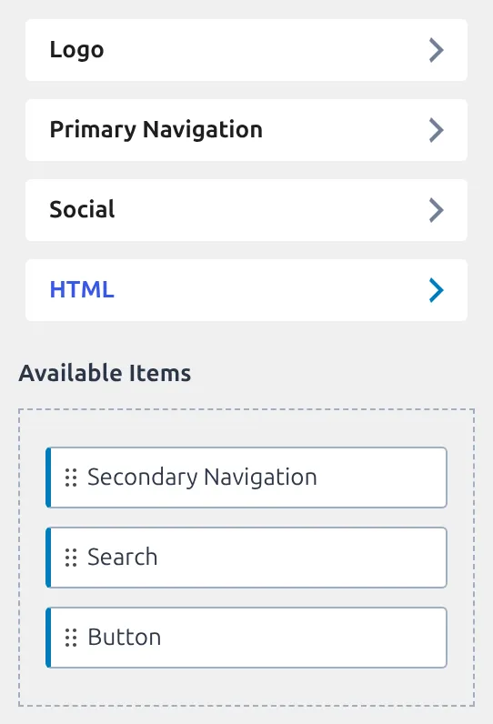
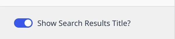
Or the setting is switched off by its neighbour. Plenty of controls only appear once a related setting is on, and some need two. Container Min Height under Search Results is registered and real, but it stays hidden until you turn Show Search Results Title on AND set that title’s layout to Above – either one alone isn’t enough. Nothing is broken. The setting is waiting on two switches, which is why hunting for it can be maddening.
Where the Header and Footer settings actually live
Here’s the part that catches everyone, and it’s why “go to Customize, then Header, then Sticky Header” is advice that can’t be followed.
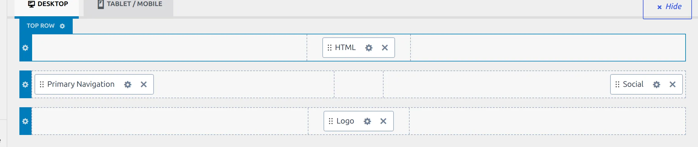
Open the Header panel and you get no list of sections. Not a short list – none. The panel’s contents are a drag-and-drop builder that docks underneath the site preview, and every one of the 222 header settings is reached from there.
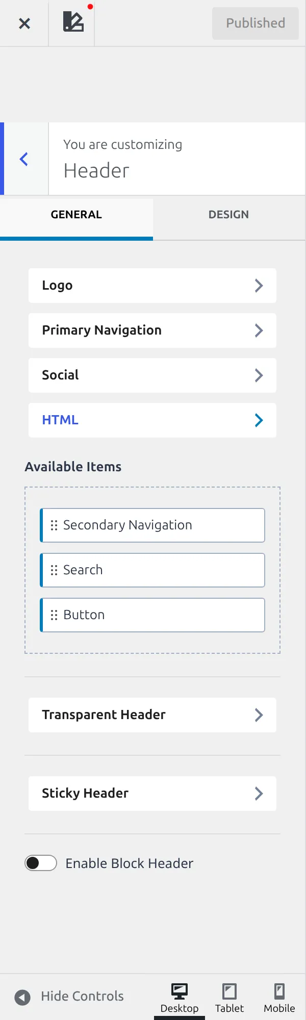
Two little gear icons do the work. The gear on a row opens that row’s own settings – top, main or bottom. The gear on a component opens that component’s settings. Same story in the Footer panel, which holds 100 settings and also lists nothing.
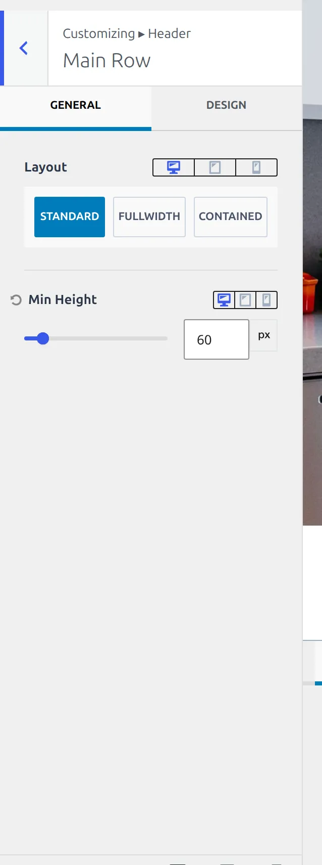
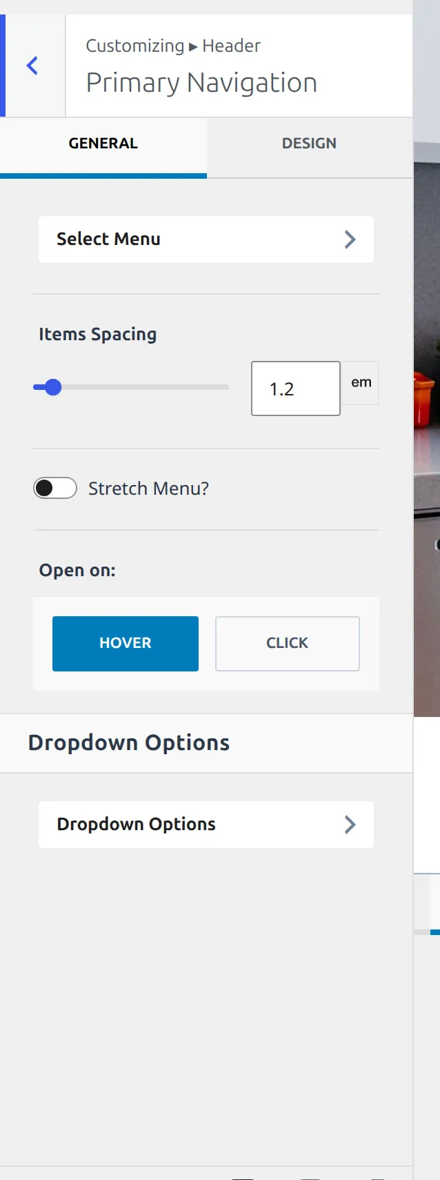
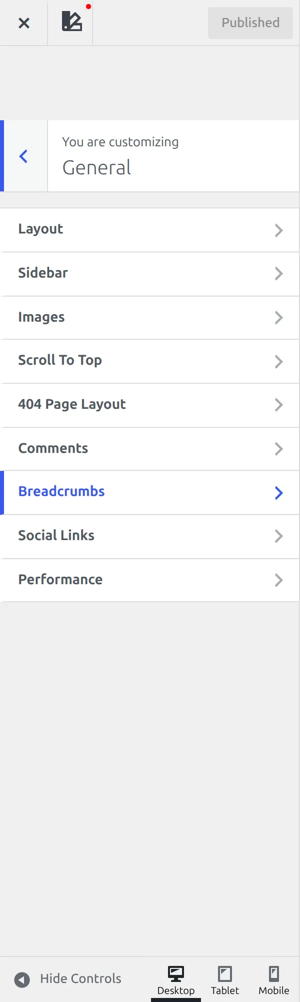
The other four areas behave normally. General, Posts/Pages Layout and Colors & Fonts all open a plain list you can click, and Search Results and Site Identity sit on their own at the top level.
One genuine oddity worth knowing: the Logo is a header component, but its settings aren’t in the Header panel. Kadence slips 14 of them – logo width, mobile logo, logo icon, Logo Layout, site title font – into WordPress’s own Site Identity screen at the top level. If you’ve placed a logo and gone hunting through Header for its options, that’s why you came back empty-handed. Part 2b covers all 16 of those settings.
What are the General and Design tabs?
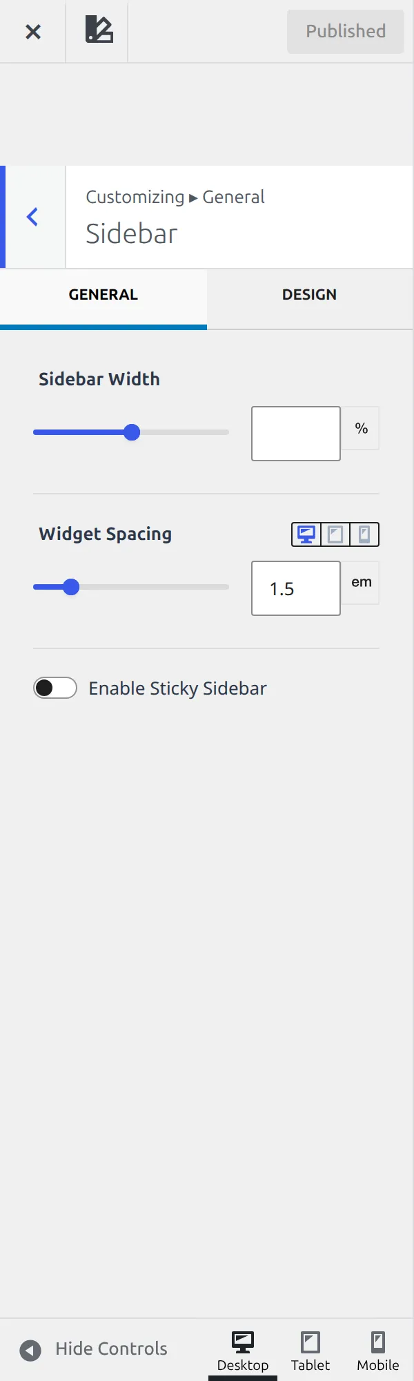
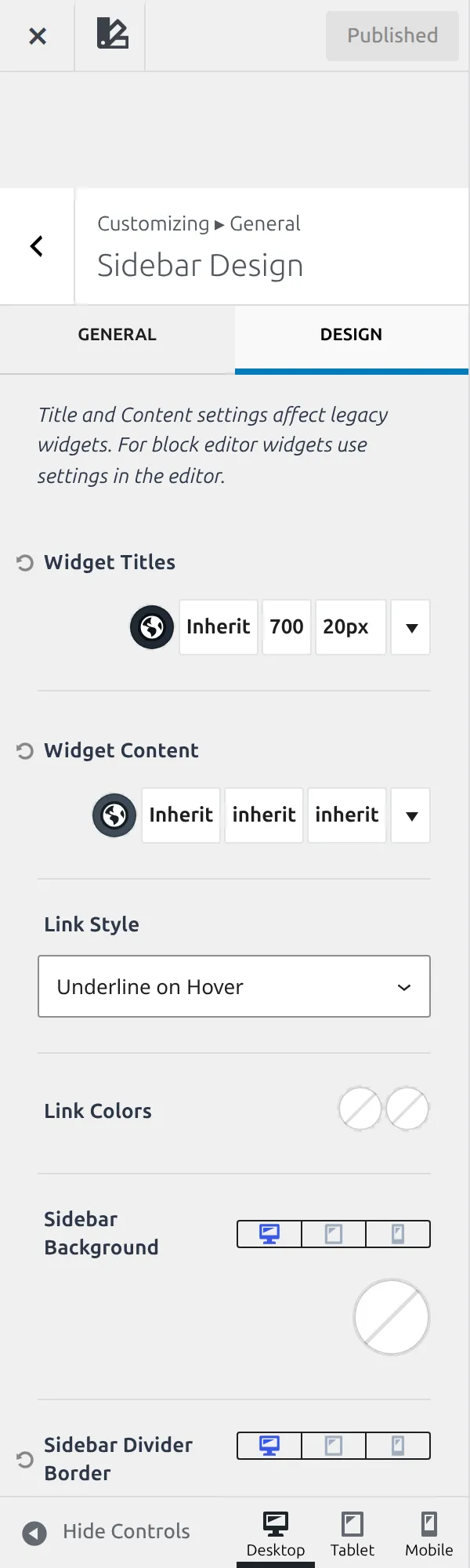
Once you’re inside a section, look at the top for two small tabs: General and Design.
36 sections have this pair, and roughly half of those sections’ options live behind Design. General holds what a thing does; Design holds what it looks like – colours, typography, spacing, borders. They aren’t a filter on one screen either. Kadence builds them as two separate sections stitched together, so clicking Design genuinely moves you somewhere else.
I lost more time to this than I’d like to admit. If a colour or a font size seems to be missing, it’s on the other tab.
There is a second version of the same idea. The header and footer rows show General and Design tabs that hide and reveal controls inside one screen rather than moving you to another. It looks identical and behaves the same way for you as a reader – only the plumbing differs.
The 11 controls you’ll meet everywhere
Kadence uses 43 kinds of control, but 11 of them cover nearly everything. Learn these once and every later part of this series reads faster.
| Control | What it does |
|---|---|
| Switch | On or off |
| Icon buttons | Pick one layout from a row of small icons |
| Slider | A number, usually with separate desktop, tablet and mobile values |
| Colour | A swatch plus a hover colour, drawn from your palette |
| Typography | Font family, size, line height and weight together |
| Spacing box | Four numbers – top, right, bottom, left |
| Dropdown | Pick one from a list |
| Border | Width, style and colour for one edge |
| Shadow | Blur, spread, offset and colour |
| Background | A colour, an image or a gradient |
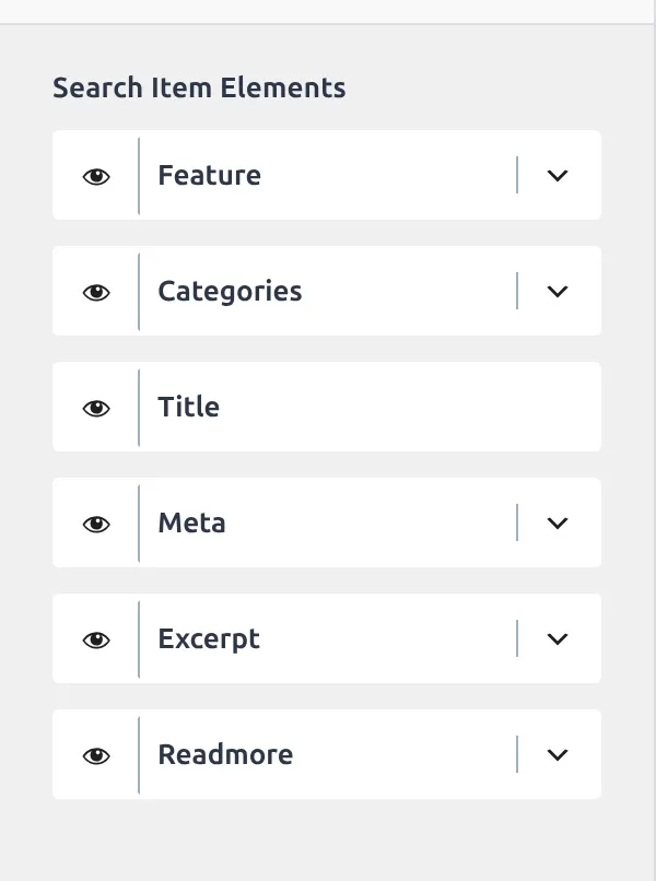
| Sorter | Drag to reorder and toggle what shows |
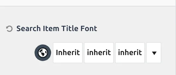
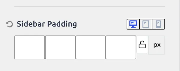
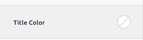
Two things apply across all of them. Most sliders and spacing boxes are responsive – the small screen icons at the bottom of the panel switch between desktop, tablet and mobile, and each keeps its own value. And nothing saves until you hit Publish – if that button isn’t doing what you expect, Kadence Customizer not saving changes covers it.
How do the desktop, tablet and mobile values work?
At the bottom of the control column there are three small icons: a monitor, a tablet and a phone. They aren’t a preview toggle. They’re an editing mode.
When you’re on the phone icon and you drag a slider, you’re setting the mobile value only. Desktop keeps whatever it had. Sliders, spacing boxes and typography controls all work this way, which is how one theme carries three sets of numbers for the same thing.
The catch is that it’s easy to change a value on the wrong device and wonder why the site looks unchanged. If a spacing tweak isn’t showing up, check which icon is lit before you change anything else. It’s the first thing I check now.
What’s not here
Two gaps to set expectations.
The free theme puts an advert at the very top of the Customizer, above every real panel: More Options Available in Kadence Pro. Everything in this series is the free theme, and I’ll say plainly when something needs Pro.
The integration settings for WooCommerce, LearnDash, LifterLMS, TutorLMS, bbPress and The Events Calendar only exist when the matching plugin is active. That’s roughly 2,900 lines of extra options invisible on a plain install, and they’re out of scope here.
The whole series
- How the Kadence Customizer works – the map, the two access models, the control widgets (you are here)
- Header structure – rows, sticky, transparent, off canvas, trigger
- Header components – navigation, search, button, social, HTML, logo
- Footer – rows, navigation, social, copyright, the six widget areas
- Posts, pages and archives – single posts, pages, archives, search, 404
- Colors and fonts – palette, typography, three button styles
- General – layout, sidebar, performance, scroll to top, social links
In the meantime, here are the settings people ask about most, each one already written up: a sticky header, the blog post container width, sidebar position and width, the back to top button, the footer copyright text, and loading Google fonts locally.
Every number here came from Kadence 1.4.5 on a test install, read out of the theme’s own settings registry rather than its documentation. I’ll re-check them at each release.