Kadence General Settings: Layout, Sidebar and Performance
This is part 7 of seven. It covers the 108 Kadence general settings in the General panel, which is where your content width, the sidebar, the back-to-top button, the performance switches and the social link boxes all live.
Every default below was read out of Kadence 1.4.5 itself, not copied from the documentation. The official docs list these settings and never say what any of them start as, which is the entire reason this reference exists.
One caveat about the screenshots. They come from a site I use, so the values in them are mine. The Default column is always the fresh-install value, read from the theme’s own defaults registry rather than from my screen.
What’s inside the Kadence General settings panel?
Nine sections, listed plainly, and you click one to open it. After the Header panel and its drag-and-drop dock, that’s a relief. If you haven’t met the two different navigation models yet, I explained them in part 1 and hit the awkward one in part 2.
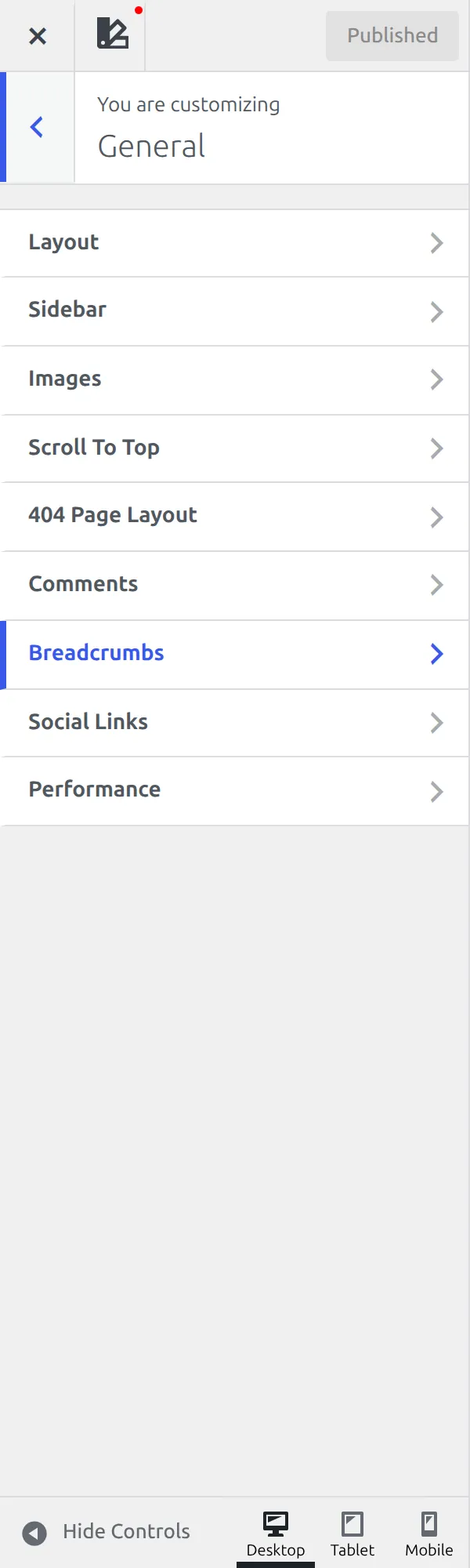
| Section | Settings |
|---|---|
| Social Links | 60 |
| Scroll To Top | 14 |
| Sidebar | 11 |
| Layout | 10 |
| Performance | 8 |
| Breadcrumbs | 2 |
| Comments | 2 |
| Images | 1 |
The ninth section is 404 Page Layout. It holds 6 settings and it sits here in General, which nobody expects, because a 404 page is a page layout in every other respect. I cover it in part 5 with the rest of the page layouts, but this is where you’ll find it.
Why 108 is really 48
Social Links reports 60 settings and that number is almost entirely fake. 59 of the 60 are the same field repeated once per network: a box you paste a URL into. The sixtieth is a genuine switch that opens those links in a new tab.
So the honest size of this part is 48 settings plus a list of networks. I’d rather say that than pad the count, because a reference that inflates its own numbers isn’t much use to anyone.
Of the 48 that remain, 26 ship a real value and 22 start empty or switched off. That ratio is unusually opinionated for Kadence, which runs about 62% inert across the whole theme. The General panel is where the theme actually decided things.
One more thing before the tables. 14 of those 48 sit behind a Design tab, 7 in Sidebar and 7 in Scroll To Top. The tab is a small pair of words at the top of the section and it is very easy to never click, so if a setting below isn’t where you expect it, check the other tab first.
How wide is a Kadence page?
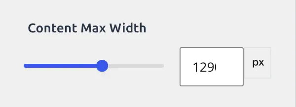
This is the section most people arrive hunting for, and the answer is 1290px.
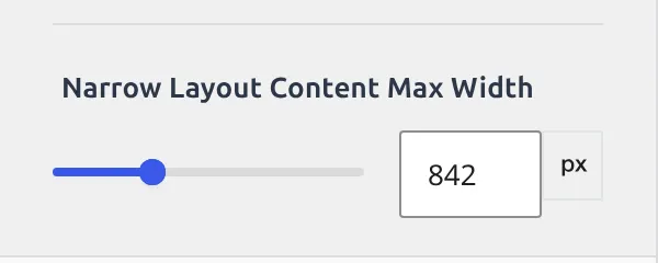
Content Max Width is the outer limit for your whole site. The Narrow Layout Content Max Width is a second, separate number at 842px, used when a page or post is set to the Narrow layout instead of the normal one. Changing one does nothing to the other, and that catches people out constantly.
| Setting | What it does | Default |
|---|---|---|
| Content Max Width | Widest your content ever gets | 1290px |
| Narrow Layout Content Max Width | Same, for pages set to Narrow | 842px |
| Content Left/Right Edge Spacing | Gap between content and the screen edge | 1.5rem on desktop, unset on tablet and mobile |
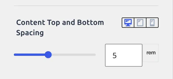
| Content Top and Bottom Spacing | Gap above and below the content area | 5rem desktop, 3rem tablet, 2rem mobile |
| Single Post Boxed Spacing | Padding inside the white box on a single post | 2rem desktop and tablet, 1.5rem mobile |
| Single Post Boxed Shadow | Shadow under that box | Faint black at 5%, dropped 15px, blurred 15px |
| Single Post Boxed Border Radius | Rounded corners on that box | Not set |
| Archive Grid Boxed Spacing | Padding inside each card on an archive | 2rem desktop and tablet, 1.5rem mobile |
| Archive Grid Boxed Shadow | Shadow under each card | Faint black at 5%, dropped 15px, blurred 15px |
| Archive Grid Boxed Border Radius | Rounded corners on those cards | Not set |
Notice that the two spacing settings work differently. Edge spacing carries one desktop value and leaves tablet and mobile empty, so those inherit. Top and bottom spacing sets all three devices, and the 5rem desktop figure is why a fresh Kadence page has so much air above the first heading.
The shadow is the theme’s one piece of visual flourish in this section, and it’s the same shadow twice: once under a single post’s box, once under each archive card. It’s a 5% black, pushed 15px down and blurred 15px, with a negative spread that pulls the edges back in. That’s why it reads as a soft lift rather than a drop shadow.
If you want the walkthrough for changing these rather than the reference, changing the blog post container width covers it step by step.
What can you change about the Kadence sidebar?
Eleven settings, and 7 of them are on the Design tab.
The General tab is short: how wide, how much space between widgets, and whether the sidebar sticks as you scroll. Width starts empty, which means Kadence uses its own proportion until you give it a percentage.
| Setting | What it does | Default |
|---|---|---|
| Sidebar Width | Width as a percentage of the row | Not set |
| Widget Spacing | Vertical gap between widgets | 1.5em on desktop |
| Enable Sticky Sidebar | Sidebar follows you down the page | Off |
| Only Stick Last Widget | Sticks the bottom widget instead of the whole column | Off, and hidden until Enable Sticky Sidebar is on |
| Widget Titles | Font for widget headings | 20px, bold, line height 1.5, palette 3 |
| Widget Content | Font for widget text | Inherits, coloured palette 4 |
| Link Style | Underline behaviour for links | Underline |
| Link Colors | Link colour and hover | Not set |
| Sidebar Background | Colour behind the sidebar | Not set |
| Sidebar Divider Border | Line between sidebar and content | Not set |
| Sidebar Padding | Space inside the sidebar, four sides | Not set |
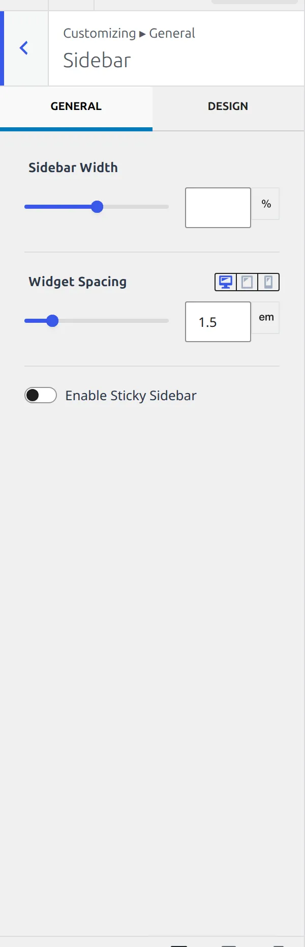
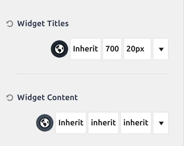
Two sticky settings rather than one is worth understanding. Enable Sticky Sidebar pins the whole column, which looks odd when the sidebar is taller than the window because the bottom of it never comes into view. Only Stick Last Widget scrolls everything normally and pins the final widget once you reach it, which is what most people actually wanted.
You won’t see the second one at first. It stays hidden until Enable Sticky Sidebar is switched on, so the Sidebar section shows three controls on a fresh install rather than the four the table lists.
The one thing this section does not contain is which side the sidebar appears on. That lives in the layout settings for posts, pages and archives, covered in part 5, and I’ve written up changing sidebar position or width if you need the clicks.
What do the 8 performance settings actually do?
This is the smallest section with the biggest consequences, and 3 of the 8 ship switched on.
| Setting | What it does | Default |
|---|---|---|
| Enable Microdata Schema | Adds structured data markup to your pages | On |
| Enable Optimized Group Block | Lighter CSS for the Group block | Off |
| Enable Scroll To ID | Smooth-scrolls anchor links instead of jumping | On |
| Enable Lightbox | Opens images in an overlay when clicked | Off |
| Load Google Fonts Locally | Serves fonts from your server, not Google’s | Off |
| Preload Local Fonts | Tells the browser to fetch local fonts early | On |
| Enable CSS Preload | Loads stylesheets without blocking the page | Off |
| Disable Default Sitemap | Turns off WordPress’s built-in sitemap | Off |
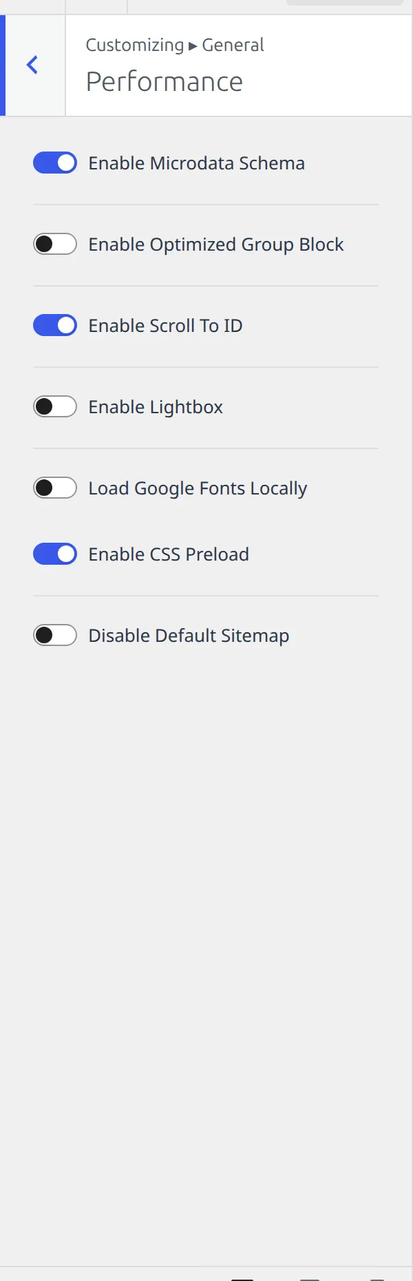
Preload Local Fonts is the odd one, and it’s odder than “on by default” suggests. It’s registered as on, but it isn’t on your screen at all until Load Google Fonts Locally is switched on – and that one ships off. So a fresh Performance section shows seven switches, not eight.
The same rule hides a ninth control the table doesn’t list, a Flush Local Font Files button. Turn local fonts on and both appear together. Nothing is broken; the theme just declines to show you settings that could not do anything yet.
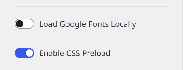
Local fonts are the setting here I’d actually change on most sites, and I’ve written loading Google Fonts locally in Kadence free as a proper walkthrough. If your site feels slow and you’re not sure why the theme is or isn’t to blame, why your WordPress site is slow is the wider diagnosis.
Enable Lightbox is off, which surprises people who expect clicking an image to open it large. Turning it on is one switch, no plugin needed. And Disable Default Sitemap exists because WordPress ships its own sitemap, so if you run an SEO plugin you now have two of them and this is how you retire the spare.
The back to top button
Fourteen settings for one small button, and the first one is the only one that matters: Enable Scroll To Top ships off.
And you won’t see the other thirteen either. Twelve of them are hidden until the master switch is on, so a fresh install shows this section as two controls: the switch, and Icon Size. The table below is what the section becomes once you turn it on, not what you’ll find there today.
| Setting | What it does | Default |
|---|---|---|
| Enable Scroll To Top | Master switch | Off |
| Scroll Up Icon | Which arrow to use | Arrow up |
| Icon Size | Size of the arrow | 1.2em |
| Align | Which side of the screen | Right |
| Side Offset | Gap from the side edge | 30px |
| Bottom Offset | Gap from the bottom edge | 30px |
| Visibility | Which devices show it | Desktop and tablet on, mobile off |
| Scroll Button Style | Filled or outline | Outline |
| Colors | Arrow colour and hover | Not set |
| Background Colors | Button background and hover | Not set |
| Border Colors | Border colour and hover | Not set |
| Border | Border width and style | Not set |
| Border Radius | Rounded corners | 0px all round |
| Scroll Button Padding | Space inside the button | 0.4em all round |
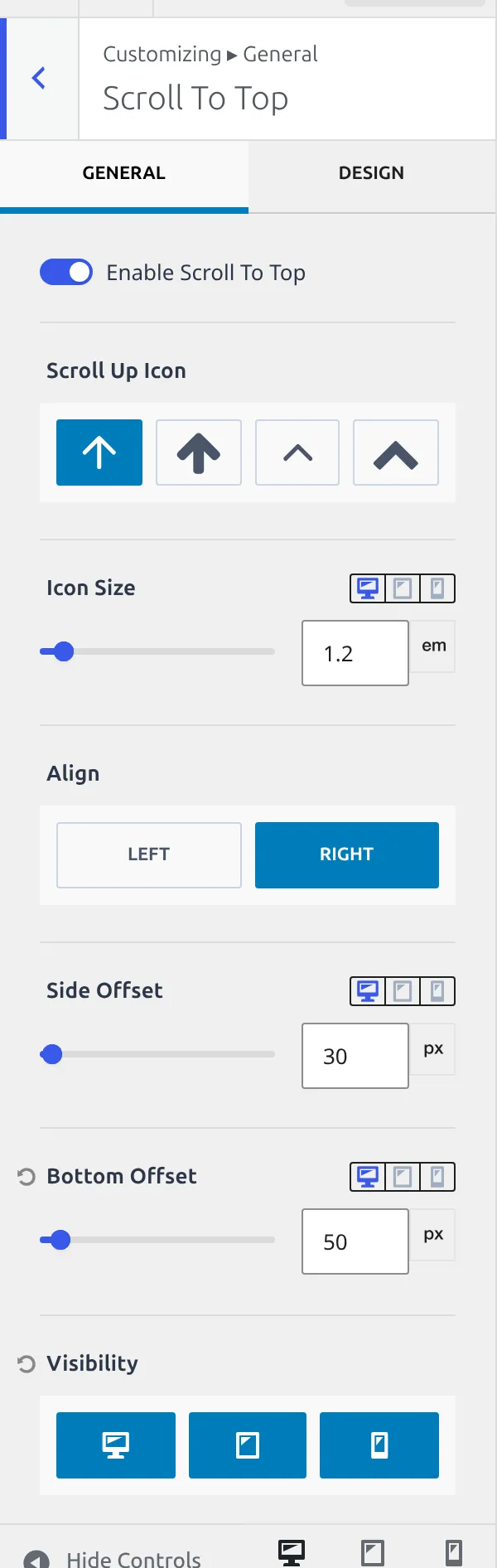
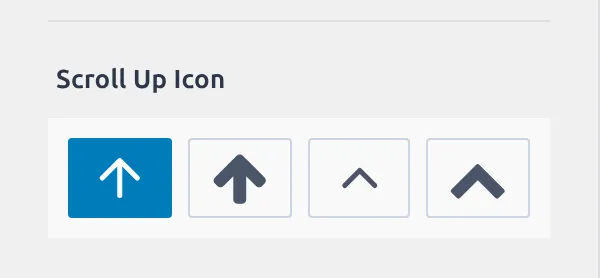
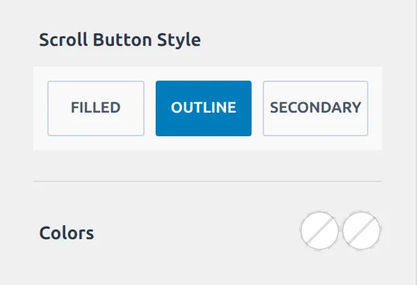
The Visibility default is the one to know. Mobile is switched off, so you can enable the button, check your phone, see nothing, and reasonably conclude it’s broken. It isn’t. Kadence assumes a phone’s own scroll gestures are enough and hides the button there.
Square corners and an outline style are the other two decisions the theme makes for you. A 0px radius on an outlined button gives you a hard square box, which suits some designs and looks wrong in others. The full setup is in adding a back to top button in Kadence.
Social Links is one setting and 59 URL boxes
Here’s the honest version of the largest section in this part.
Social Links registers 60 settings. 59 of them are identical: a plain text box, one per network, waiting for a URL. There is nothing to explain about any of them individually, no defaults, no behaviour, no options. Paste a link in and that icon becomes available to the social components in your header and footer.
| Setting | What it does | Default |
|---|---|---|
| Open Social Links in New Tab | Opens every social link in a new tab | On |
| 59 network URL boxes | One text field per network, listed below | Not set |
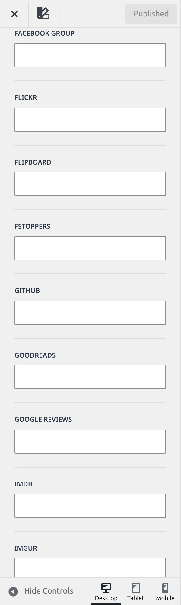
The 59 in Kadence 1.4.5, in the order the Customizer lists them: Facebook, X formerly Twitter, YouTube, Instagram, Pinterest, 500PX, Amazon, Anchor, Apple Podcast, Bandcamp, Behance, Bluesky, Bookbub, Discord, Dribbble, Email, Facebook Group, Flickr, Flipboard, Fstoppers, GitHub, Goodreads, Google Reviews, IMDB, Imgur, Line, Linkedin, Mastodon, Medium, MeWe, Parler, Patreon, Phone, Quora, Ravelry, Reddit, RSS, Rumble, Snapchat, SoundCloud, Spotify, Steam, Strava, Telegram, Threads, Tiktok, Trip Advisor, Tumblr, Twitch, Vero, Vimeo, VK, WhatsApp, WordPress, Xing, Yelp, Custom 1, Custom 2, Custom 3.
Three of those are Custom slots, so you can point an icon at anything Kadence doesn’t already list. Email and Phone aren’t social networks at all, they’re the two contact links people most often want beside their icons.
Filling a box in here does not put an icon on your site. The URLs live in General, the icons live in the header and footer builders, and you have to place a Social component in a row before anything appears. That split is the single most common reason people think this section is broken.
Breadcrumbs, comments and images
Five settings between them, so here they are together.
| Setting | Section | What it does | Default |
|---|---|---|---|
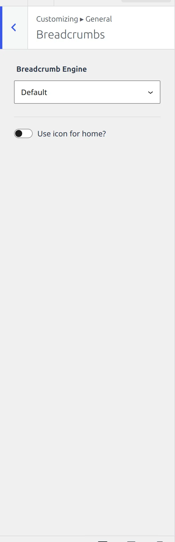
| Breadcrumb Engine | Breadcrumbs | Which system generates the trail | Not set |
| Use icon for home? | Breadcrumbs | Shows a house icon instead of the word Home | Off |
| Move Comments input above comment list | Comments | Puts the reply box first | Off |
| Remove Comments Website field | Comments | Drops the URL box from the comment form | Off |
| Border Radius | Images | Rounded corners on images site-wide | Not set |
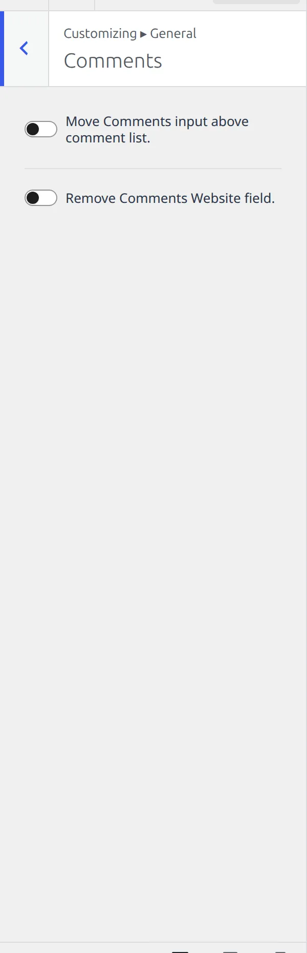
Remove Comments Website field is a small setting with a real effect. That URL box is the main thing comment spammers are after, and dropping it costs your genuine commenters nothing.
The breadcrumbs question people actually have is how to turn them off on one page rather than everywhere, and that’s a per-page control rather than a Customizer one. I covered it in disabling breadcrumbs on specific pages.
Images gets exactly one setting: a border radius applied across the site. One number, three device values, and that’s the whole section.
Which Kadence general settings are worth changing first?
Three of the 108, and you can ignore the rest until something bothers you.
Content Max Width at 1290px, because it decides how wide your entire site reads and every other layout decision sits inside it. Load Google Fonts Locally, because it’s off, it’s one switch, and it removes a request to a third-party server on every page load. And Visibility under Scroll To Top, because mobile ships off and that’s the reason your new back-to-top button seems not to work.
Everything else in this panel either already carries a sensible value or sits empty waiting for a decision you may never need to make.
That’s all 617 Kadence settings, across seven parts. If you came here hunting one switch and found it, the rest of the series is the map for the next time.
Everything here was read from Kadence 1.4.5’s own settings registry. I’ll re-check it at each release.
The whole series
- How the Kadence Customizer works – the map, the two access models, the control widgets
- Header structure – rows, sticky, transparent, off canvas, trigger
- Header components – navigation, search, button, social, HTML, logo
- Footer – rows, navigation, social, copyright, the six widget areas
- Posts, pages and archives – single posts, pages, archives, search, 404
- Colors and fonts – palette, typography, three button styles
- General – layout, sidebar, performance, scroll to top, social links (you are here)