Kadence Colors and Fonts Settings: Palette, Type and Buttons
This is part 6 of seven. It covers the 45 Kadence colors and fonts settings – the global colour palette, the type scale, and the three button styles the theme ships with.
It’s the smallest part of this reference and the one I’d read first. Almost every colour setting elsewhere in Kadence points back at the palette defined here.
Every default below was read out of Kadence 1.4.5 itself, not copied from the documentation. The official docs list these settings but never say what any of them starts as, which is the whole reason I’m writing this down.
Where do the Kadence colors and fonts settings live?
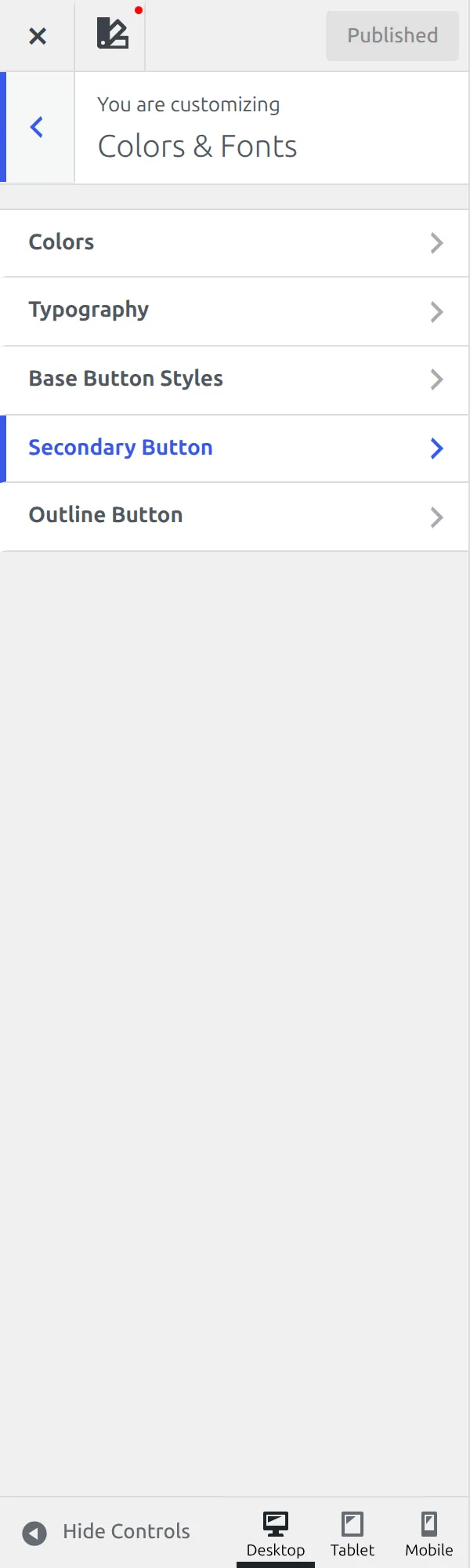
Open the Customizer and Colors & Fonts is the first functional panel in the list, sitting above Header, Footer and General. That catches people out, because design settings usually come last.
Unlike Header and Footer, this panel behaves the way you’d expect: it opens a plain list of 5 named sections and you click one. No builder, no dock, no gear icons – I covered why those exist in part 1 and part 2. The sections are Colors (6 settings), Typography (13), Base Button Styles (9), Secondary Button (9) and Outline Button (8).
One naming trap first. There are two sections called Colors – WordPress’s own at the top level of the Customizer, and Kadence’s inside this panel. The Kadence one is the one that matters here.
How does the Kadence colour palette work?
This confuses beginners more than anything else in the theme, so I’ll go slowly.
Kadence doesn’t ask you to pick a colour in each of its 85 colour controls. It asks you to pick a slot. The theme defines 15 named slots, gives each one a hex value, and then every colour setting across the theme points at a slot instead of at a colour.
That’s why you’ll see values like “Palette 5” and “palette-highlight” in the other parts of this reference. Those aren’t colours. They’re references to slots.
Change the hex value in slot 1 and everything pointing at slot 1 changes with it – buttons, links, hover states, all of it, across the whole site, in one edit.
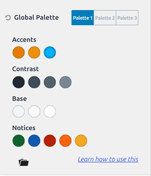
| Slot | Kadence’s own label | Default |
|---|---|---|
| Palette 1 | 1 – Accent | #2B6CB0 (blue) |
| Palette 2 | 2 – Accent – alt | #215387 (darker blue) |
| Palette 3 | 3 – Strongest text | #1A202C (near black) |
| Palette 4 | 4 – Strong Text | #2D3748 |
| Palette 5 | 5 – Medium text | #4A5568 |
| Palette 6 | 6 – Subtle Text | #718096 |
| Palette 7 | 7 – Subtle Background | #EDF2F7 |
| Palette 8 | 8 – Lighter Background | #F7FAFC |
| Palette 9 | 9 – White or offwhite | #FFFFFF |
| Palette 10 | 10 – Accent – Complement | #FFFFFF as stored, but see below |
| Palette 11 | 11 – Notices – Success | #13612E (green) |
| Palette 12 | 12 – Notices – Info | #1159AF (blue) |
| Palette 13 | 13 – Notices – Alert | #B82105 (red) |
| Palette 14 | 14 – Notices – Warning | #F7630C (orange) |
| Palette 15 | 15 – Notices – Rating | #F5A524 (amber) |
On screen those 15 are grouped into 4 blocks, using the theme’s own words: Accents (slots 1, 2 and 10), Contrast (3 to 6), Base (7 to 9) and Notices (11 to 15).
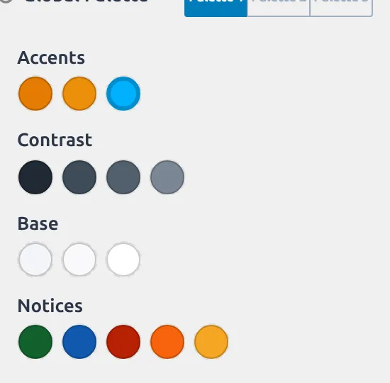
The defaults are ordered on purpose: slots 3 to 6 run dark to light for text, slots 7 to 9 run light to white for backgrounds. Keep that ordering when you swap in your own colours and the theme keeps its contrast. Put a pale yellow in slot 3 and every major heading on the site goes pale yellow at once.
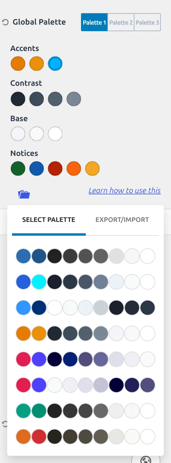
There’s one more layer. Kadence stores three complete palettes, with one active at a time, and on a fresh install all three hold identical colours. They’re there so you can build an alternative scheme and switch to it, not so you can run three at once.
Careful with Reset Values
The palette control has a Reset Values button, and it does not put back the colours Kadence ships with.
I compared the theme’s PHP defaults against the reset data inside the Customizer’s own JavaScript file. Slots 3 to 15 come back correctly. Slot 1 is reset to #3182CE, a blue that isn’t the shipped colour for any slot, and slot 2 is reset to #2B6CB0 – which is actually slot 1’s shipped colour. The real slot 2, the darker #215387 in the table above, doesn’t appear anywhere in that file, so Reset cannot restore it.
It’s a small thing and nobody dies, but it means the button doesn’t do what its name promises. If you want the shipped palette back, the table above has the values.
A note on slot 10
Slot 10 stores #FFFFFF, the same as slot 9. It doesn’t render as white.
Whenever the stored value is exactly white, Kadence substitutes a colour it calculates from slot 1 instead. So the option holds white while the page shows a complement of your accent colour, which is why the slot is named Accent – Complement rather than something about white. Change it to any other colour and the substitution stops.
Colors: 6 settings
| Setting | What it does | Default |
|---|---|---|
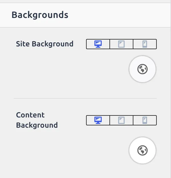
| Site Background | Colour or image behind the whole page | Palette 8 (#F7FAFC) |
| Content Background | Colour behind your post and page content | Palette 9 (white) |
| Title Above Content Background | Background for the title band above content | Not set |
| Title Above Content Overlay Color | A colour laid over that background | Not set |
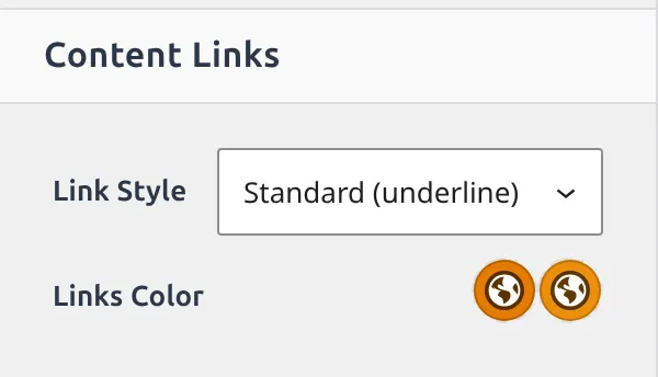
| Links Color | Link colours plus the link style | Initial Palette 1, hover Palette 2, style Standard (underline) |
| Global Palette | The 15 slots above | The 15 colours above |
Site Background is Palette 8, a very pale grey, and Content Background is Palette 9, plain white. That small difference is what makes your content area read as a card sitting on the page rather than filling it.
Links Color isn’t one colour picker either. It holds 3 colours – Initial, Hover and Text Alt – plus a Link Style dropdown with 5 choices: Standard (underline), Highlight Underline, No Underline, Background on Hover, and Offset Background. Text Alt only shows up once you pick one of the 2 background styles.
Typography: 13 settings
The most important thing here is a non-thing: Kadence ships no webfont at all. Base Font is set to the visitor’s own system font stack, so a fresh install loads zero Google Fonts.

| Setting | What it does | Default |
|---|---|---|
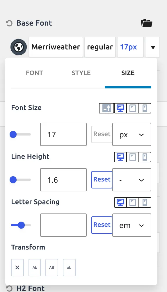
| Base Font | Body text family, size, line height, weight and colour | 17px, line height 1.6, weight 400, system font, Palette 4 |
| Load Italics Font Styles | Also downloads the italic cut of a Google font | Off |
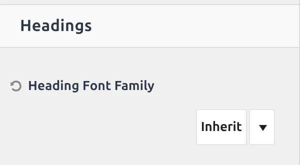
| Heading Font Family | One family for H1 through H6 | Inherit (uses Base Font) |
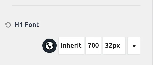
| H1 Font | Size, line height, weight, colour for H1 | 32px, line height 1.5, weight 700, Palette 3 |
| H2 Font | Same, for H2 | 28px, 1.5, 700, Palette 3 |
| H3 Font | Same, for H3 | 24px, 1.5, 700, Palette 3 |
| H4 Font | Same, for H4 | 22px, 1.5, 700, Palette 4 |
| H5 Font | Same, for H5 | 20px, 1.5, 700, Palette 4 |
| H6 Font | Same, for H6 | 18px, 1.5, 700, Palette 5 |
| H1 Title | Font for the page title in the title band above content | Not set |
| Breadcrumbs | Font for breadcrumbs in that same band | Not set |
| Enable Font Smoothing | Thins text rendering on Mac screens | Off |
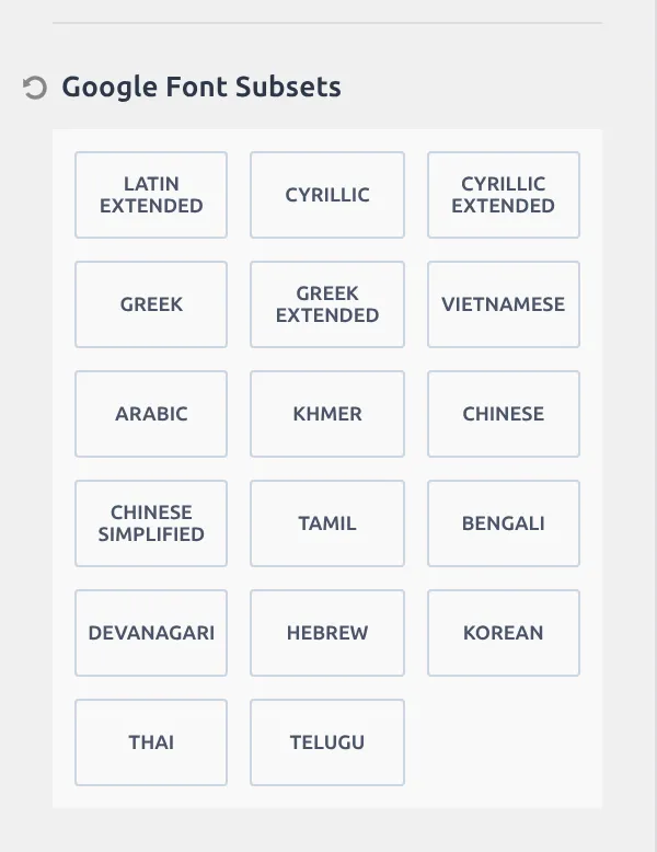
| Google Font Subsets | 17 extra character sets | All 17 off |
The font family has two levels of inheritance, and that’s what trips people up. Each heading’s family is set to inherit, so it takes whatever Heading Font Family says, and Heading Font Family is itself set to inherit, so it takes Base Font. One change to Heading Font Family moves all 6 headings; a change inside H2 Font overrides that one heading only.
The sizes form a real scale: 32, 28, 24, 22, 20, 18. The colours step down too – Palette 3 for H1 to H3, Palette 4 for H4 and H5, Palette 5 for H6 – so the hierarchy is built from contrast as well as size. That’s why an H6 looks quieter than an H5 at almost the same size.
Google Font Subsets lists 17 extra character sets and every one starts unchecked. Tick one only if your language needs it – Cyrillic, Greek, Vietnamese and the rest – because each box makes the downloaded font file bigger. If you’re loading Google Fonts at all, read how to load them locally and the GDPR side of it first.
The three button styles
Kadence styles buttons in 3 flavours, each with its own section: Base is the solid primary button, Secondary is the quieter one, Outline is the bordered transparent one.
Base and Secondary carry 9 settings each. Outline carries 8 – the same list minus Background Colors, because an outline button has no background to set.
| Setting | What it does |
|---|---|
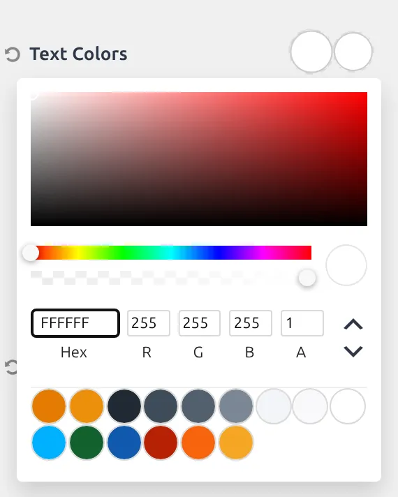
| Text Colors | Label colour, plus a separate hover colour |
| Background Colors | Fill colour and hover fill (not on Outline) |
| Border Colors | Border colour and hover colour |
| Border | Border width and style |
| Border Radius | How rounded the corners are |
| Font | Family, size, line height and weight for the label |
| Padding | Space inside the button, four sides |
| Button Shadow | Resting drop shadow |
| Button Hover State Shadow | Drop shadow while hovered |
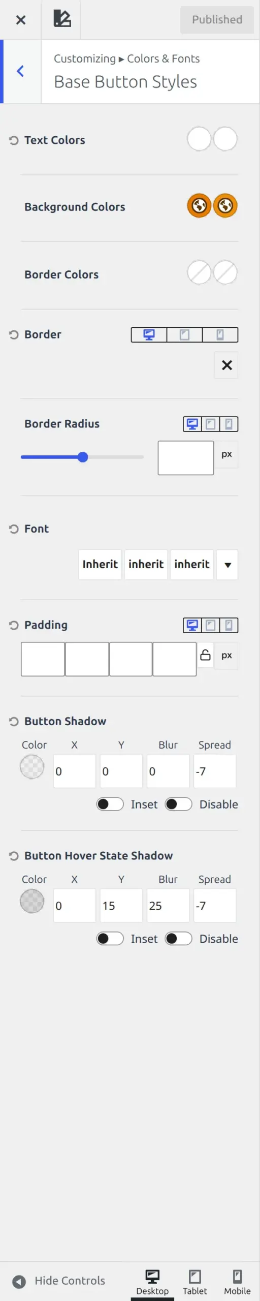
| Setting | Base Button | Secondary Button | Outline Button |
|---|---|---|---|
| Text Colors | Palette 9, hover Palette 9 | Palette 3, hover Palette 9 | Not set |
| Background Colors | Palette 1, hover Palette 2 | Palette 7, hover Palette 2 | Not offered |
| Border Colors | Not set | Not set | Not set |
| Border | Not set | Not set | Not set |
| Border Radius | Not set | Not set | Not set |
| Font | Inherit | Inherit | Inherit |
| Padding | Not set | Not set | Not set |
| Button Shadow | On, but fully transparent | Off | Off |
| Button Hover State Shadow | On – a soft drop shadow | Off | Off |
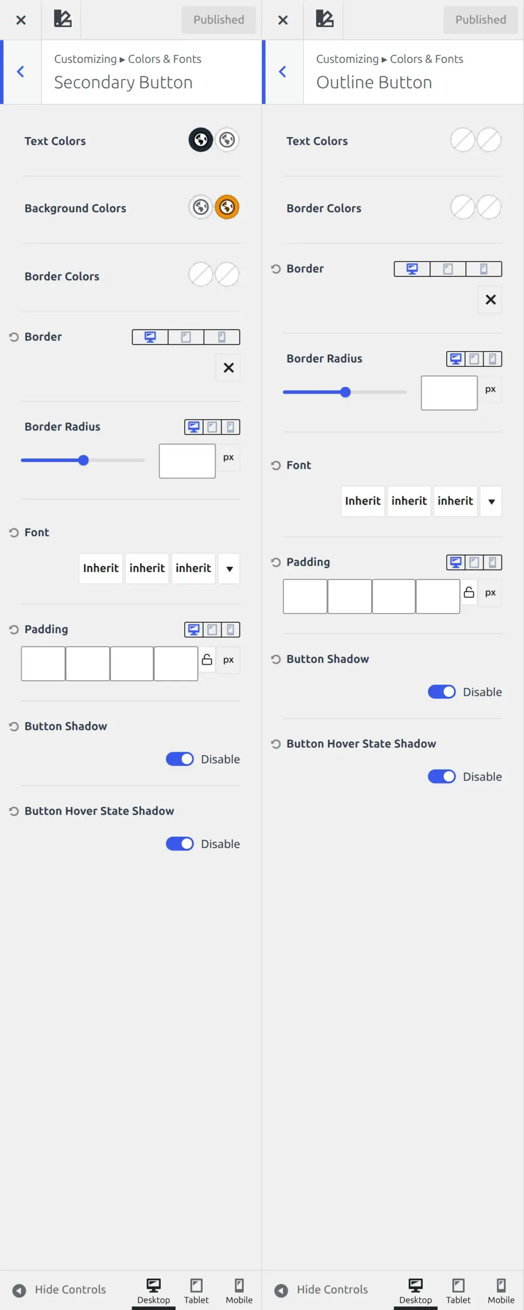
The Outline Button section is completely empty on a fresh install, all 8 settings unset, so it inherits everything and looks like plain text until you give it a border colour.
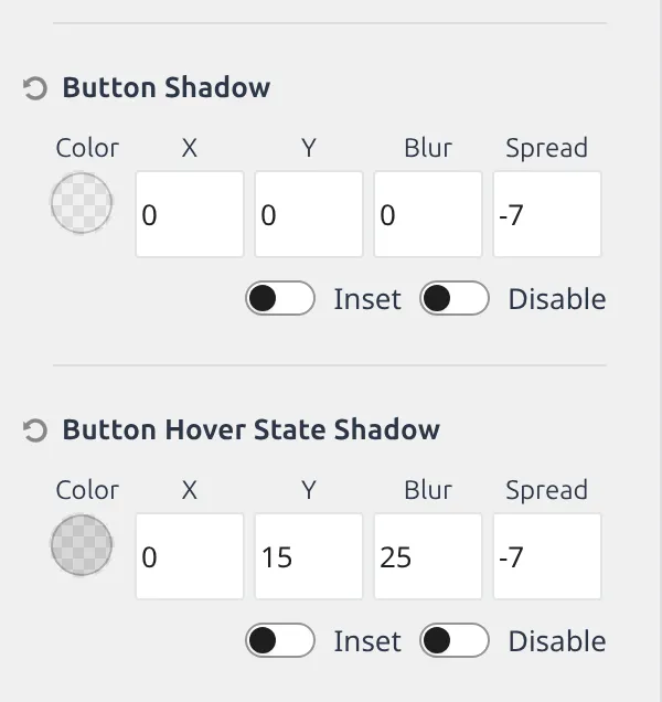
The base button is the only one of the 3 with a shadow switched on. Its resting shadow is enabled but fully transparent, so you never see it, while its hover shadow is a real soft drop of 25px blur pulled in by 7px. That’s why the primary button lifts on hover and the other two sit flat.
How many of these 45 settings actually do anything?
Sixteen.
I walked all 45 defaults, counting anything that starts empty, off, or set to inherit as doing nothing. 29 of the 45 are inert on a fresh install – about 64%, close to the 61.9% I measured across the whole theme.
That ratio is the useful part. If your colours or fonts look wrong out of the box it’s one of those 16, and all 16 sit in 3 places: the 7 real font settings, the 4 in Colors, and the text and background colours of the 2 solid buttons.
Which Kadence colors and fonts settings are worth changing first?
Three of them.
The Global Palette, because it’s the only setting in the theme that changes hundreds of things at once. Fill slots 1 to 9 with your own colours and most of your site is done before you touch anything else.
Base Font, because 17px on a 1.6 line height is sensible, but it’s the one number your readers feel on every page.
And the Link Style dropdown inside Links Color, because underlined links are the theme’s choice rather than a rule, and the 2 background styles look completely different for a 2-second change.
The other 42 can wait. If you’re still weighing Kadence against the alternatives, I wrote about choosing your first WordPress theme separately.
Next
Part 7 covers General – Layout, the sidebar, Scroll To Top, the performance switches, and the Social Links section that shows 60 controls but is really one field repeated for 59 networks.
Everything here was read from Kadence 1.4.5’s own settings registry. I’ll re-check it at each release.
The whole series
- How the Kadence Customizer works – the map, the two access models, the control widgets
- Header structure – rows, sticky, transparent, off canvas, trigger
- Header components – navigation, search, button, social, HTML, logo
- Footer – rows, navigation, social, copyright, the six widget areas
- Posts, pages and archives – single posts, pages, archives, search, 404
- Colors and fonts – palette, typography, three button styles (you are here)
- General – layout, sidebar, performance, scroll to top, social links