How to Change Blog Post Container Width in Kadence
If your blog posts feel either cramped or stretched across the screen like a newspaper headline, the fix is a single slider in Kadence’s Customizer. Kadence gives you separate controls for the overall container, the content area, and even per-post overrides – all in the free version.
But here’s the mistake I see constantly: people crank their content width up to 1400px because “bigger is better.” Then their text stretches across the entire screen and nobody wants to read it. There’s a typography rule that explains exactly why – and I’ll cover it below so you can pick a width that actually looks good.
How Do I Change the Global Content Width?
The main width control lives in the Customizer under Layout settings.
- Go to Appearance > Customize > General > Layout.
- Find “Content Max Width” – this controls the maximum width of your outer container (content area plus sidebar).
- The default is 1290px. Drag the slider or type an exact pixel value.
This sets the maximum width for your entire site. Everything – your header content, your blog posts, your pages – sits within this boundary. On screens smaller than this value, the layout automatically shrinks to fit.
Two controls below it, you’ll find “Narrow Layout Content Max Width”, set to 842px out of the box. That’s the second number worth knowing, and I’ll come back to it – it’s what the Narrow layout actually uses.
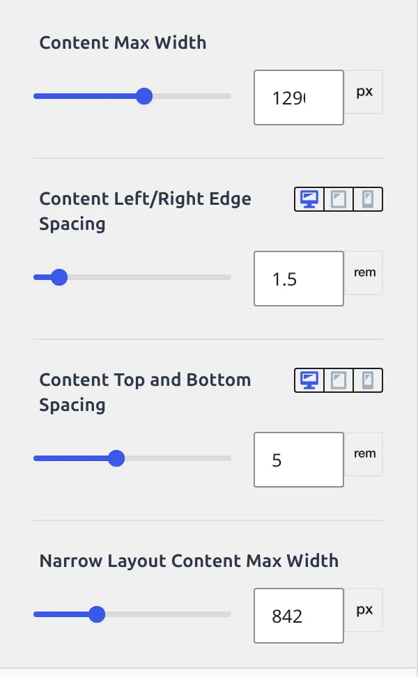
A few things to note about this setting:
- It controls the outer container (
.site-container), not the text area itself. - If you have a sidebar enabled, the sidebar and content share this space. More on that trap in a moment.
- Changing this affects every page on your site unless you override it per-post.
What Width Should I Actually Use?
This is where most tutorials just say “use the default” and move on. But the width you pick directly affects whether people actually read your content or bounce.
There’s a typography principle called the Rule of 75: the ideal line length for reading is 65-75 characters per line. Shorter than 65 and the reader’s eyes are bouncing back and forth too quickly. Longer than 75 and they start losing their place when jumping to the next line.
I tested this on my own site. At 1400px with no sidebar, body text at 16px font size produced lines of about 120 characters. That’s nearly double the recommended length. My eyes were exhausted after 2 paragraphs.
At 1100px with no sidebar, it dropped to about 80 characters – much closer to comfortable.
Here’s a quick reference based on common setups:
| Layout | Container Width | Approximate Text Line Length | Verdict |
|---|---|---|---|
| No sidebar, default font | 1400px | ~120 characters | Way too wide |
| No sidebar, default font | 1200px | ~90 characters | Still wide |
| No sidebar, Narrow layout | any (Narrow overrides it) | ~65-75 characters | Ideal |
| With sidebar | 1290px | ~70-80 characters | Good |
The takeaway: if you run a blog without a sidebar, don’t just widen the container. Set Default Post Layout to “Narrow” instead. The container stays where it is and Kadence constrains the text to its own narrow width, so the two numbers stop fighting each other.
What’s the “Sidebar Squish” Trap?
This catches most beginners. Here’s the scenario:
- You set your container width to 1200px.
- You enable a sidebar.
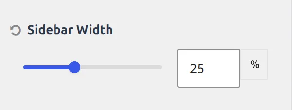
- The sidebar takes roughly 30% of the container (the exact percentage depends on Sidebar Width under General > Sidebar).
- Your text area is now squeezed into about 840px.
- You think “this is too narrow” and bump the container to 1500px.
- Now your site looks oddly stretched on large monitors, with a massive sidebar and awkward whitespace.
The fix isn’t making the container wider. It’s choosing the right combination of container width and sidebar width.
For a blog with a sidebar, I recommend keeping the container at 1290px (Kadence’s default) and adjusting the sidebar width percentage if needed. The default split gives your text area about 70% of 1290px, which lands around 900px – a comfortable reading width for content sitting next to a sidebar.
If you want to adjust the sidebar’s share, the control is not in the Layout section where you’d expect it. Go to Appearance > Customize > General > Sidebar – its own section, one below Layout – and look for Sidebar Width. It’s blank by default, which means Kadence uses its built-in split rather than a number you chose. I cover sidebar positioning and width in more detail in my guide on changing sidebar position and width in Kadence.
How Do I Set Width for Blog Posts Specifically?
Kadence separates width controls for different post types. So you can have wide pages (for landing pages or portfolios) and a comfortable reading width for blog posts.
- Go to Appearance > Customize > Posts/Pages Layout > Single Post Layout.
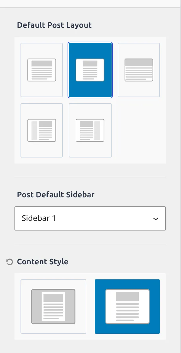
- Look for “Default Post Layout”. It’s a block of 5 little icons, not a dropdown, and hovering one names it.
Those 5 icons are your width choices:
- Normal – content plus sidebar, at the global container width.
- Narrow – no sidebar, and the content is squeezed to the Narrow Layout Content Max Width you saw earlier (842px by default). Kadence does this by putting a
content-width-narrowclass on the page. - Fullwidth – no sidebar, content fills the whole container.
- Left Sidebar / Right Sidebar – content plus a sidebar, on the side you pick.
Here’s the thing that trips people up: two controls further down sits Content Style, and it looks like it belongs to the same decision. It does not. Content Style only picks Boxed or Unboxed – whether your post sits on a white card with a shadow, or straight on the page background. Width is Default Post Layout. Card-or-no-card is Content Style. Two different controls, with the Post Default Sidebar dropdown sitting between them.
For blog posts, I almost always reach for Narrow. It’s the fastest way toward a comfortable line length without fiddling with pixel values, and if 842px still feels wide you change it once in General > Layout and every Narrow page follows. It only affects your blog posts – your other pages stay at whatever you’ve set under Page Layout.
Fullwidth is useful for posts with lots of images, galleries, or embedded content where you want maximum horizontal space. But for text-heavy articles, it makes reading harder unless your container width is already on the narrow side. Check your block padding on mobile too – width settings that look great on desktop can break on smaller screens.
How Do I Override Width on a Single Post?
Sometimes you want one specific post to break the rules. Maybe it’s a photo essay that needs full width, or a long-form piece that reads better narrow.
- Open the post in the block editor.
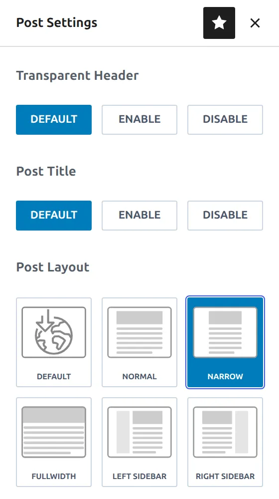
- Click the Kadence Post Settings icon – the pencil near the top-right of the editor. On a page it’s labelled Page Settings instead, same panel.
- Find “Post Layout”. On a page the same group is called Page Layout – Kadence renames it to match what you’re editing.
- It’s the same icons as the Customizer, plus a Default at the front, and here each one is captioned. Choose Narrow, Normal, Fullwidth, Left Sidebar, or Right Sidebar. Leaving it on Default means “whatever the Customizer says.”
This overrides whatever you set globally in the Customizer. Only this one post is affected.
I use per-post overrides for about 10% of my posts. My global setting is Narrow for all blog posts, but occasionally I’ll switch a specific tutorial to Fullwidth when it has wide comparison tables or side-by-side screenshots that need breathing room.
What’s the Difference Between Container Width and Content Width?
This confuses people, so here’s the simple version. Think of it as a box inside a box.
Container width is the outer box. It’s the maximum width of everything on the page – your content, your sidebar, your margins. This is what the “Content Max Width” slider in General > Layout controls. Kadence applies this to the .site-container class.
Content width is the inner box. It’s the actual area where your text, images, and blocks live. If you have a sidebar, the content width is whatever’s left after the sidebar takes its share. If you’re using the Narrow layout, Kadence overrides this with a tighter constraint regardless of the container size.
Here’s how they relate:
| Setting | What It Controls | Where to Find It |
|---|---|---|
| Content Max Width | Outer container (content + sidebar) | Customize > General > Layout |
| Sidebar Width | Sidebar’s share of the container | Customize > General > Sidebar |
| Default Post Layout | Whether the post uses the narrow width, and whether it gets a sidebar | Customize > Posts/Pages Layout > Single Post Layout, or per-post |
The most common confusion: changing “Content Max Width” to a smaller number and wondering why the sidebar looks squished. That’s because you shrank the outer box that both elements share. If you only want to narrow the text, set Default Post Layout to Narrow instead.
My Recommended Settings
After testing dozens of configurations on my own sites, here’s what I’d suggest based on what you’re building:
| Site Type | Container Width | Post Layout | Sidebar | Why |
|---|---|---|---|---|
| Blog with sidebar | 1290px | Normal | Right | Default split gives ~900px text area |
| Blog without sidebar | 1200px | Narrow | None | Narrow drops the content to 842px, adjustable in General > Layout |
| Portfolio or agency | 1400px | Fullwidth | None | Visual work needs horizontal space |
| WooCommerce store | 1290px | Normal | Right or None | Product grids need room for 3-4 columns |
| Long-form articles | 1200px | Narrow | None | Minimal distractions, optimal line length |
And here’s the biggest thing I’ve learned: start with Narrow and only go wider if you have a reason. Most blog posts are primarily text. And text reads best at 65-75 characters per line. The Narrow layout in Kadence was designed specifically for this.
Quick Troubleshooting
| Problem | Cause | Fix |
|---|---|---|
| Text stretches across entire screen | Container too wide with no sidebar or Narrow style | Set Default Post Layout to Narrow in Single Post Layout |
| Sidebar looks squished | Container width too small for content + sidebar | Increase Content Max Width to 1290px or reduce sidebar percentage |
| Width change doesn’t appear | Browser cache or caching plugin | Clear cache and hard-refresh (Ctrl+Shift+R) |
| Per-post override not working | Kadence Post Settings panel collapsed | Click the pencil icon in the top-right of the editor |
| Narrow layout cuts off wide images | Images wider than narrow container get cropped | Use Fullwidth for image-heavy posts, or use the Wide Width alignment on specific image blocks |
Frequently Asked Questions
What is the default Kadence content width?
Kadence ships with a default Content Max Width of 1290px. This applies to the outer container that holds both your content area and sidebar. I’ve found this default works well for most blog layouts, especially with a sidebar enabled.
Does changing the Kadence content width affect mobile?
No. Kadence’s width settings only apply when the screen is wider than the value you set. On phones and tablets, the layout automatically shrinks to fit the screen. So a 1290px container still looks fine on a 375px phone – it just fills the full width.
Can I set different widths for pages and posts?
Yes. Kadence separates layout settings by post type. Go to Customize > Posts/Pages Layout and you’ll find separate sections for Single Post Layout and Page Layout. I use Narrow for blog posts and Normal for pages, so my landing pages get more horizontal space.
What’s the best Kadence content width for a blog without a sidebar?
I’d recommend 1200px container width with the Narrow content style. This keeps your text area around 700px – right in the 65-75 character sweet spot for comfortable reading. Without Narrow, 1200px produces lines that are still too long for body text.
Does Kadence Pro give more width options?
Not for basic container width. The free version has the same Content Max Width slider, the same Default Post Layout icon row, and the same per-post overrides. Kadence Pro adds Hooked Elements for more advanced layout control, but the width settings themselves are identical.
Wrapping Up
Changing your Kadence content width takes about 30 seconds – it’s just a slider. But picking the right width is what separates a site that’s pleasant to read from one that exhausts your visitors after 2 paragraphs.
The short version: keep your container at 1290px (or close to it), use the Narrow content style for blog posts, and only go wider when your content actually demands it. Your readers’ eyes will thank you.