Kadence Post and Page Layout Settings: All 126 Defaults
This is part 5 of seven. It covers the 126 Kadence post and page layout settings that decide what a single post looks like, what a page looks like, what your blog archive looks like, what your search results look like, and what happens on a 404.
Five sections, and they don’t all live where you’d expect:
| Section | Settings |
|---|---|
| Single Post Layout | 47 |
| Archive Layout | 26 |
| Page Layout | 25 |
| Search Results | 22 |
| 404 Page Layout | 6 |
Every default below was read out of Kadence 1.4.5’s own settings registry, not copied from the documentation. The official docs list these same settings and never say what any of them starts as, which is the entire reason this article exists.
One warning about the screenshots. They come from a site I use, so the values on screen are mine. The Default column is always the fresh-install value.
Where do these settings actually live?
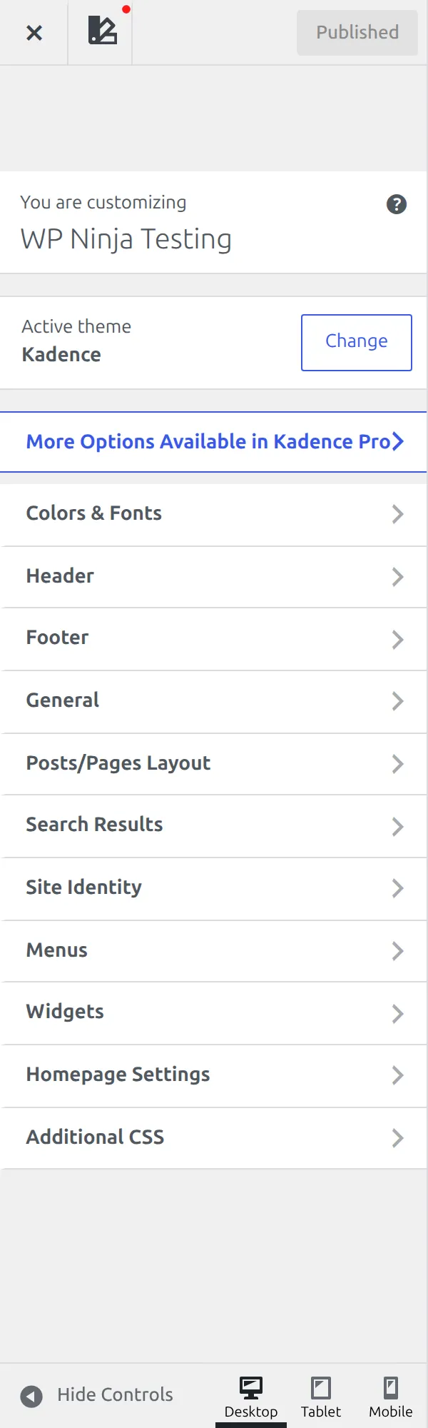
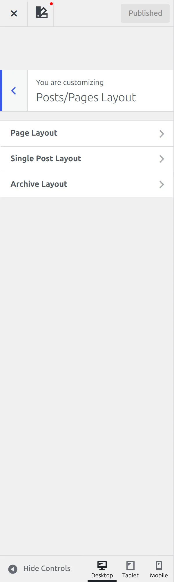
Three of the five sections sit inside Customize > Posts/Pages Layout: Page Layout, Single Post Layout and Archive Layout. That panel opens a plain list of three section names, so it behaves nothing like the Header panel, which opens a drag-and-drop builder instead. I explained that split in part 1 and worked through the builder in part 2.
The other two are the traps.
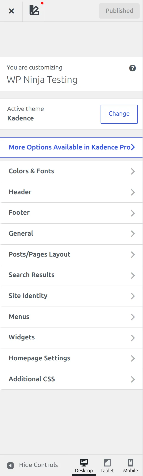
Search Results is a top-level section. It isn’t inside Posts/Pages Layout, and it isn’t inside General. It sits in the main Customizer list on its own, even though it controls an archive in every meaningful way and shares almost the same 22 settings as Archive Layout.
404 Page Layout lives under Customize > General. I’ve grouped it here because it’s a page template and this is the article about page templates, but you won’t find it in the Posts/Pages Layout panel no matter how long you look.
How many of these 126 settings actually do anything?
Fifty.
I walked every default in this part of the theme, counting anything that starts empty, switched off, or set to “normal” as doing nothing yet. 76 of the 126 are inert on a fresh install – about 60%, which matches the theme as a whole almost exactly. Kadence gives you a real value for 50 settings here and leaves the other 76 sitting as switches.
That ratio isn’t spread evenly. The General tabs carry nearly all the opinions, and the Design tabs are close to empty by design: of the 43 Design-tab settings across these five sections, exactly one ships a value, and it’s an off switch. Colour and font settings here exist to override the palette you set in Colors & Fonts, not to set it.
So if your blog archive looks wrong out of the box, it’s very unlikely to be a Design setting. It’ll be one of the 50 real values, and most of those are on the General tab.
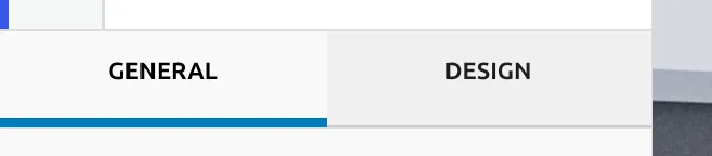
That’s the practical shortcut for this whole part. Read the General tab first, change what’s wrong there, and only open Design once you want something the palette isn’t giving you. Four of the five sections carry that tab pair, and it’s easy to lose an evening in the empty half.
What can you change on a single post?
More than anywhere else in this part. Single Post Layout carries 47 settings split across 30 on the General tab and 17 on Design, and it’s where the theme makes the most decisions for you.
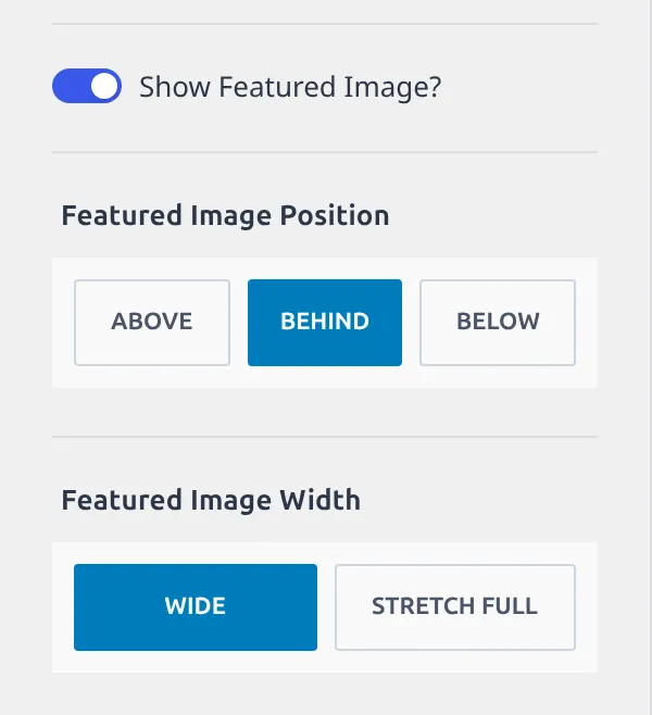
Two defaults here surprise people. Default Post Layout is Narrow, not Normal, so a fresh Kadence post is deliberately more like a reading column than a full-width page. And Featured Image Position is Behind, which is why your featured image shows up as a background band behind the post title rather than as a picture above the text.
| Setting | What it does | Default |
|---|---|---|
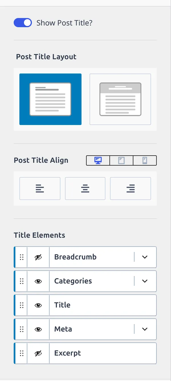
| Show Post Title? | The whole post title block, on or off | On |
| Post Title Layout | Title in the normal content flow, or in its own band | Normal |
| Container Width | Standard site width or full width for that block | Standard |
| Post Title Align | Left, centre or right, set per device | Not set |
| Container Min Height | Smallest height of the title block | 200px on desktop, not set on tablet or mobile |
| Title Elements | Which parts appear above the post and in what order, each with its own switch | Order: breadcrumb, categories, title, meta, excerpt |
| Default Post Layout | Container shape for every single post | Narrow |
| Post Default Sidebar | Which sidebar a sidebar layout pulls in | Primary Sidebar |
| Content Style | Boxed content card or unboxed | Boxed |
| Content Vertical Spacing | Space above and below the content | Show |
| Show Featured Image? | The post’s featured image | On |
| Featured Image Position | Where it sits relative to the title | Behind |
| Featured Image Width | How wide the image runs | Wide |
| Show Featured Image Caption? | Prints the caption under the image | Off |
| Featured Image Ratio | Crop ratio applied to the image | 2:3 |
| Show Post Tags? | Tag list at the end of the post | On |
| Show Footer Area in Boxed Mode? | Pulls tags, author box and navigation inside the content box | Off |
| Show Post Author Box? | Author bio block under the post | Off |
| Author Box Style | Plain or boxed styling for it | Normal |
| Use Author Archive Link? | Links the author name to their archive | On |
| Show Post Navigation? | Previous and next post links | On |
| Show Related Posts? | The related posts carousel | On |
| Show Related Posts Pagination Dots? | Dots underneath the carousel | On |
| Related Posts Columns | How many show at once | Not set |
| Related Posts Title | Heading above the carousel | Not set |
| Related Posts Order By | What decides which posts get picked | Not set |
| Related Posts Order | Ascending or descending | Not set |
| Endlessly Loop Related Carousel? | Carousel wraps back to the start | On |
| Show Comments? | Comments on single posts | On |
| Show Comment Date? | The date on each comment | On |
The related posts block is worth a second look. It’s on by default, its four configuration settings are all empty, and it loops endlessly. That means a new site with four posts shows a carousel that cycles the same four posts forever, which reads as a bug and isn’t one.
If you want the post title gone, that’s the first row of the table, and I’ve written up three ways to remove the title. For the date and author line under it, see removing author meta. And Default Post Layout is the setting behind changing the blog post container width.
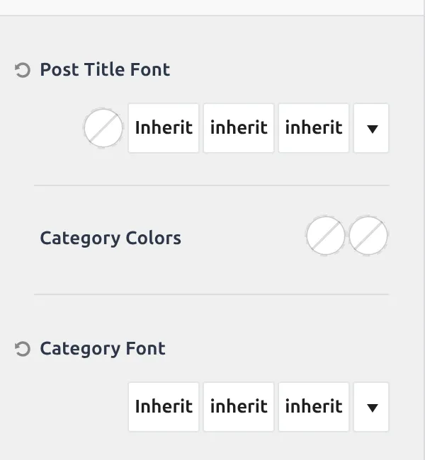
Here’s the Design tab. Sixteen of its 17 settings start empty.
| Setting | What it does | Default |
|---|---|---|
| Post Title Font | Family, size, line height and weight for the title | Not set |
| Category Colors | Colour and hover for the category links | Not set |
| Category Font | Font for those links | Not set |
| Breadcrumb Colors | Colour and hover for the breadcrumb trail | Not set |
| Breadcrumb Font | Font for the trail | Not set |
| Meta Colors | Colour and hover for the date and author line | Not set |
| Meta Font | Font for that line | Not set |
| Excerpt Colors | Colour for the excerpt in the title block | Not set |
| Excerpt Font | Font for it | Not set |
| Post Title Background | Background behind the title block | Not set |
| Use Featured Image for Background? | Puts the featured image behind the title block | Off |
| Background Overlay Color | A tint laid over that background | Not set |
| Border | Top and bottom border on the title block | Not set |
| Site Background | Background behind the whole page | Not set |
| Content Background | Background behind the content card | Not set |
| Related Posts Section Title Font | Font for the “Related Posts” heading | Not set |
| Related Posts Section Background | Background behind the carousel | Not set |
Why does Page Layout’s Design tab behave differently?
All five sections in this part show a General and a Design tab. Page Layout’s works differently underneath, and it’s the only one that does.
The other four are built as two separate sections stitched together, so clicking Design actually moves you to a sibling screen. Page Layout is a single section, and its Design tab filters the controls in front of you rather than taking you anywhere. You won’t notice the difference as a reader – it matters only because a link straight to “Page Layout Design” doesn’t exist the way it does for the other four.
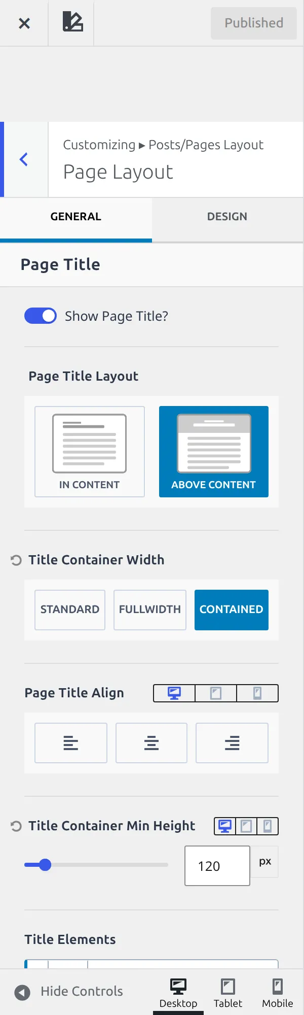
Pages also differ from posts in three defaults, and the differences are deliberate. Page Title Layout is Above, so a page title gets its own band while a post title sits in the content flow. Show Featured Image is Off for pages and On for posts. And Show Comments is Off for pages and On for posts.
| Setting | What it does | Default |
|---|---|---|
| Show Page Title? | The page title block, on or off | On |
| Page Title Layout | Own band above the content, or in the normal flow | Above |
| Title Container Width | Standard site width or full width | Standard |
| Page Title Align | Left, centre or right, per device | Not set |
| Title Container Min Height | Smallest height of the title band | 200px on desktop, not set on tablet or mobile |
| Title Elements | What appears in the title band and in what order | Order: title, breadcrumb, meta |
| Page Title Font | Family, size, line height and weight | Not set |
| Breadcrumb Colors | Colour and hover for the trail | Not set |
| Breadcrumb Font | Font for the trail | Not set |
| Meta Colors | Colour and hover for the meta line | Not set |
| Meta Font | Font for it | Not set |
| Page Title Background | Background behind the title band | Not set |
| Use Featured Image for Background? | Featured image behind the title band | Off |
| Background Overlay Color | Tint over that background | Not set |
| Border | Top and bottom border on the band | Not set |
| Default Page Layout | Container shape for every page | Normal |
| Page Default Sidebar | Which sidebar a sidebar layout pulls in | Primary Sidebar |
| Content Style | Boxed content card or unboxed | Boxed |
| Content Vertical Spacing | Space above and below the content | Show |
| Show Featured Image? | The page’s featured image | Off |
| Featured Image Position | Where it sits relative to the title | Above |
| Featured Image Ratio | Crop ratio applied to it | 2:3 |
| Show Comments? | Comments on pages | Off |
| Site Background | Background behind the whole page | Not set |
| Content Background | Background behind the content card | Not set |
Page Default Sidebar is the one people hunt for when a page shows the wrong widgets. It picks which sidebar gets used, not whether one appears – that’s Default Page Layout’s job. I’ve covered the whole relationship in changing sidebar position or width.
What does Archive Layout control?
Your blog index, your category pages, your tag pages and your author pages. All of them, with one set of 26 settings, split evenly at 13 on General and 13 on Design.
The card grid is the part you’ll change first. Kadence ships 3 columns, image above the text, content aligned to the top of each card, and six elements in every card.
| Setting | What it does | Default |
|---|---|---|
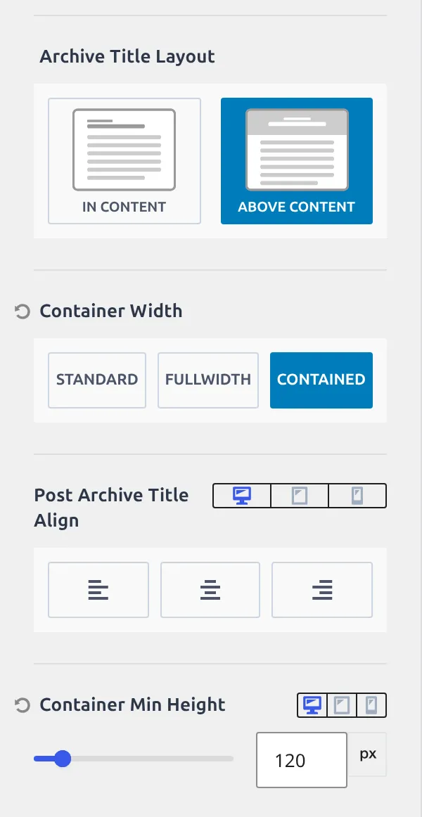
| Show Archive Title? | The title band at the top of the archive | On |
| Archive Title Layout | Own band above, or in the normal flow | Above |
| Container Width | Standard site width or full width for the band | Standard |
| Post Archive Title Align | Left, centre or right, per device | Not set |
| Container Min Height | Smallest height of the band | Not set |
| Title Elements | What goes in the band and in what order | Order: breadcrumb, title, description |
| Archive Layout | Container shape for the archive | Normal |
| Post Archive Default Sidebar | Which sidebar a sidebar layout pulls in | Primary Sidebar |
| Content Style | Boxed cards or unboxed | Boxed |
| Post Archive Columns | Cards per row | 3 |
| Item Image Placement | Image above the text, or beside it | Above |
| Content Vertical Alignment | Where the text sits inside a card | Top |
| Post Item Elements | What each card shows and in what order, each with its own switch | Order: feature, categories, title, meta, excerpt, read more |

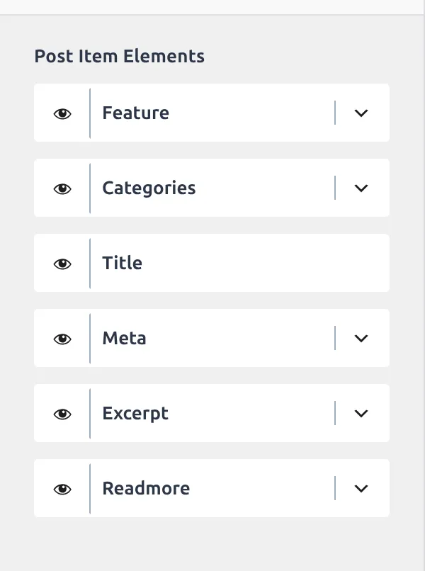
Post Item Elements is the most useful control in this section and the least obvious, because it’s a drag-and-drop list rather than a set of checkboxes. Each row has its own on/off switch, and the order you drag them into is the order they render in every card. That’s how you drop the category links or the read-more button without touching CSS.
Notice that Container Min Height is Not set here, while single posts and pages both get 200px. So an archive title band collapses to fit its contents and a post title band doesn’t, which is the usual reason those two look different heights on the same site.
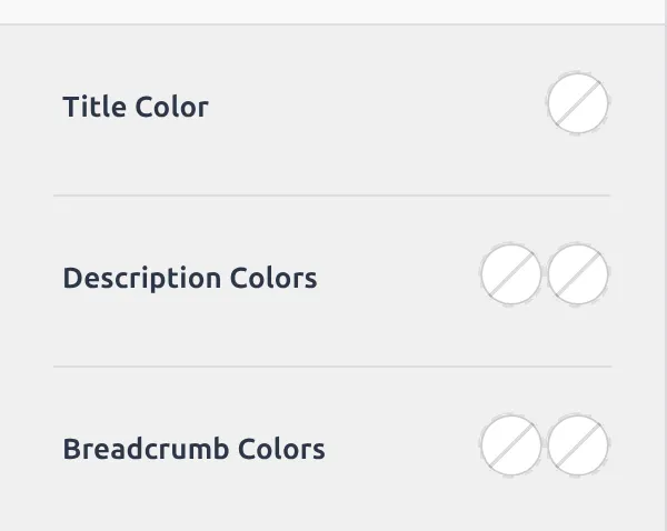
The Design tab is 13 settings and all 13 are empty: Title Color, Description Colors, Breadcrumb Colors, Archive Title Background, Background Overlay Color, Border, Post Item Title Font, Item Category Colors, Item Category Font, Item Meta Colors, Item Meta Font, Site Background and Content Background.
If your archive is showing nothing at all rather than showing it wrongly, that’s a different problem – blog posts disappearing is usually a Reading settings issue, not a Kadence one.
Why does Search Results have its own section?
Because Kadence treats it as a template rather than an archive, even though its 22 settings are nearly a copy of Archive Layout’s 26. It’s the same 11 General settings and 11 Design settings, minus the description colours and the vertical alignment control.
| Setting | What it does | Default |
|---|---|---|
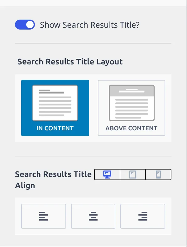
| Show Search Results Title? | The “Search Results for…” band | On |
| Search Results Title Layout | Own band above, or in the normal flow | Normal |
| Container Width | Standard site width or full width | Standard |
| Search Results Title Align | Left, centre or right, per device | Not set |
| Container Min Height | Smallest height of the band | Not set |
| Archive Layout | Container shape for the results page | Normal |
| Post Archive Default Sidebar | Which sidebar a sidebar layout pulls in | Primary Sidebar |
| Content Style | Boxed cards or unboxed | Boxed |
| Search Result Columns | Cards per row | 3 |
| Item Image Placement | Image above the text, or beside it | Above |
| Search Item Elements | What each result shows and in what order | Order: feature, categories, title, meta, excerpt, read more |
Its Design tab holds Title Color, Archive Title Background, Background Overlay Color, Border, Search Item Title Font, Item Category Colors, Item Category Font, Item Meta Colors, Item Meta Font, Site Background and Content Background. Every one of them starts empty.
The difference from Archive Layout that catches people: Search Results Title Layout defaults to Normal, while Archive Title Layout defaults to Above. Same control, same choices, opposite default. So your category page gets a title band and your search page doesn’t, on a stock install, and it looks like an inconsistency you introduced.
What is in the 404 Page Layout section?
Six settings, and they’re the smallest section in this article. It’s under Customize > General > 404 Page Layout, not in the Posts/Pages Layout panel.
| Setting | What it does | Default |
|---|---|---|
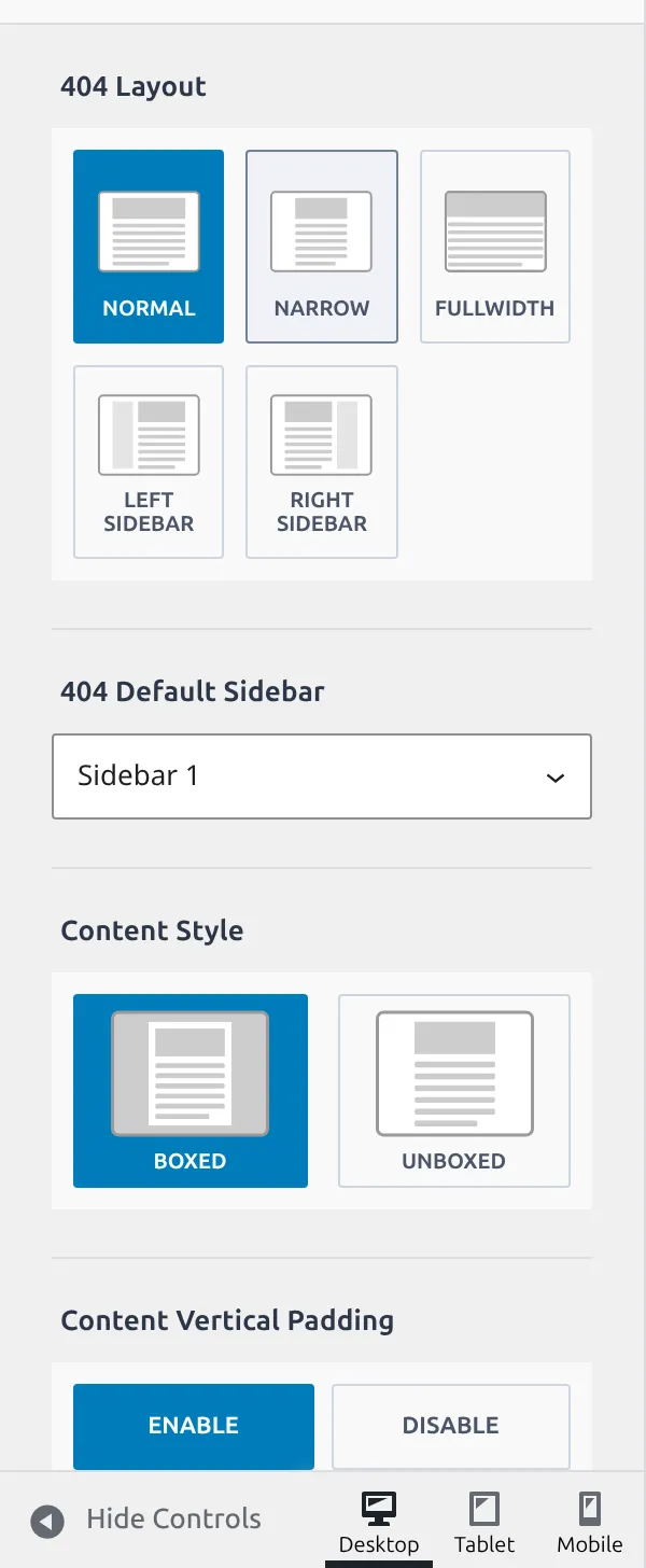
| 404 Layout | Container shape for the 404 page | Normal |
| 404 Default Sidebar | Which sidebar a sidebar layout pulls in | Primary Sidebar |
| Content Style | Boxed content card or unboxed | Boxed |
| Content Vertical Padding | Space above and below the content | Show |
| Site Background | Background behind the whole page | Not set |
| Content Background | Background behind the content card | Not set |
There’s no setting here for the 404 page’s wording, its heading or its search box. Kadence’s own template supplies those, and changing them means a child theme or a block template rather than the Customizer.
And if you’re here because 404s are appearing on pages that should exist, that isn’t a theme setting at all – WordPress 404 errors on every page covers the permalink cause.
Which settings are hidden until you switch something else on?
This is the second reason a setting a tutorial names isn’t on your screen, and it catches people harder than the first. Kadence hides a control completely when the setting it depends on is off. It doesn’t grey it out, it removes it.
I read the theme’s own rules for this rather than guessing, and the first one I checked turned out to need two switches, not one. Container Min Height in Search Results stays hidden until Show Search Results Title is on AND that title’s layout is set to Above. The layout ships as Normal, so turning the title on and expecting the control to appear leaves you staring at a list that hasn’t changed.
That’s worth knowing as a habit: when a control is missing, there may be more than one switch behind it. Archive Layout shows the same control quite happily, because its title layout already defaults to Above.
The same pattern runs through this part. The ones to expect are:
- The title layout, width, align, height and element settings in all five sections, which
depend on that section’s Show … Title switch
- Author Box Style and Use Author Archive Link, which depend on Show Post Author Box
being on. It’s off by default, so on a fresh install both are invisible
- The four related posts settings, plus the dots and the loop switch, which depend on
Show Related Posts
- Show Comment Date, which depends on Show Comments
- The featured image position, width, caption and ratio settings, which depend on Show
Featured Image. Pages ship with that off, so on a new site a page shows no image settings at all while a post shows four
- Background Overlay Color, which only matters once there’s a background to overlay
Which of these is worth changing first?
If you touch four things in this part, make them these.
Default Post Layout, because Narrow is the single decision that shapes every post on your site, and it’s the one most people change within their first hour. Featured Image Position, because Behind is why your images look like background bands instead of pictures. Post Archive Columns, because 3 columns squeeze long titles and short excerpts into narrow cards on anything below a desktop screen.
And Show Related Posts, because it’s on, it loops endlessly, and none of its four configuration settings has a value yet. It’s the one default in this part that actively looks wrong on a young site.
The other 122 can wait until you want them.
Next
Part 6 covers Colors and Fonts – the 45 settings behind the palette, the typography stack and the three button styles, and the panel that sits above Header in the Customizer list rather than below it.
Everything above was read from Kadence 1.4.5’s own settings registry. I re-check it at each release.
The whole series
- How the Kadence Customizer works – the map, the two access models, the control widgets
- Header structure – rows, sticky, transparent, off canvas, trigger
- Header components – navigation, search, button, social, HTML, logo
- Footer – rows, navigation, social, copyright, the six widget areas
- Posts, pages and archives – single posts, pages, archives, search, 404 (you are here)
- Colors and fonts – palette, typography, three button styles
- General – layout, sidebar, performance, scroll to top, social links