Kadence Header Components: Menu, Search, Button and Logo Settings
This is part 3 of seven. Part 2 covered the header’s structure – the rows, sticky, transparent. This one covers the 145 settings that belong to the things you put inside those rows: navigation, search, a button, social icons, custom HTML, and the logo.
Every default here was read from Kadence 1.4.5’s own settings registry. The official docs list these settings but never say what any of them starts as.
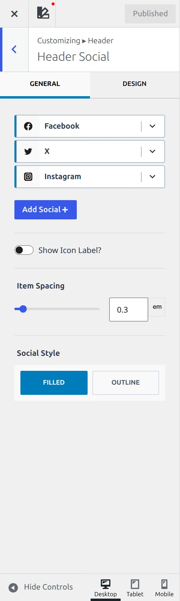
One note on the screenshots: they come from a site I actually use, so the values in them are mine rather than the defaults. The HTML component in my header holds real copy, for instance, while the table below correctly says it ships with placeholder text. The Default column is always the fresh-install value, read from the theme’s registry rather than from my screen.
Where do component settings live?
Each component keeps its settings on itself, not in a list.
Open Customize, then Header, and you get the builder docked under the preview. Every placed component has a small gear on it, and that gear opens its settings. Part 2 has the full explanation of the builder.
The part that trips people is what happens before you place anything. A component that is still sitting in the Available Items tray has no settings at all. Drag it into a row first, then look for the gear.
That is worth saying twice, because it makes tutorials look wrong. Somebody writes “go to Header Search and set the icon size”, you go looking, and there is no Header Search anywhere. The section genuinely does not exist until the search component is sitting in one of your rows.

Every component has a mobile twin
Before the tables, one structural thing that explains why the count is so high.
Most components exist twice – once for the desktop header and once for the mobile one – and each copy has its own settings section with its own values. Social icons on desktop and social icons on mobile are 14 settings and 13 settings, not one set shared between them. Same for the button, the HTML block and the navigation.
That’s why styling your desktop header does nothing to your phone. It isn’t a bug or a missing responsive control. They’re two headers, and you build both.
The logo settings are not in the Header panel
This one cost me a while.
The Logo is a header component – you drag it into a row like anything else. But its settings aren’t in Header. Kadence puts 14 of them inside WordPress’s own Site Identity screen, at the top level of the Customizer, mixed in with the site title and tagline.
| Setting | What it does | Default |
|---|---|---|
| Logo Max Width | Caps the logo width, per device | Not set |
| Different Logo for Mobile? | Use a second logo on phones | Off |
| Mobile Logo | That second logo | Not set |
| Use Logo Icon? | Show an icon instead of an image | Off |
| Logo Icon | Which icon | Arrow |
| Logo Icon Width | Size of it | Not set |
| Logo Icon Color | Colour of it | Palette 3 |
| Logo Layout | Whether icon, title and tagline show, per device | Not set |
| Site Title Font | Font for the site title | 26px |
| Site Title Hover and Active Colors | Title link colours | Not set |
| Site Tagline Font | Font for the tagline | 16px |
| Padding | Space around the logo block | Not set |
| Site Icon | Jumps to the favicon setting | – |
| Site Title and Logo Control | What the logo links to | Not set |
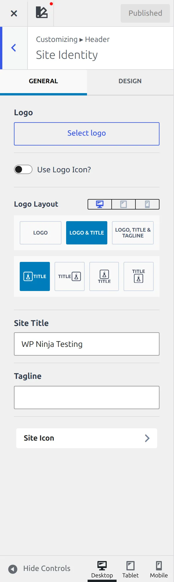
So if you’ve placed a logo and gone hunting through the Header panel for its options, that’s why you came back empty-handed. It’s the single most confusing piece of navigation in the theme. If you’re changing the title itself rather than the logo, that’s the site title setting.
Primary and Secondary Navigation
Kadence gives you two menu components, and they are identical. Twelve settings each, same names, same defaults. Learn one, you know both.
| Setting | What it does | Default |
|---|---|---|
| Select Menu | Which WordPress menu to show | Not set |
| Items Spacing | Gap between top-level items | 1.2em |
| Open on: | Whether sub-menus open on hover or click | Hover |
| Stretch Menu? | Spread items across the row | Off |
| Fill and Center Menu Items? | Fill the space and centre each item | Off |
| Navigation Style | Underline, background, or plain | Standard |
| Items Top and Bottom Padding | Vertical padding on each item | 0.6em |
| Navigation Colors | Link, hover and active colours | Palette 5, highlight on hover |
| Navigation Background | Background behind items | Not set |
| Make Parent of Current Menu Item Active? | Highlights the parent too | Off |
| Navigation Font | Font for menu items | Not set |
| Dropdown Options | Jumps to the dropdown settings | – |
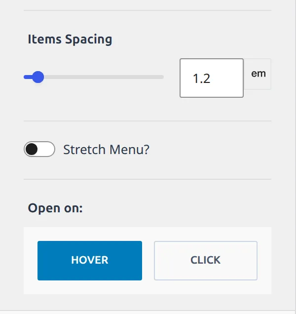
The menu you pick here is a WordPress menu, built in Appearance then Menus, and Kadence does not replace that. It only decides how the chosen menu looks and behaves once it is in your header. If your menu is empty, this section will not help – the menu itself needs building first.
Two of these are worth knowing about. Open on: hover is why sub-menus appear when you brush past them, and switching it to click is often kinder on touchscreens. And Navigation Style is where the underline-on-hover effect lives, not in a CSS box.
What do the Dropdown settings control?
Sub-menus have their own section, shared by both menus. Nine settings, and unusually for Kadence, most of them ship with a real value.
| Setting | What it does | Default |
|---|---|---|
| Dropdown Colors | Link and hover colour inside a sub-menu | Palette 8, palette 9 on hover |
| Dropdown Background | Background of the sub-menu panel | Palette 3, palette 4 on hover |
| Item Divider | Line between sub-menu items | 1px solid |
| Border Radius | Rounded corners on the panel | 0 |
| Dropdown Font | Font inside the sub-menu | 12px |
| Dropdown Shadow | Shadow under the panel | Soft black at 10% |
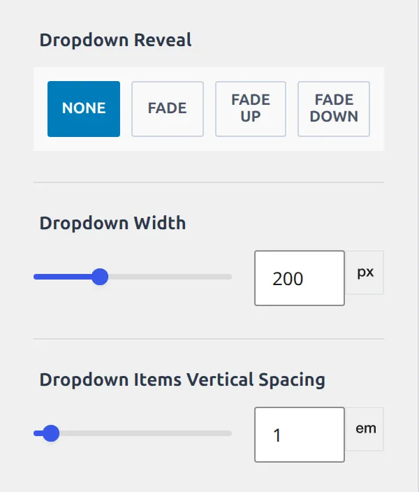
| Dropdown Reveal | Animation when it opens | None |
| Dropdown Width | Width of the panel | 200px |
| Dropdown Items Vertical Spacing | Padding on each item | 1em |
That 200px width is the one people come looking for. A long menu item in a sub-menu wraps onto two lines because the panel is fixed at 200px, and this is the setting that fixes it.
Dropdown Reveal is set to None, so sub-menus appear instantly. The alternatives animate them in. It is a small thing that changes how a site feels, and almost nobody finds it because it sits in a section you only reach through a jump button on another screen.
Mobile Navigation
The menu inside the off-canvas drawer. Eight settings, and one real opinion.
| Setting | What it does | Default |
|---|---|---|
| Select Menu | Which menu to show on mobile | Not set |
| Colors | Link, hover and active colours | Palette 8 |
| Background | Behind the menu items | Not set |
| Item Divider | Line between items | 1px solid |
| Font | Font for menu items | 14px |
| Items Vertical Spacing | Padding on each item | 1em |
| Collapse sub menu items? | Sub-menus start closed | On |
| Entire parent menu item expands sub menu | Tapping the parent opens it rather than following the link | Off |
Collapse sub menu items is on, which is why your mobile menu shows top-level items only until someone taps the arrow. The setting below it decides whether tapping the parent’s text opens the sub-menu or follows its link – a genuine usability choice, and it’s off.
The Search component
Thirteen settings covering the icon, the label beside it, and the modal that opens.
| Setting | What it does | Default |
|---|---|---|
| Search Label | Text next to the icon | Not set |
| Search Label Visibility | Which devices show the label | All three on |
| Search Icon | Which magnifier | Search |
| Search Style | Plain, bordered or filled | Default |
| Search Border | Border around it | 1px solid |
| Icon Size | Size of the icon | Not set |
| Search Colors | Icon and hover colour | Palette 5 |
| Search Background | Background and hover | Not set |
| Label Font | Font for the label | Not set |
| Search Padding | Space inside | Not set |
| Margin | Space outside | Not set |
| Text Colors | Colours inside the search modal | Not set |
| Modal Background | Background of the modal | Near-black, semi-transparent |
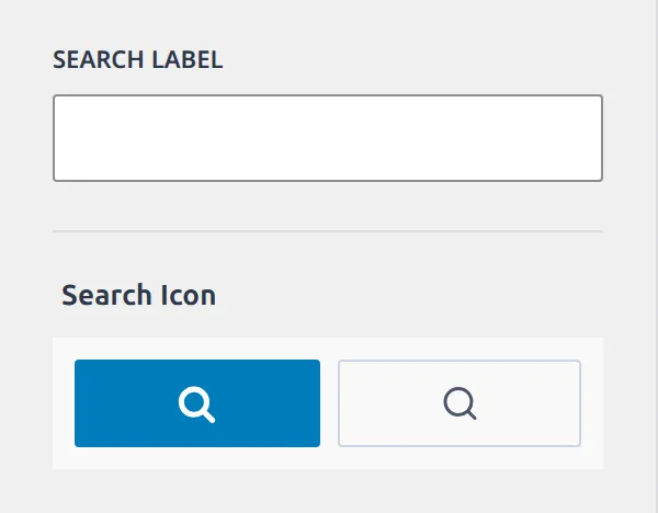
The last two rows are the interesting ones. Clicking search does not send people to a search page – it opens a full-screen modal over the site, and that modal has its own background and text colours. Kadence ships the background as a near-black overlay at partial transparency, which is why search looks dark even on a light site.
The Button component
Nineteen settings, the most of any component. And a default that catches people.
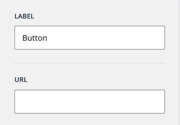
The label ships as the word “Button”. Place the component, forget to edit it, and your header says Button. The URL, by contrast, starts empty.
| Setting | What it does | Default |
|---|---|---|
| Label | The button text | “Button” |
| URL | Where it goes | Not set |
| Open in New Tab? / nofollow / Sponsored / Download | Link attributes | Off |
| Button Style | Filled or outline | Filled |
| Button Visibility | Which devices show it | All |
| Button Size | Small, medium or large | Medium |
| Padding, Margin, Border Radius | Spacing and corners | Not set |
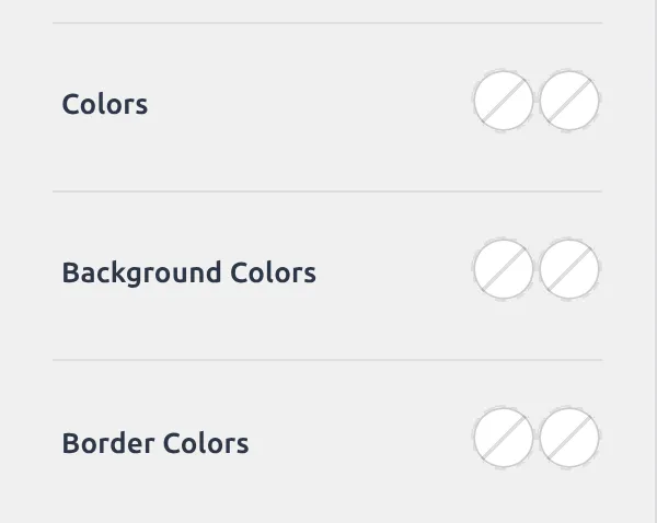
| Colors, Background Colors, Border Colors | Three colour pairs | Not set |
| Border | Border width | 2px |
| Font | Button font | Not set |
| Button Shadow | Resting shadow | None |
| Button Hover State Shadow | Shadow on hover | Soft black at 10% |
The four link attributes – new tab, nofollow, sponsored and download – are the same set WordPress gives any link, and all four start off. Button Size is worth a mention too: small, medium and large are preset padding and font combinations rather than fixed pixel sizes, so they scale with your typography settings.
Social icons
Fourteen settings for the desktop version, thirteen for the mobile one.
| Setting | What it does | Default |
|---|---|---|
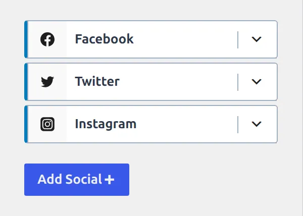
| Social Items | Which networks, and their order | Facebook first, drag to reorder |
| Show Icon Label? | Text beside each icon | Off |
| Item Spacing | Gap between icons | 0.3em |
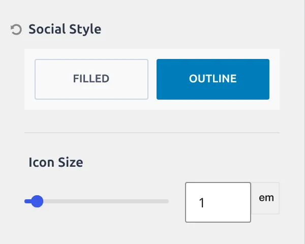
| Social Style | Filled, outline or plain | Filled |
| Icon Size | Size of each icon | 1em |
| Use Brand Colors? | Each network in its own colour | Not set |
| Colors, Background Colors, Border Colors | Three colour pairs | Not set |
| Border | Border width and style | 2px, no style |
| Border Radius | Rounded corners | 3px |
| Font | Font for labels | Not set |
| Margin | Space outside | Not set |
| Set Social Links | Jumps to where the URLs are entered | – |
The URLs themselves aren’t here. They live in General, under Social Links, and part 7 covers them – which is why this section has a button that just jumps you there.
Social Items is the one control here that is not a simple value. It is a sortable list – you tick the networks you want, drag them into order, and the icons follow. Kadence enables Facebook to start with, which is why a freshly placed social component shows a single icon rather than nothing at all.
The HTML component
Six settings, and one more default worth knowing.
The content ships as the literal text “Insert HTML here”. Place it, don’t edit it, and that’s what your visitors read.
| Setting | What it does | Default |
|---|---|---|
| Content | The HTML itself | “Insert HTML here” |
| Automatically Add Paragraphs | Wraps lines in paragraph tags | On |
| Font | Font for the content | Not set |
| Link Style | How links inside it look | Normal |
| Link Colors | Link and hover colour | Not set |
| Margin | Space outside | Not set |
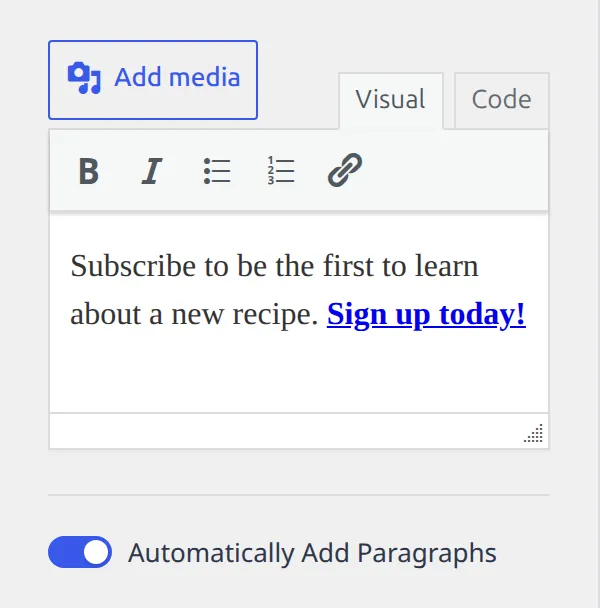
Automatically Add Paragraphs is on, which matters more than it sounds. Paste a couple of lines of plain text and Kadence wraps each in a paragraph tag for you. Paste carefully formatted markup and it may add tags you did not ask for – that switch is how you stop it.
What does palette5 mean in these defaults?
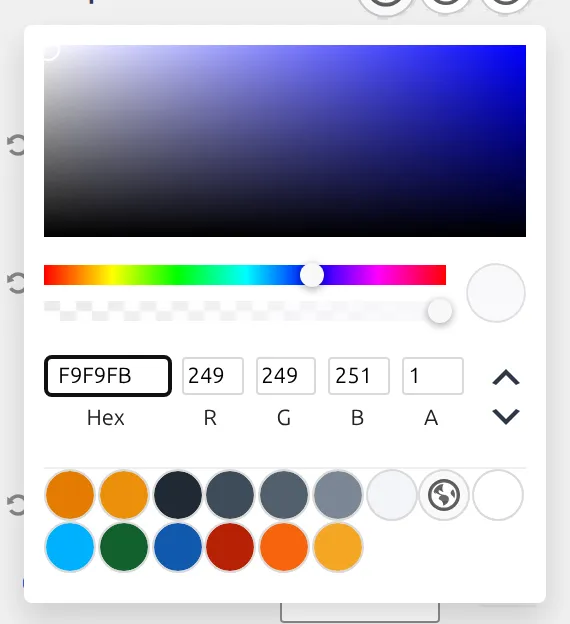
You’ll have noticed colours that read Palette 5 or Palette 8 rather than a hex code. That’s deliberate on Kadence’s part.
Components point at a slot in your colour palette rather than at a fixed colour. Change the palette and every component that points at slot 5 changes with it, without you touching a single component. Part 6 covers how the palette itself works.
It also explains something that looks like a bug. Set a header link colour by hand, then switch palettes, and that one link stays where you put it while everything around it moves. You broke the link to the slot. Clearing the colour puts it back under palette control.
How many of these 145 do anything?
Sixty-nine.
Walking every default, 76 of the 145 are inert on a fresh install – about 52%. Compare that with the header’s structure settings in part 2, where 71% do nothing. Components are far more opinionated than the frame around them, which makes sense: a button has to look like a button before you touch it, while a row can happily be invisible.
So this is the part of the header where the defaults matter most, and where the Default column above is worth reading before you start changing things.
Which of these is worth changing first?
Three, and none of them is a colour.
The Button label, because it ships reading “Button” and a live site saying Button in the corner looks unfinished. Open on: hover under whichever navigation you’re using, because hover menus are awkward on touchscreens and the switch to click takes one second. And Dropdown Width, because 200px is narrow enough that ordinary menu wording wraps, and wrapped sub-menu items are the most common “my menu looks broken” complaint I see.
After that, the palette does most of the work for you. That’s the point of it.
The whole series
- How the Kadence Customizer works – the map, the two access models, the control widgets
- Header structure – rows, sticky, transparent, off canvas, trigger
- Header components – navigation, search, button, social, HTML, logo (you are here)
- Footer – rows, navigation, social, copyright, the six widget areas
- Posts, pages and archives – single posts, pages, archives, search, 404
- Colors and fonts – palette, typography, three button styles
- General – layout, sidebar, performance, scroll to top, social links
Everything here came from Kadence 1.4.5’s own settings registry. I re-check it at each release.