Kadence Header Settings: Rows, Sticky and Transparent
This is part 2 of seven. It covers the 93 Kadence header settings that build the structure – the three rows, the sticky behaviour, the transparent mode, the off-canvas panel and the hamburger trigger.
It doesn’t cover the things you put inside a header. Navigation, search, buttons, social icons and the logo are components, and they get part 3.
Every default below was read out of the theme itself on Kadence 1.4.5, not copied from the documentation. The official docs list these settings but don’t say what any of them start as, which is the whole reason I’m writing this down.
One thing about the screenshots: they come from a site I actually use, so the values you see in them are mine, not the defaults. Sticky is switched on in my Customizer, for instance, while the table below correctly says it ships off. The Default column is always the fresh-install value, read from the theme’s registry rather than from my screen.
Why the Header panel looks empty
Open Customize, then Header, and you get no list of sections to click. That’s normal, and it’s the thing that confuses people most.
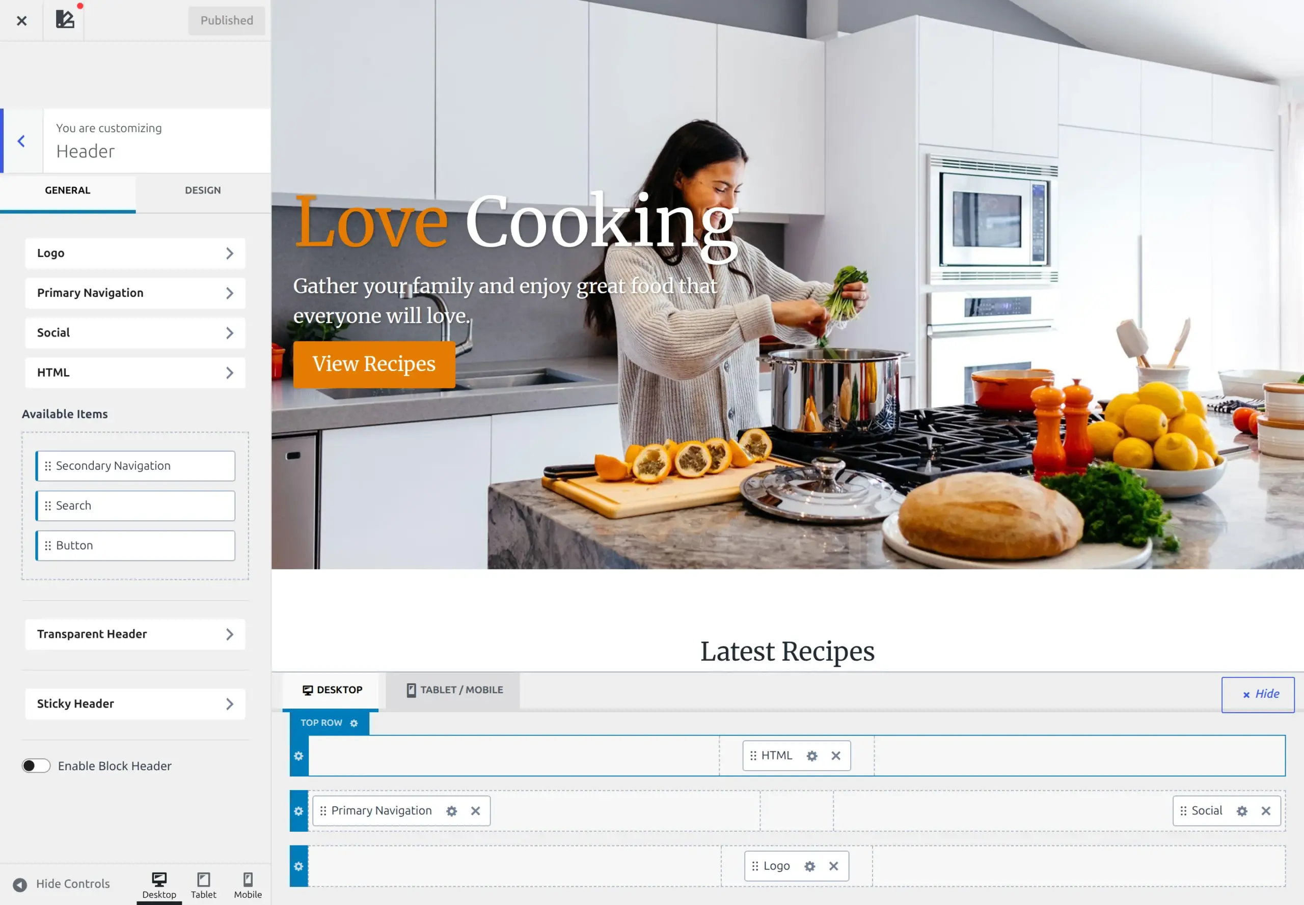
The Header panel’s contents are a builder that docks underneath the site preview. Everything here is reached from that dock – a gear on a row opens the row’s settings, a gear on a component opens that component’s. I covered the mechanics in part 1.
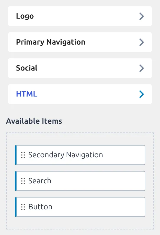
What’s in the default Kadence header?
Two components. That’s it.
Out of the box Kadence puts the logo on the left of the Main row and the navigation on the right, and leaves the Top and Bottom rows completely empty. The mobile header is laid out separately: logo left, hamburger toggle right, and the menu itself parked inside the off-canvas panel.
Knowing that helps, because an empty Top row isn’t broken. It’s waiting.
How many of these 93 settings actually do anything?
Twenty-seven.
I walked every default in this part of the theme, counting anything that starts empty, off, or set to inherit as doing nothing. 66 of the 93 are inert on a fresh install – about 71%, which is more inert than the theme as a whole. The header structure is almost entirely a set of switches waiting for you.
That’s useful when you’re hunting a problem. If your header looks wrong out of the box, it is very unlikely to be one of these settings, because 66 of them aren’t doing anything. It’s far more likely to be the content you placed in a row, or the 80px Main row height further down this page.
The three header rows
Top, Main and Bottom. All three have the same six settings, so learn them once.
| Setting | What it does | Default |
|---|---|---|
| Layout | How the row splits into left, centre and right areas | Standard on desktop, inherits on tablet and mobile |
| Min Height | Smallest height the row can be | Main 80px, Top and Bottom 0 |
| Row Background | Colour or image behind the row | Not set |
| Border | A border on the row | Not set |
| (When Transparent Header) Row Background | A separate background used only in transparent mode, hidden until you enable it | Not set |
| Padding | Space inside the row, four sides | Not set |
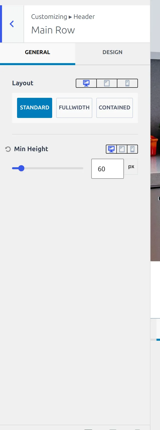
The 80px Main row height is the one worth remembering. It’s the only row Kadence gives a real number to, and it’s why a tall logo pushes your header out of shape – the logo grows past 80px and the row follows it.
Top and Bottom sit at 0, which means they collapse to whatever you put in them.
The duplicate background setting deserves a word. Each row carries a normal background and a second one labelled “(When Transparent Header)”. That isn’t a bug or a leftover. Transparent mode needs its own background per row, because the whole point is that the normal one gets dropped, and Kadence keeps the two values separate so switching transparent on and off doesn’t destroy your colours.
You won’t see that second one straight away. It stays hidden until Transparent Header is switched on, which is worth knowing before you go looking for it in a fresh install.
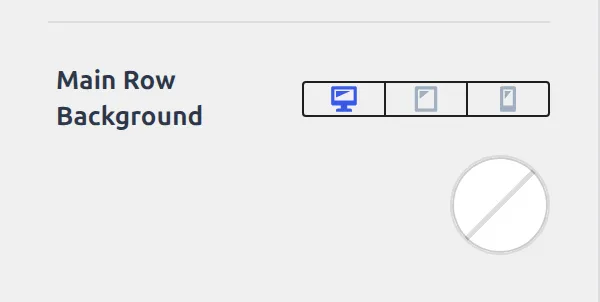
Header Layout: the settings that live outside the rows
Eight settings sit above the rows and apply to the header as a whole.
| Setting | What it does | Default |
|---|---|---|
| Header Background | Background behind the whole header | White (#ffffff) |
| Screen size to switch to mobile header | The width where the desktop header hands over | Not set |
| Enable Block Header | Swap the builder for a block-built header | Off |
| Header Block | Which block template to use, if enabled | Not set |
| Transparent Header | A shortcut through to those settings | – |
| Sticky Header | A shortcut through to those settings | – |
| Available items (desktop and mobile) | The trays of unplaced components | – |
The white background is one of the few real opinions in the whole header. Most of the rest start empty and inherit.
Two of these are worth knowing about even though they’re blank. Screen size to switch to mobile header is the breakpoint where the desktop header hands over to the mobile one – leave it alone and Kadence uses its own value, set it and you override the handover point for the whole site. And Enable Block Header swaps the whole drag-and-drop builder for a header built from blocks, which is a different way of working rather than an extra feature. It’s off, and everything in this article assumes it stays off.
How does the sticky header work?
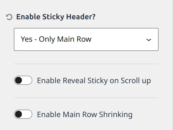
Sticky is off by default, and it isn’t a simple on/off. Enable Sticky Header? is a dropdown with six choices:
- No
- Yes – Only Main Row
- Yes – Top Row & Main Row
- Yes – Whole Header
- Yes – Only Top Row
- Yes – Only Bottom Row
That’s the setting people miss. If you turned sticky on and the wrong strip of your header followed you down the page, this dropdown is why.
| Setting | What it does | Default |
|---|---|---|
| Enable Sticky Header? | Which rows stick | No |
| Enable Reveal Sticky on Scroll up | Header appears only when scrolling up | Off |
| Enable Main Row Shrinking | Main row shrinks once stuck | Off |
| Main Row Shrink Height | Height it shrinks to | 60px |
| Different Logo for Stuck Header? | Swap the logo when stuck | Off |
| Stuck Header Logo | The replacement logo | Not set |
| Logo Max Width | Width for that logo | Not set |
| Enable Sticky for Mobile? | Same, for the mobile header | No |
| Enable Reveal Sticky on Scroll up (mobile) | Mobile reveal-on-scroll-up | Off |
| Enabled Main Row Shrinking (mobile) | Mobile shrink | Off |
| Main Row Shrink Height (mobile) | Mobile shrink height | 60px |
| Different Logo for Mobile? | Mobile stuck logo swap | Off |
| Mobile Logo | That logo | Not set |
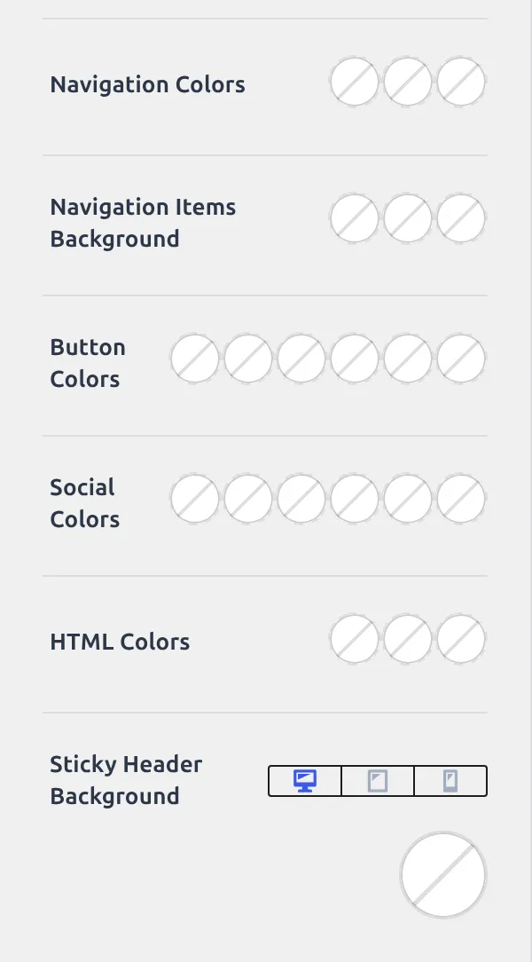
The Design tab adds 10 more, and all 10 start empty: site title colour, logo icon colour, navigation colours, navigation item background, button colours, social colours, HTML colours, sticky background, bottom border and box shadow.
They exist so the stuck header can look different from the resting one. Until you set them, it looks identical.
Reveal on Scroll up is the other one worth understanding. With plain sticky, the header is on screen the entire time you’re reading. With reveal, it slides away as you scroll down and comes back the moment you scroll up, which buys back the vertical space on a phone. Both mobile and desktop have their own copy of the switch. If you want the walkthrough rather than the reference, I’ve written up setting up a sticky header.
What does transparent header actually do?
It lifts the header out of the page flow and lets your hero image run underneath it.
There’s one default here that catches people, and it’s on: Disable Search and Archives? starts switched on. So even with transparent enabled, your blog archive and search results keep a normal solid header. That’s a sensible default and an easy hour lost if you don’t know about it.
You won’t meet it until you flip the master switch, though. Every setting in the table below except the first one stays hidden until Enable Transparent Header is on, so on a fresh install this section looks like it holds a single checkbox.
| Setting | What it does | Default |
|---|---|---|
| Enable Transparent Header? | Master switch | Off |
| Disable Search and Archives? | Skip transparent on archives and search | On |
| Disable on Pages? | Skip transparent on pages | Off |
| Disable on Posts? | Skip transparent on posts | Off |
| Enable for: | Desktop and mobile toggles | Both on |
| Different Logo for Transparent Header? | Swap the logo | Off |
| Transparent Header Logo | That logo | Not set |
| Logo Max Width | Width for it | Not set |
| Different Logo for Mobile? | Mobile variant | Off |
| Mobile Logo | That logo | Not set |

Its Design tab carries 9 colour settings, all empty, all there so light text can sit on a dark image. The pattern repeats across this whole part: a General tab that controls behaviour and ships a handful of real values, and a Design tab that is almost entirely blank because it exists to override the theme’s colours rather than to set them.
Note that transparent is site-wide with exceptions, not per-page. To control it page by page, see hiding the header on specific pages.
The off-canvas panel
This is the drawer the hamburger opens. On mobile it’s where your menu lives by default.
| Setting | What it does | Default |
|---|---|---|
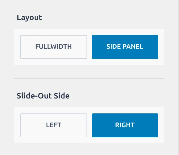
| Layout | Side panel or full screen | Side panel |
| Slide-Out Side | Which edge it comes from | Right |
| Panel Width | Width of the drawer | Not set |
| Content Max Width | Width limit for the contents | Not set |
| Move Body with toggle? | Page slides across as it opens | Off |
| Animation | How it appears | Fade |
| Content Align | Left, centre or right | Left |
| Content Vertical Align | Top, middle or bottom | Top |
The Design tab adds 5: panel background, close icon size (24px), close toggle colours and background, and close icon padding.
The off-canvas panel is the most opinionated corner of the header structure, and that makes sense – a drawer has to work the moment you enable it. Side panel, from the right, fading in, contents aligned left and to the top. You can change every one of those, but none of them is empty waiting for you.
The mobile trigger
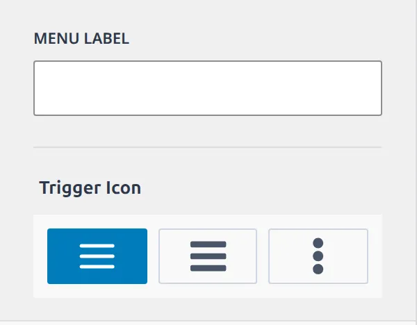
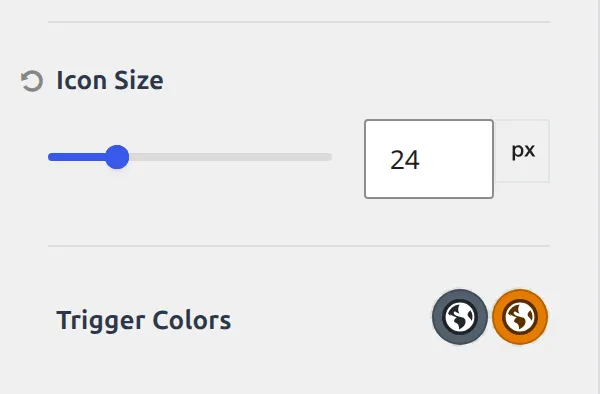
The hamburger itself. Three settings on General, seven on Design, and it’s the most opinionated corner of the header – almost everything here ships with a real value.
| Setting | What it does | Default |
|---|---|---|
| Menu Label | Text beside the icon | Not set |
| Trigger Icon | Which icon | Menu (the three bars) |
| Drawer Container Options | Jumps to the off-canvas settings | – |
| Trigger Style | Default, or a bordered variant | Default |
| Trigger Border | Border around the button | 1px solid |
| Icon Size | Size of the icon | 20px |
| Trigger Colors | Icon colour and hover | Palette 5, highlight on hover |
| Trigger Background | Background and hover | Not set |
| Trigger Font | Font for the label | 14px |
| Trigger Padding | Space inside the button | 0.4em top and bottom, 0.6em sides |
Desktop and mobile are two separate headers
Worth saying plainly, because it explains so much confusion: the builder has a desktop set of rows and a mobile set of rows, each with its own placed components and its own Available Items tray.
Dragging navigation into your desktop Main row does nothing to mobile. That’s deliberate, and it’s why Kadence registers separate sections for the desktop and mobile versions of the same component.
It also means the mobile header has its own Available Items tray, and its own empty Top and Bottom rows. If you’ve built a beautiful desktop header and your phone still shows a bare logo and a hamburger, nothing has gone wrong – you haven’t built the mobile one yet.
Which of these is worth changing first?
If you only touch three things in this part, make them these.
Main Row Min Height, because 80px is the number that decides how tall your header sits and how much of a large logo fits inside it. Enable Sticky Header?, because the six-way dropdown is the difference between a sticky header that works and one that brings the wrong strip with it. And Disable Search and Archives? under transparent, because it’s on by default and it’s the reason a transparent header can look broken on your blog page but fine on your homepage.
The other 90 can wait until you want them.
Next
Part 3 covers the components you drop into these rows – navigation, search, button, social, HTML, and the 16 logo settings Kadence hides inside WordPress’s Site Identity screen.
Everything here was read from Kadence 1.4.5’s own settings registry. I’ll re-check it at each release.
The whole series
- How the Kadence Customizer works – the map, the two access models, the control widgets
- Header structure – rows, sticky, transparent, off canvas, trigger (you are here)
- Header components – navigation, search, button, social, HTML, logo
- Footer – rows, navigation, social, copyright, the six widget areas
- Posts, pages and archives – single posts, pages, archives, search, 404
- Colors and fonts – palette, typography, three button styles
- General – layout, sidebar, performance, scroll to top, social links