Kadence Footer Settings: Rows, Widgets and Copyright
This is part 4 of seven. It covers the 100 Kadence footer settings – the three footer rows, the six widget areas, the footer navigation, the social icons and the copyright line at the bottom of every page.
The footer is the header’s mirror image. Same builder, same gears, same General and Design tabs. If you’ve read part 2 on the header, you already know how to get around in here.
Every default below was read out of the theme itself on Kadence 1.4.5, not copied from the documentation. Kadence’s own docs list these settings without saying what a single one of them starts as, which is the whole reason I’m writing this down.
One note about the screenshots: they come from a site I actually use, so the values on screen are mine. The Default column is always the fresh-install value.
Why the Footer panel looks empty
Open Customize, then Footer, and you get nothing to click. No list of sections, no headings, just an empty column.
That’s not broken. The Footer panel’s contents are a drag-and-drop builder that docks underneath the site preview, exactly like the header. A gear on a row opens that row’s settings, and a gear on a component opens that component’s. I covered the mechanics in part 1.
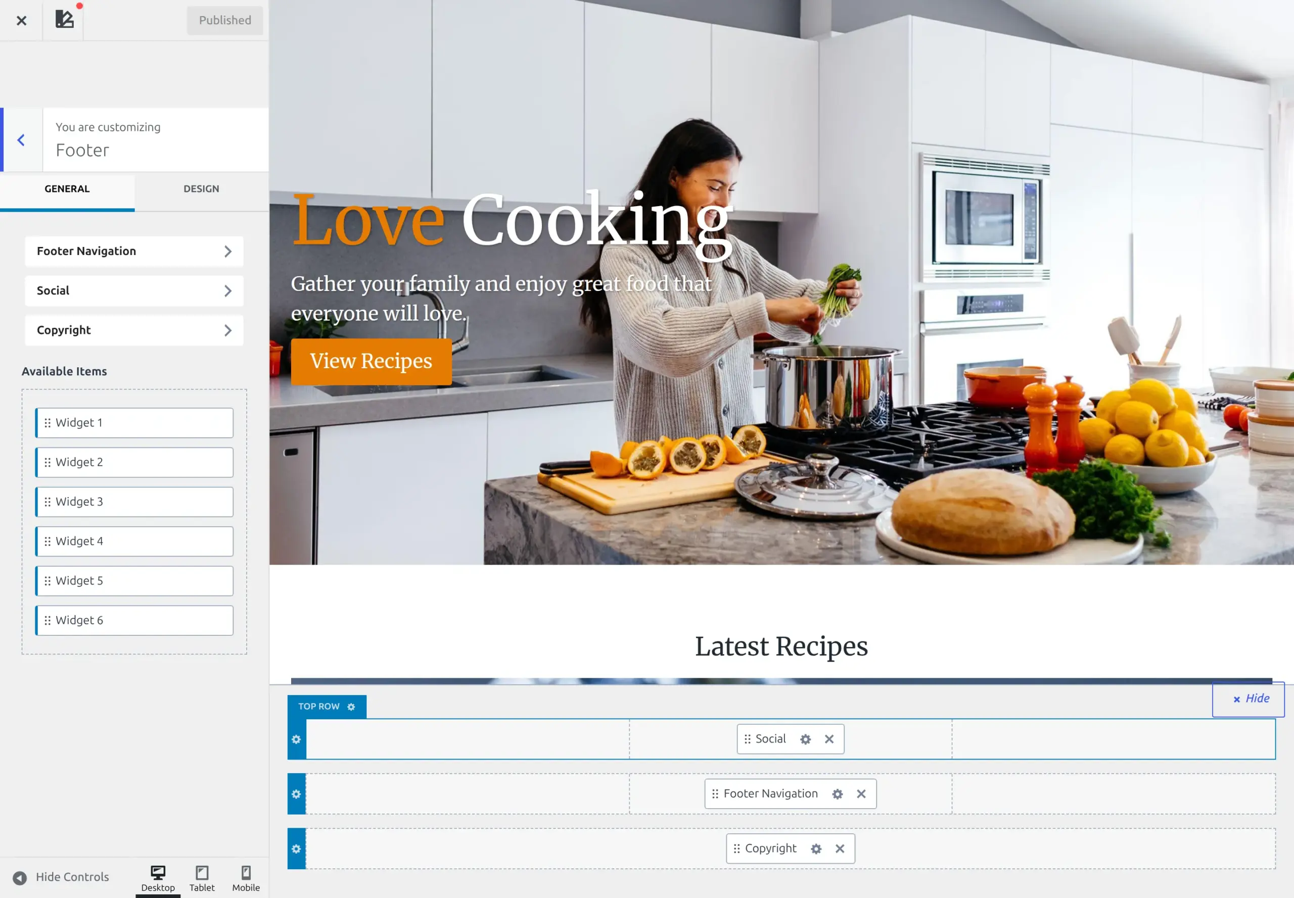
One note on the screenshots: they come from a site I actually use, so the values in them are mine rather than the defaults. My social icons still read Twitter, for instance, while Kadence 1.4.5 ships that slot as X. The Default column is always the fresh-install value, read from the theme’s registry rather than from my screen.
The part that trips people up is the tray. Kadence gives the footer 9 components, and any you haven’t placed sit in Available Items with no settings you can reach. On a fresh install only Copyright is already placed, in the bottom row, so the other 8 are waiting: Footer Navigation, Social, and Widget 1 through Widget 6.
So if a tutorial tells you to set the footer navigation spacing and you can’t find the control, you haven’t done anything wrong. You just haven’t dropped the component into a row yet.
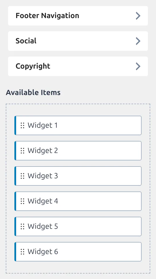
What’s in the default Kadence footer?
One component. The copyright line, in the first column of the bottom row.
The Top and Middle rows ship completely empty, and so do the other four columns of the bottom row. That’s the entire out-of-the-box footer: a single line of text saying copyright, the year, your site name and a credit to Kadence.

How many of these 100 settings actually do anything?
Thirty-nine.
I walked every default in this part of the theme, counting anything that starts empty, off, or set to inherit as doing nothing. 61 of the 100 are inert on a fresh install, which is 61% and almost exactly the theme-wide figure of 62.6%.
The ones that do ship a value cluster in the three rows, and they’re mostly spacing and column counts. Everything to do with colour, borders and fonts starts blank and waits for you.
That’s useful when you’re hunting a problem. If your footer looks wrong before you’ve changed anything, it’s very unlikely to be one of these settings, because 61 of them aren’t doing anything yet. It’s far more likely to be the 30px spacing values further down this page, or a widget you dropped into a three-column row.
The three footer rows
Top, Middle and Bottom. All three carry the same 10 settings on the General tab, so learn them once and you know all three.
| Setting | What it does | Default |
|---|---|---|
| Container Width | Full width, standard width or narrow | Standard |
| Columns | How many columns the row splits into | Top 3, Middle 3, Bottom 1 |
| Layout | How the columns divide the width | Top and Middle equal, Bottom single row |
| Row Collapse | When columns stack on smaller screens | Normal |
| Column Direction | Columns side by side or stacked | Row |
| Column Spacing | Gap between columns | 30px |
| Widget Spacing | Gap between widgets inside one column | 30px |
| Top Spacing | Space above the row | 30px |
| Bottom Spacing | Space below the row | 30px |
| Min Height | Smallest height the row can be | Not set |
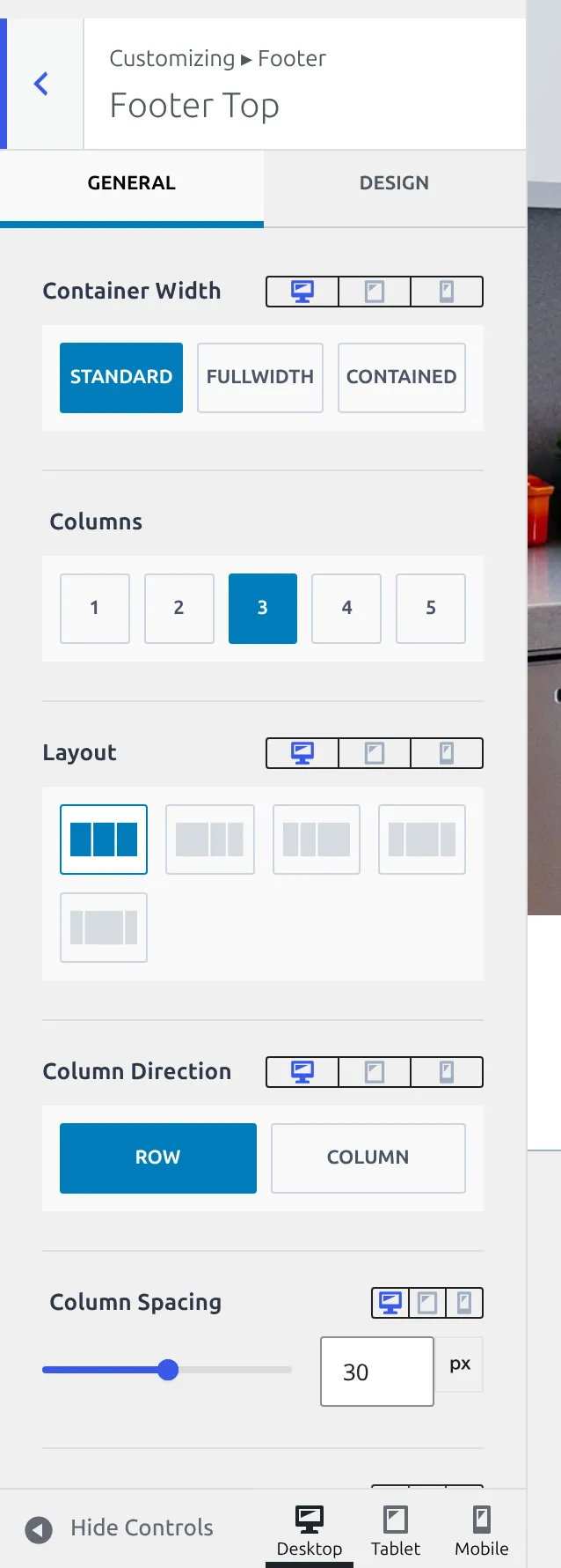
That block of 30s is the number to remember. Kadence answers almost every footer spacing question with 30px, and because each row has four of them, a three-row footer carries 12 separate 30px values.
They add up faster than you’d expect. If your footer has more air in it than you wanted, that’s usually Top Spacing and Bottom Spacing rather than anything you did. I’ve written up fixing extra footer white space separately.
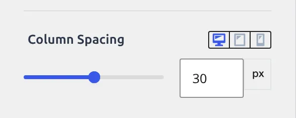
The column counts are the other real opinion here. Top and Middle both ship at 3 columns set to equal widths, and Bottom ships at 1. So the moment you drag anything into the Middle row, it lands in a three-up grid whether you wanted one or not.
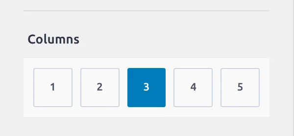
Container Width and Row Collapse are the two nobody reads and everybody needs. Container Width decides whether the row’s contents line up with the rest of your page or run edge to edge, and it ships at Standard, meaning it matches your content width. Row Collapse decides when those three columns stop sitting side by side and stack into one, and it ships at Normal.
Both start with an opinion rather than blank, which makes them easy to miss. You’ll only notice Row Collapse exists when your three-column footer looks wrong on a phone.
The three rows build their Design tab two different ways
Every row carries these 7 styling settings, and they’re identical across Top, Middle and Bottom:
| Setting | What it does | Default |
|---|---|---|
| Widget Titles | Font for widget headings in this row | Not set |
| Widget Content | Font for widget body text in this row | Not set |
| Link Colors | Normal, hover and active link colours | Not set |
| Link Style | Underline treatment for links in the row | Underline on Hover |
| Row Background | Colour or image behind the row | Not set |
| Column Border | A border between the columns | Not set |
| Border | A top and a bottom border on the row | Not set |
All three rows show a General and a Design tab, and all 7 of those settings live behind Design. What differs is how Kadence builds the tab, and it’s the kind of detail you’d only notice by reading the code.
Footer Bottom’s Design tab swaps you to a separate screen. Footer Top’s and Middle’s filter the controls in front of you without going anywhere. In the theme’s source the sections footer_top_design and footer_middle_design are declared and then never registered, because no setting is assigned to them – Top and Middle use the other mechanism instead.
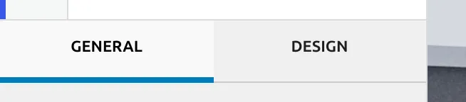
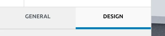
Practically it changes nothing – you click Design on any row and you get the same 7 settings. It only matters if you ever try to link straight to “Footer Middle Design”, which is a screen that doesn’t exist.
Footer Layout: the settings outside the rows
Three settings sit above the rows and apply to the footer as a whole.
| Setting | What it does | Default |
|---|---|---|
| Available items | The tray of unplaced components | – |
| Footer Background | Background behind the entire footer | Not set |
| Keep footer on bottom of screen | Pushes the footer down on short pages | On |
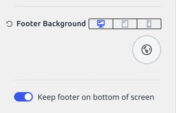
That last one is switched on, and it’s one of the few real decisions Kadence makes about your footer. On a page with almost no content, the footer gets pushed to the bottom of the browser window instead of sitting directly under the text. It stops a thin page from leaving a grey void underneath, and it’s also the setting people blame when a short page looks oddly stretched.
Footer Background is the other one to understand, because each row has a background too. This one sits behind the entire footer, all three rows at once, and it starts unset. Set a row background and only that strip changes colour; set this one and the whole block does.
The six widget areas
Each of Widget Footer 1 through 6 has exactly 2 settings in the Customizer, and both are alignment:
| Setting | What it does | Default |
|---|---|---|
| Content Align | Left, centre or right | Not set |
| Content Vertical Align | Top, middle or bottom | Not set |
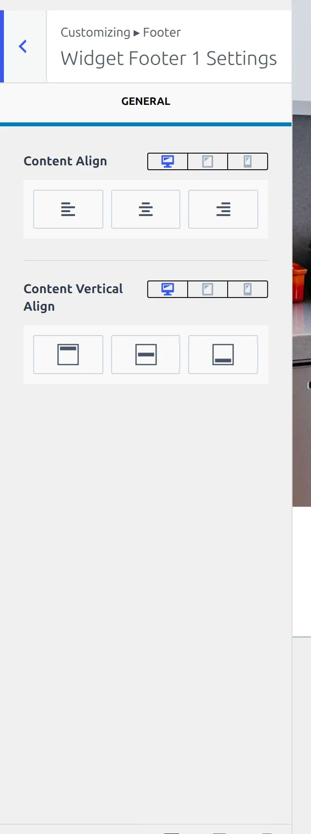
That’s 12 settings across the six areas, and all 12 start blank.
The thing worth knowing is where the actual content goes. You don’t fill a footer widget area from the Customizer footer builder. You drag the widget area into a footer row here, then you put things in it from Appearance, then Widgets, where all six show up as normal WordPress widget areas.
It’s the same split as the logo, which is a header component whose settings live under Site Identity. Kadence places things in one screen and fills them in another.
Footer Navigation
Nine settings, and this one has a real opinion baked into its colours.
| Setting | What it does | Default |
|---|---|---|
| Select Menu | Jumps across to the WordPress Menus screen | – |
| Items Spacing | Horizontal gap between menu items | 1.2em |
| Stretch Menu? | Spread items across the full width | Off |
| Items Top and Bottom Padding | Vertical padding on each item | 0.6em |
| Content Align | Left, centre or right | Not set |
| Content Vertical Align | Top, middle or bottom | Not set |
| Navigation Colors | Link, hover and active colours | Palette 5, highlight on hover |
| Navigation Background | Background behind the items | Not set |
| Navigation Font | Font for the menu items | Not set |
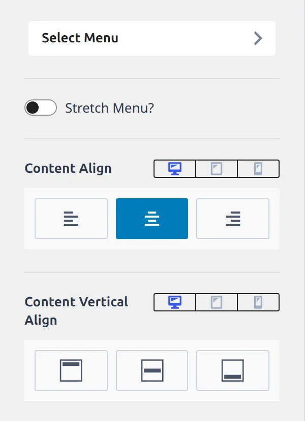
Note the first row. Choosing which menu appears down here isn’t a setting in this panel at all, it’s a button that sends you to the Menus screen. The footer navigation shows whatever menu you’ve assigned to the footer location.
Footer Social
Seventeen settings, split across a General tab and a Design tab, and it ships with three networks already switched on.
| Setting | What it does | Default |
|---|---|---|
| Title | A heading above the icons | Not set |
| Social Items | Which networks show, and their links | Facebook, X and Instagram on, all three with no URL |
| Show Icon Label? | Print the network name beside the icon | Off |
| Item Spacing | Gap between icons | 0.3em |
| Content Align | Left, centre or right | Not set |
| Content Vertical Align | Top, middle or bottom | Not set |
| Set Social Links | Jumps to the shared social URL list | – |
| Social Style | Filled, outline or plain icons | Filled |
| Icon Size | Size of each icon | 1em |
| Use Brand Colors? | Colour each icon in its network’s brand colour | Not set |
| Colors | Icon colour and hover | Not set |
| Background Colors | Icon background and hover | Not set |
| Border Colors | Icon border colour and hover | Not set |
| Border | Border around each icon | No border, with a 2px width held ready |
| Border Radius | Corner rounding on each icon | 3px |
| Font | Font for the icon labels | Not set |
| Margin | Space around the whole block | Not set |
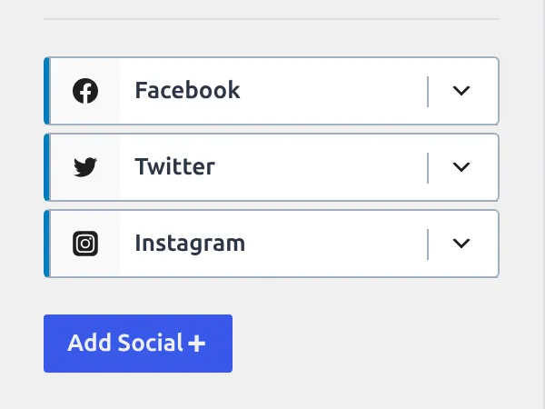
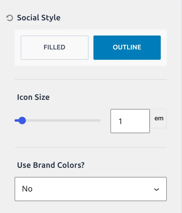
The three enabled networks with empty URLs are worth pausing on. Drop this component into a row and you get three icons immediately, pointing nowhere. The URLs aren’t stored here either, they live in one shared list under General so the header and footer icons stay in sync.
Footer Copyright HTML
Seven settings, and the one that people search for most.
| Setting | What it does | Default |
|---|---|---|
| Content | The text itself, in a small editor | {copyright} {year} {site-title} {theme-credit} |
| Content Align | Left, centre or right | Not set |
| Content Vertical Align | Top, middle or bottom | Not set |
| Font | Font for the copyright text | Not set |
| Link Colors | Link colour and hover | Not set |
| Link Style | Underline treatment | Underline |
| Margin | Space around the block | Not set |
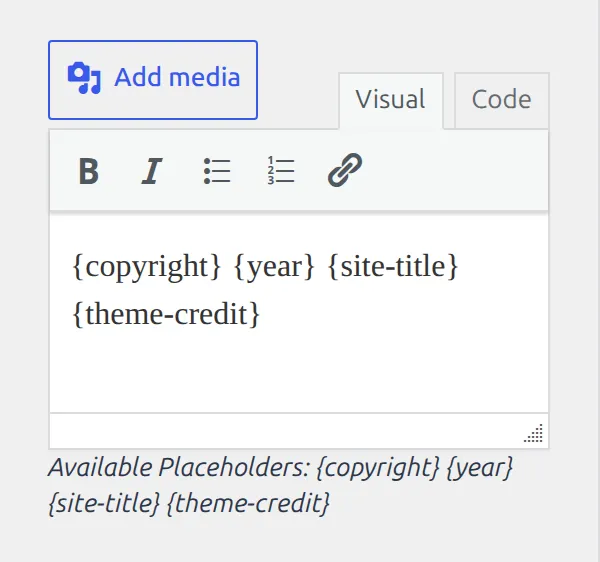
Those four things in curly brackets are placeholders that Kadence swaps out when the page loads. {copyright} becomes the symbol, {year} becomes the current year, {site-title} becomes your site name, and {theme-credit} becomes the “Kadence WP” link.
You can delete any of them, including the credit, and type plain text instead. That’s the single most common footer edit, and I’ve written the walkthrough separately in changing the footer copyright text.
Which of these is worth changing first?
Three things, if you only touch three.
Top Spacing and Bottom Spacing on whichever row you’re using, because 30px each is generous and a footer with three rows is carrying six of those values before you add anything. Columns on the Top and Middle rows, because 3 is a decision Kadence made for you and a two-column footer is far more common. And the copyright content, because the default line credits the theme on every page of your site.
The other 97 can wait until you want them.
If you’re working on the bottom of your pages anyway, a back to top button pairs well with a tall footer. I’ve covered adding one in its own article.
Next
Part 5 covers posts, pages and archives – the 126 settings behind single post layout, page layout, archive layout, search results and the 404 page.
Everything here was read from Kadence 1.4.5’s own settings registry. I’ll re-check it at each release.
The whole series
- How the Kadence Customizer works – the map, the two access models, the control widgets
- Header structure – rows, sticky, transparent, off canvas, trigger
- Header components – navigation, search, button, social, HTML, logo
- Footer – rows, navigation, social, copyright, the six widget areas (you are here)
- Posts, pages and archives – single posts, pages, archives, search, 404
- Colors and fonts – palette, typography, three button styles
- General – layout, sidebar, performance, scroll to top, social links